6 Modern graphics
6.1 Overview
ggplot2 was created by Hadley Wickham back in 2005 as an implementation of Leland Wilkinson’s grammar of graphics. The general idea behind the grammar of graphics is that a plot can be broken down into different elements and assembled by adding elements together. This reasoning is the foundation of the popular data visualization package ggplot2.
ggplot2 is built on the premise that graphically data can be represented as either:
- Points e.g. in the case of scatter plots
- Lines e.g. in the case of line plots
- Bars e.g. in the case of histograms and bar plots
- Or a combination of some or all of them e.g. dot plot
These are collectively known as geometric objects. These geometric objects can have different attributes (colours, shape, and size). These attributes can either be mapped or set during plotting.
Mapping simply means colour, shape and size are added in such a manner that they are linked to the underlying data represented by the geometric objects. In so doing they add more information and understanding to the plot and most often changes if the underlying data changes.
While setting, on the other hand, is not linked to the underlying data but rather adds more beauty than information. Because they add little or no information, setting should be done with care most especially when using size and shape.
ggplot2 consist of seven layers which are:
- data: holds data to be plotted
- geom: determines the type of plot, that is the type of geometric object to be used e.g. geom_point(), geom_line(), geom_bar(), etc.
- aesthetics: maps data and attributes (colour, shape, and size) to the geom
- stat: performs a statistical transformation
- position adjustment: determines where elements are positioned on the plot relative to others
- coordinate-system: manipulates the coordinate system
- faceting: used for creating subplots
library(ggplot2)
library(dplyr)
library(gapminder)
data(gapminder)

# data preparation
gapminder_2007 <- gapminder %>%
  filter(year == '2007' & continent != 'Oceania') %>%
  select(-3) %>%
  mutate(pop = round(pop/1e6, 2))

head(gapminder_2007)
#> # A tibble: 6 x 5
#>   country     continent lifeExp   pop gdpPercap
#>   <fct>       <fct>       <dbl> <dbl>     <dbl>
#> 1 Afghanistan Asia         43.8  31.9      975.
#> 2 Albania     Europe       76.4   3.6     5937.
#> 3 Algeria     Africa       72.3  33.3     6223.
#> 4 Angola      Africa       42.7  12.4     4797.
#> 5 Argentina   Americas     75.3  40.3    12779.
#> 6 Austria     Europe       79.8   8.2    36126.
6.2 The data layer
The function ggplot() initializes a ggplot object. It can be used to pass in both data and aesthetic. Data and aesthetic passed in here becomes available to all subsequent layers but can be overridden if need be within subsequent layers.
# initializing plot with data
ggplot(data = gapminder_2007)
# mapping data to x and y-axis
ggplot(data = gapminder_2007,  mapping = aes(y = lifeExp, x = gdpPercap))
6.3 The geom layer
The geom layer declares the type of plot to be produced. More on this in the next chapter.
# adding the geom layer
ggplot(data = gapminder_2007, aes(y = lifeExp, x = gdpPercap)) +
  geom_point()
# Both data and axis can be declared within the geom layer.
ggplot(data = gapminder_2007) +
  geom_point(mapping = aes(y = lifeExp, x = gdpPercap))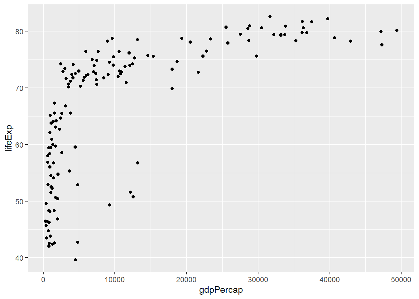
ggplot() +
  geom_point(data = gapminder_2007, aes(y = lifeExp, x = gdpPercap))
6.4 Shape
Shapes are controlled using the argument shape.
6.4.1 Setting shapes
Shapes are set by passing shape to geom_* but must be placed outside aes() as aes() is meant for mapping. Shape expects the same arguments as pch in base graphics that is, integers ranging from 1 to 25 or characters.
# changing shapes
ggplot(gapminder_2007) +
  geom_point(aes(y = lifeExp, x = gdpPercap), shape = 21)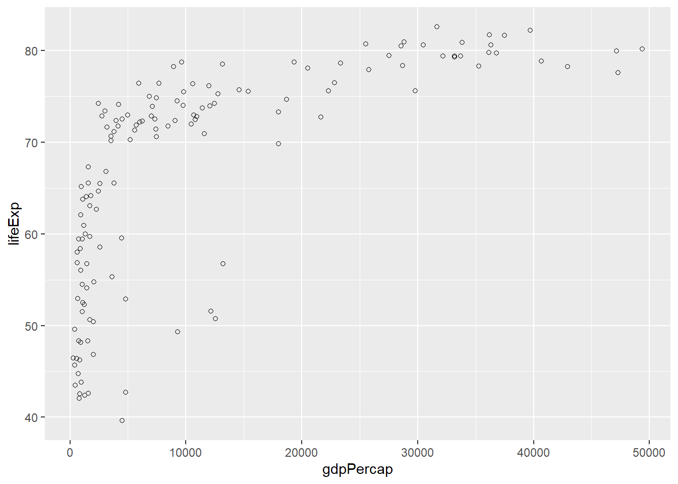
# using a character
ggplot(gapminder_2007) +
  geom_point(aes(y = lifeExp, x = gdpPercap), shape = '*')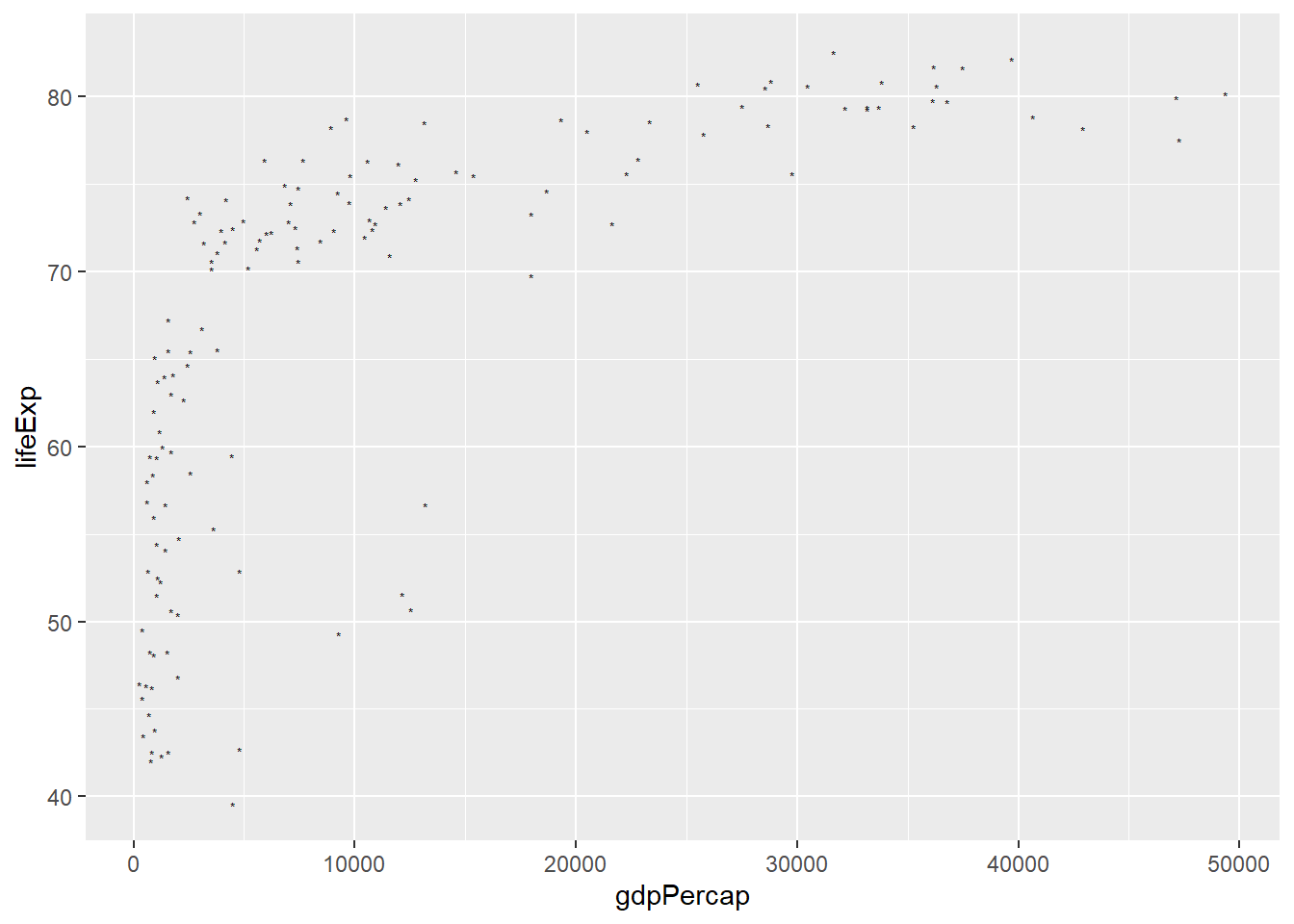
6.4.2 Mapping shapes
The mapping of data to shapes allows us to have shapes by groups or categories for example having different shapes for different continents. To map data to shapes, the shape argument is passed a categorical variable and placed within aes().
# shapes by continent
ggplot(gapminder_2007) +
  geom_point(aes(y = lifeExp, x = gdpPercap, shape = continent))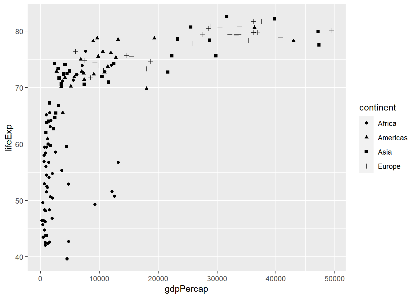
6.4.3 Scaling shapes
The function scale_shape_manual() is used to scale shapes that is determine the shapes to use in the plot.
# using shapes ranging from 15 to 19
ggplot(gapminder_2007) +
  geom_point(aes(y = lifeExp, x = gdpPercap, shape = continent)) +
  scale_shape_manual(values = 15:19)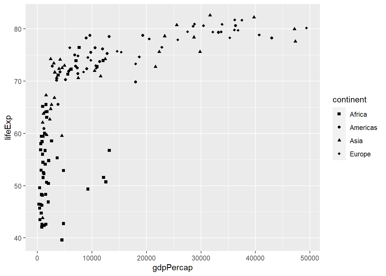
6.5 Size
size is controlled using the argument size=.
6.5.1 Setting size
# adjusting size
ggplot(gapminder_2007) +
  geom_point(aes(y = lifeExp, x = gdpPercap), size = 3)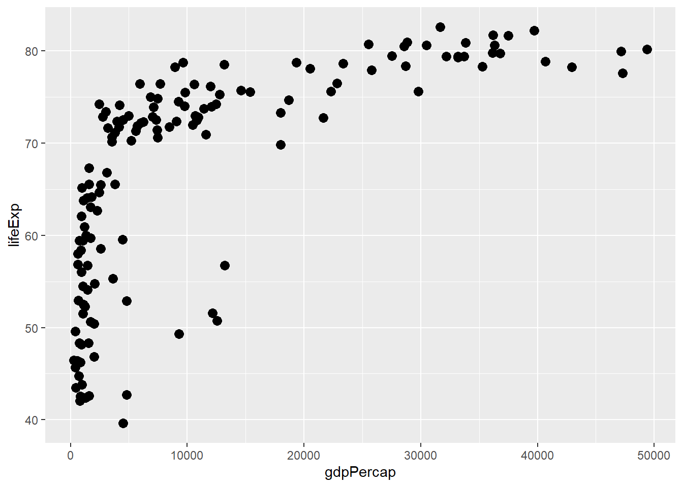
6.5.2 Mapping size
Size is mapped by assigning them a continuous variable and placing them within aes().
# size by population
ggplot(gapminder_2007) +
  geom_point(aes(y = lifeExp, x = gdpPercap, size = pop), shape = 21)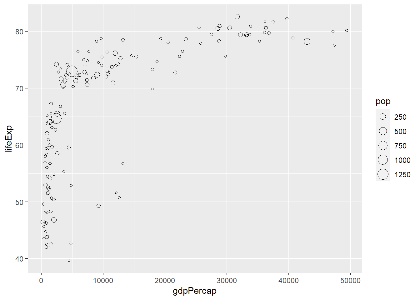
6.6 Colour
Colour is controlled using the argument color= or colour=.
6.6.1 Setting colours
ggplot(gapminder_2007) +
  geom_point(aes(y = lifeExp, x = gdpPercap), colour = 'darkblue', size = 3, shape = 19)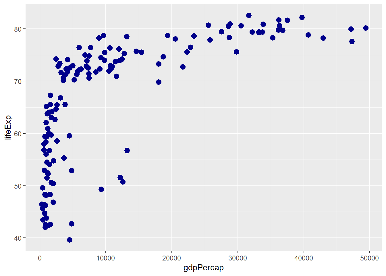
6.6.2 Fill vs colour
With shapes between 21 to 25 and bars, the argument fill is used to fill shapes while colour is used to colour borders (outlines).
# using colour and fill
ggplot(gapminder_2007) +
geom_point(aes(y = lifeExp, x = gdpPercap), colour = 'darkblue', fill = 'lightblue',
           size = 3, shape = 21)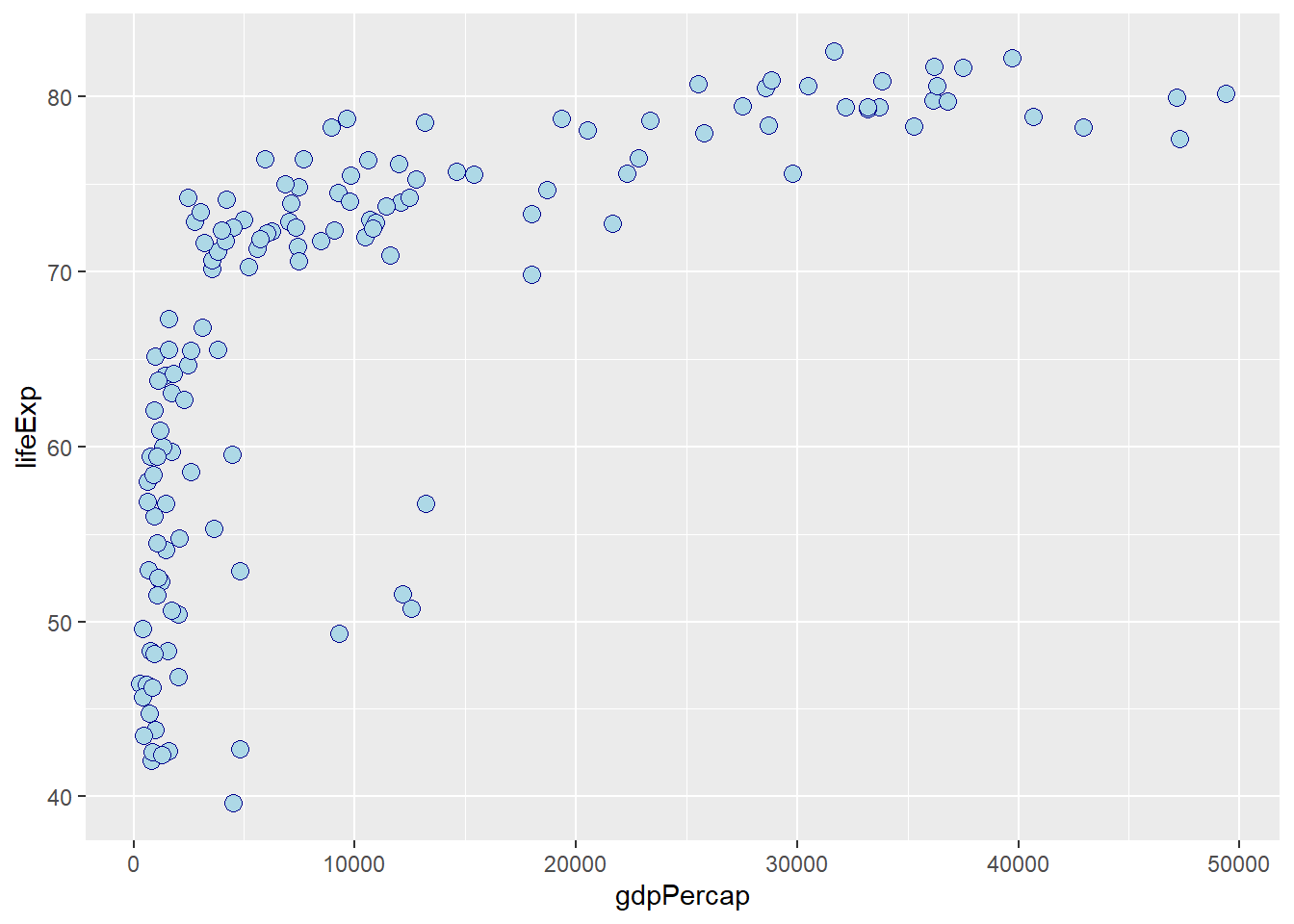
6.6.3 Stroke
The border or outline size is controlled using the argument stroke=.
ggplot(gapminder_2007) +
  geom_point(aes(y = lifeExp, x = gdpPercap), colour = 'darkblue', fill = 'lightblue',
           size = 3, shape = 21, stroke = 1)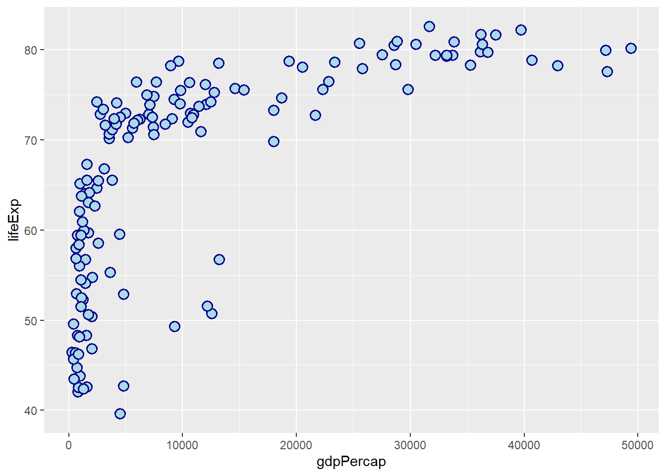
6.6.4 Transparency
Transparency is controlled by the argument alpha=. It accepts values from 0 to 1.
ggplot(gapminder_2007) +
  geom_point(aes(y = lifeExp, x = gdpPercap),
           colour = 'darkblue', fill = 'lightblue', size = 3, shape = 21,
           stroke = 1, alpha = 0.5)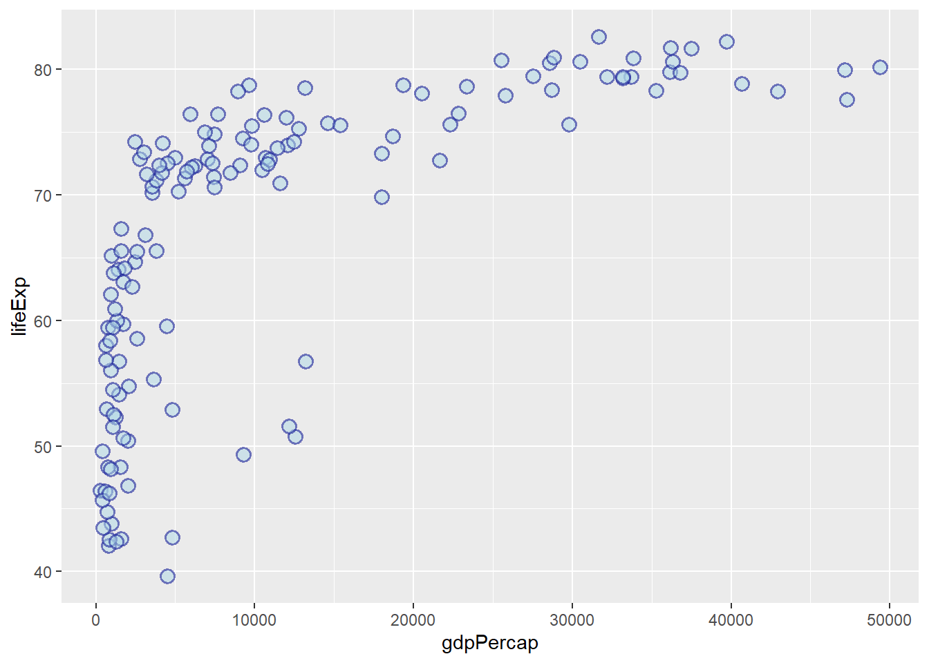
6.6.5 Mapping colours to discrete variables
As with shapes, colours are mapped by assigning a discrete variable to them and placing them within aes().
# colour by continent
ggplot(gapminder_2007) +
  geom_point(aes(y = lifeExp, x = gdpPercap, colour = continent), size = 3,
             shape = 19, alpha = 0.5)
# fill by continent
ggplot(gapminder_2007) +
  geom_point(aes(y = lifeExp, x = gdpPercap, fill = continent),
             colour = 'darkblue', size = 4, shape = 21, alpha = 0.5, stroke = 1)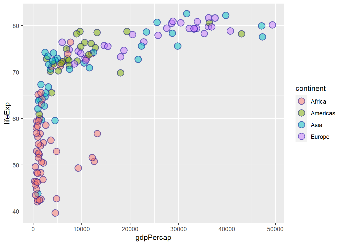
6.6.6 Default colours
The functions scale_colour_hue() and scale_fill_hue() sets the default colour and fill scale for discrete variables.
ggplot(gapminder_2007) +
  geom_point(aes(y = lifeExp, x = gdpPercap, colour = continent), size = 3,
             shape = 19, alpha = 0.5) +
  scale_colour_hue()
# Adjust luminosity and chroma
ggplot(gapminder_2007) +
  geom_point(aes(y = lifeExp, x = gdpPercap, colour = continent), size = 3,
             shape = 19, alpha = 0.5) +
  scale_colour_hue(l = 70, c = 150)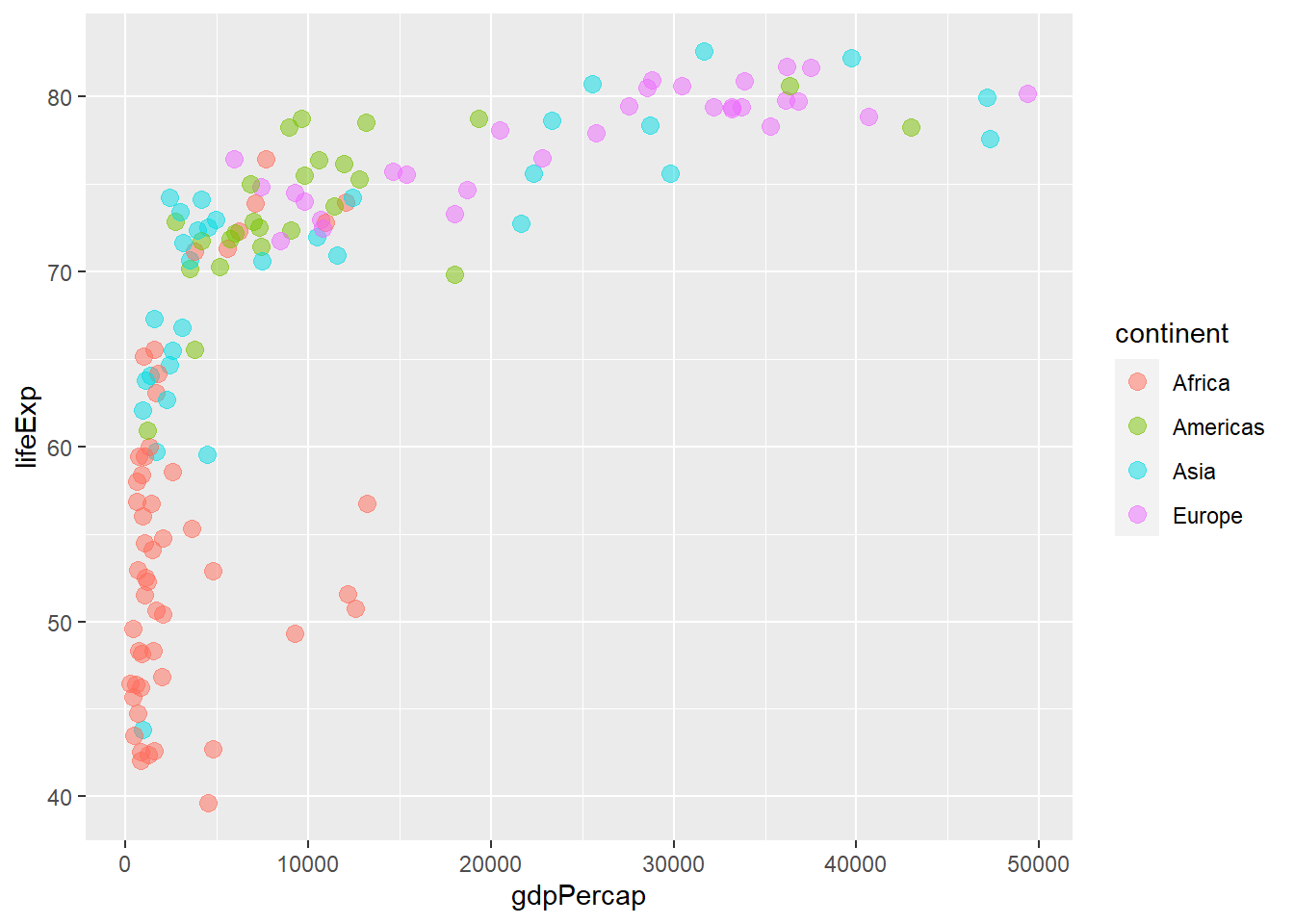
# Changing the range of hues used
ggplot(gapminder_2007) +
  geom_point(aes(y = lifeExp, x = gdpPercap, colour = continent), size = 3,
             shape = 19, alpha = 0.5) +
  scale_colour_hue(h = c(0, 90))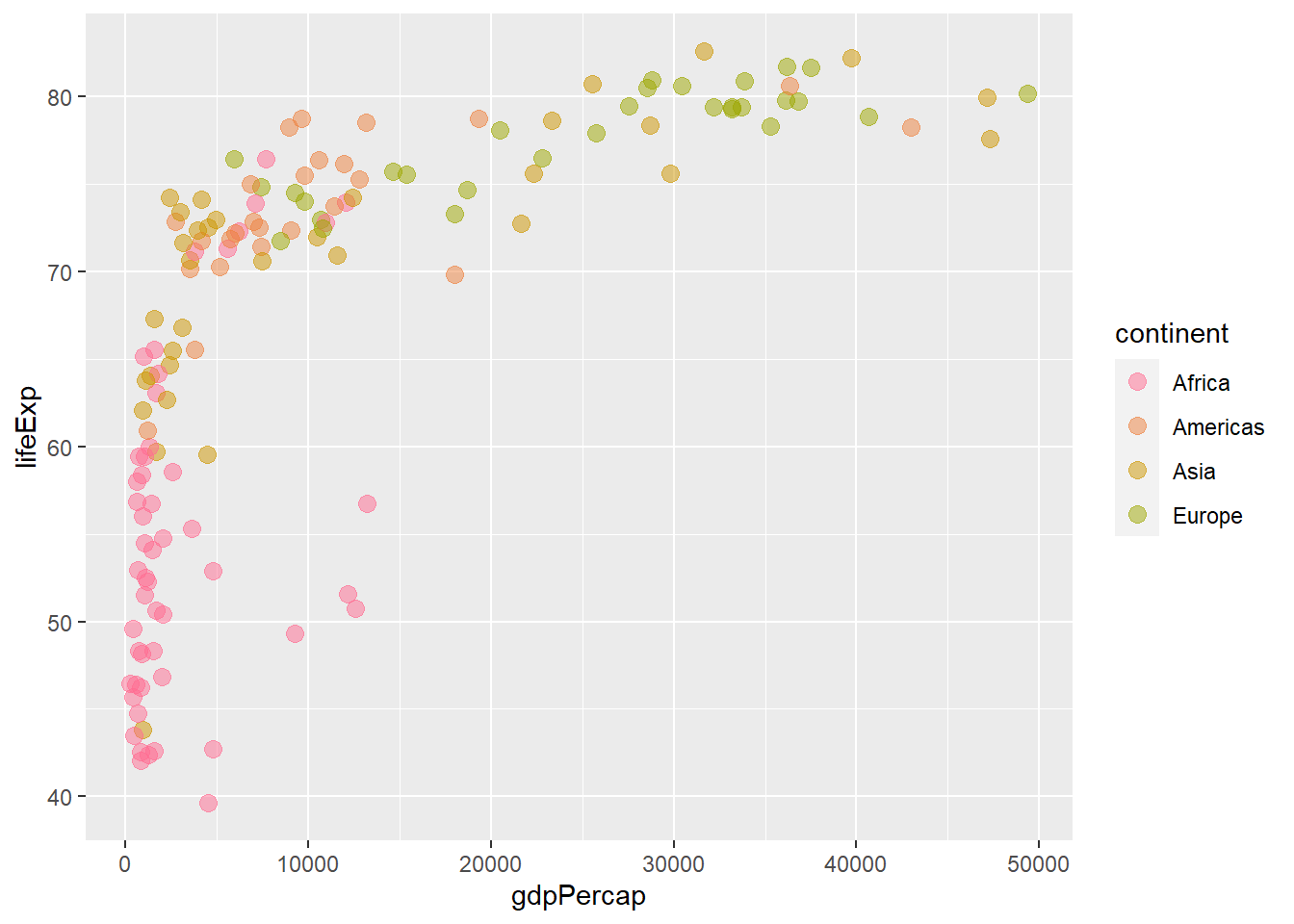
6.6.7 Grey colours
The function scale_colour_grey() defines grey colours for discrete variables.
ggplot(gapminder_2007) +
  geom_point(aes(y = lifeExp, x = gdpPercap, colour = continent), size = 3,
             shape = 19, alpha = 0.5) +
  scale_colour_grey()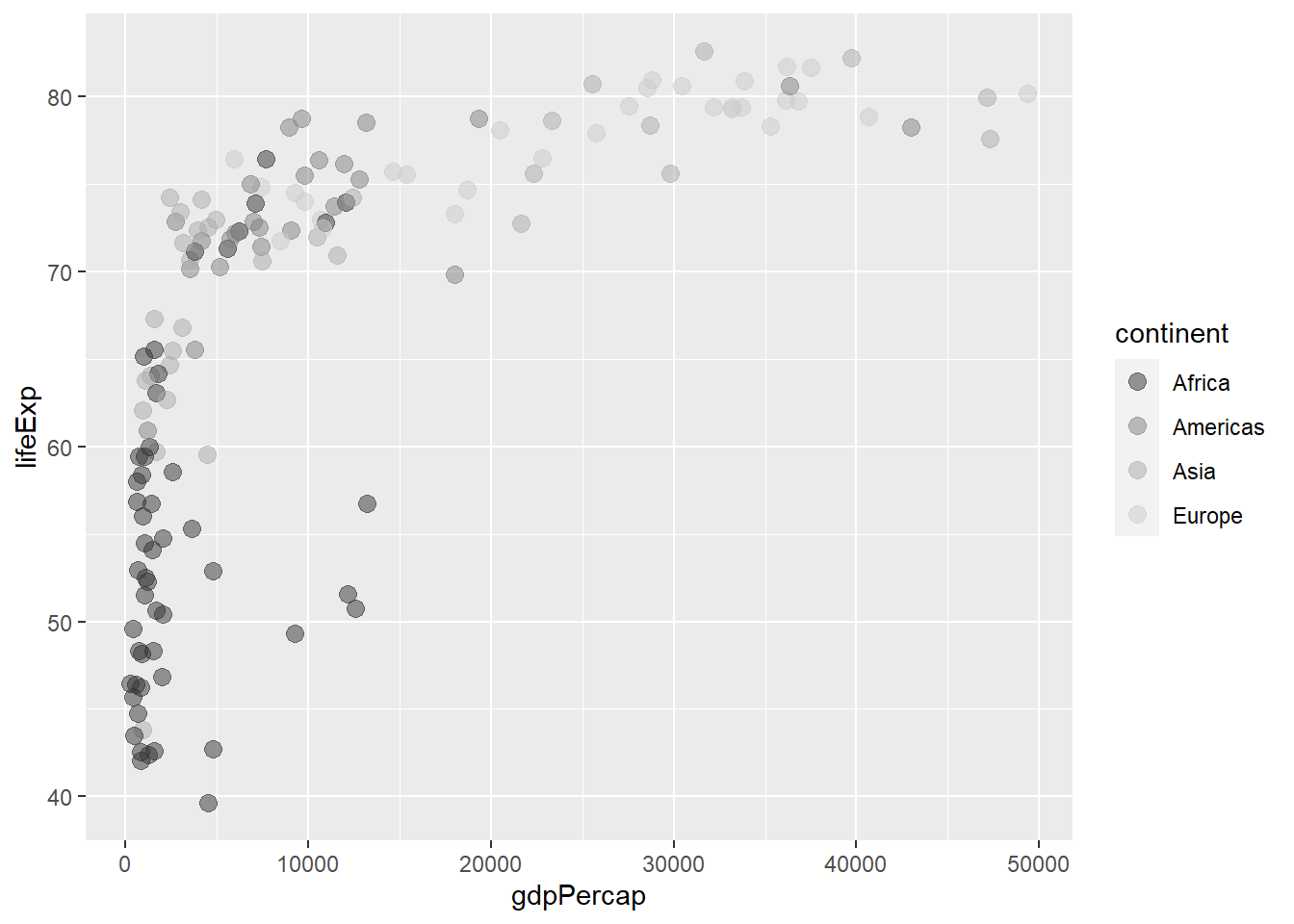
6.6.8 Manually specifying colours
The functions scale_colour_manual() and scale_fill_manual() specify colour and fill, respectively.
ggplot(gapminder_2007) +
  geom_point(aes(y = lifeExp, x = gdpPercap, colour = continent), size = 3,
             shape = 19, alpha = 0.5) +
  scale_colour_manual(values = c('lightblue', 'lightgreen', 'purple', 'orange', 'pink'))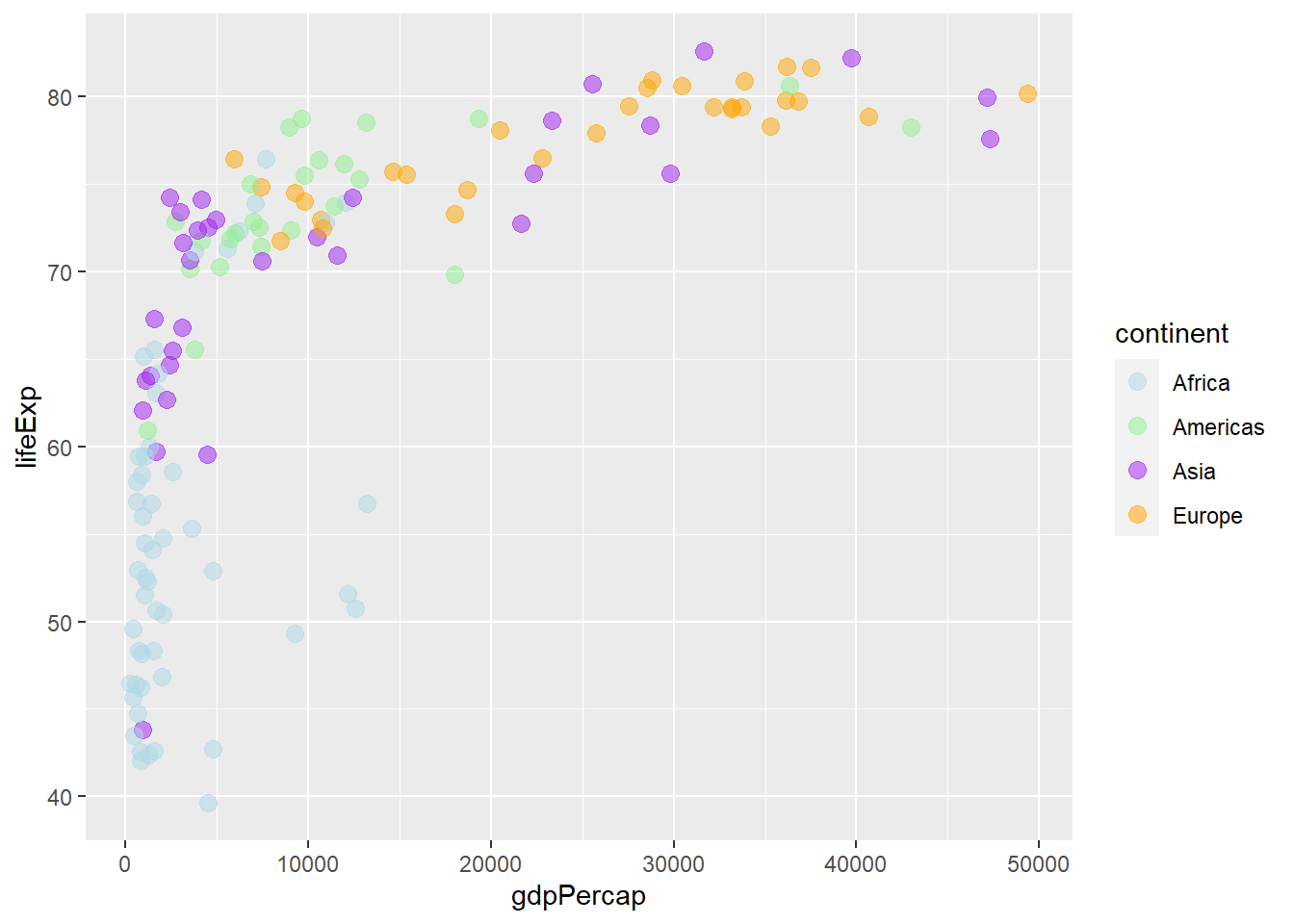
6.6.9 Mapping colours by continuous variables
As with sizes, colours are mapped by assigning a continuous variable to them and placing them within aes().
# colour by pop
ggplot(gapminder_2007) +
  geom_point(aes(y = lifeExp, x = gdpPercap, size = pop, col = pop), shape = 19) +
  scale_radius(range = c(1, 24))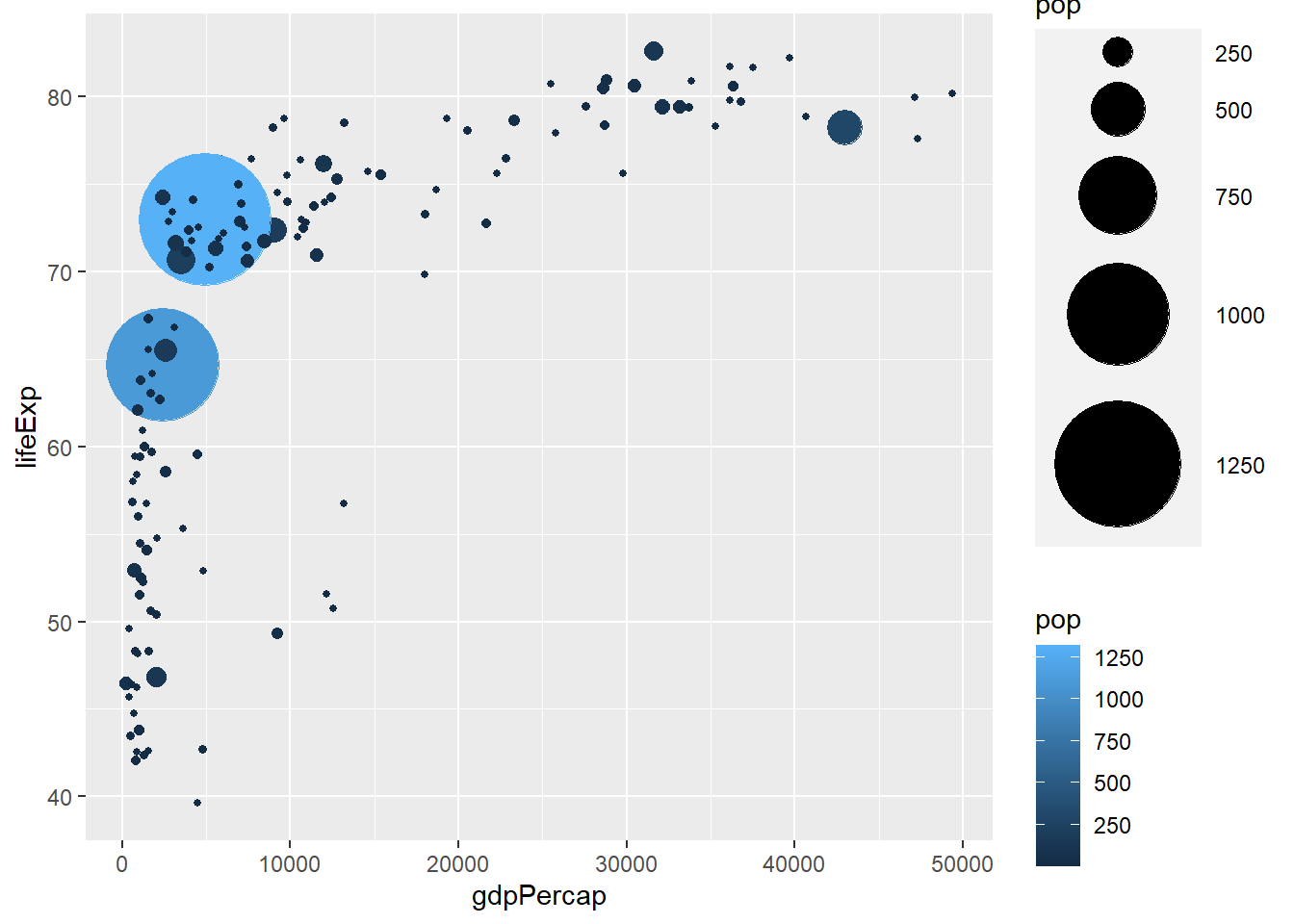
# reversing colour with desc()
ggplot(gapminder_2007) +
  geom_point(aes(y = lifeExp, x = gdpPercap, size = pop, colour = desc(pop)), shape = 19) +
  scale_radius(range = c(1, 24))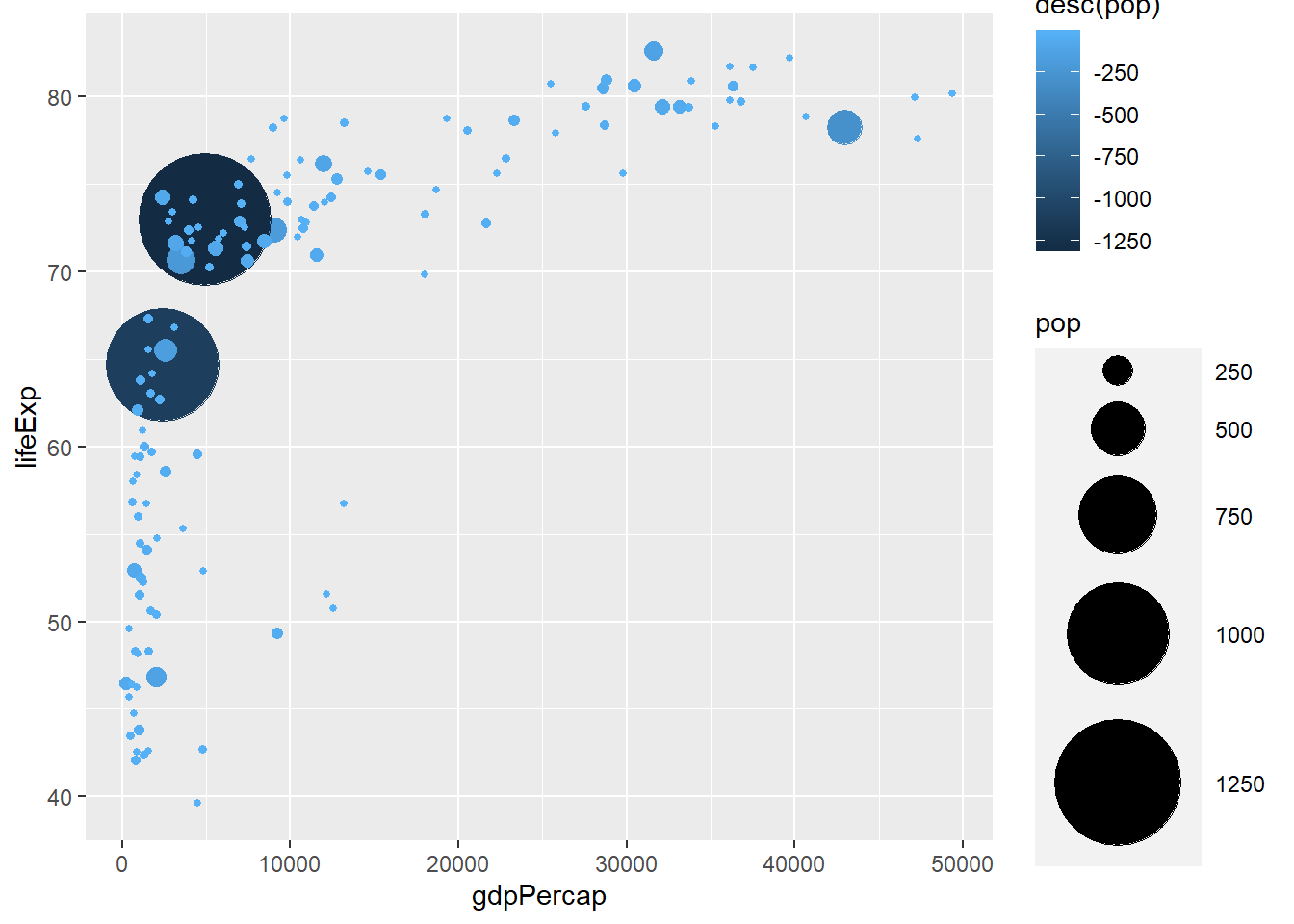
6.6.10 Manually defining colours
The functions:
scale_colour_gradient() and scale_fill_gradient() defines a two-colour gradient scale_colour_gradient2() and scale_fill_gradient2() defines a three-colour gradient (low-mid-high) scale_colour_gradientn() and scale_fill_gradientn() defines a more then three colour gradient
# two colour gradient
ggplot(gapminder_2007) +
  geom_point(aes(y = lifeExp, x = gdpPercap, size = pop, col = desc(log(pop))),
           shape = 19, alpha = 0.8) +
  scale_radius(range = c(1, 24)) +
  scale_colour_gradient(low = 'lightgreen', high = 'darkgreen')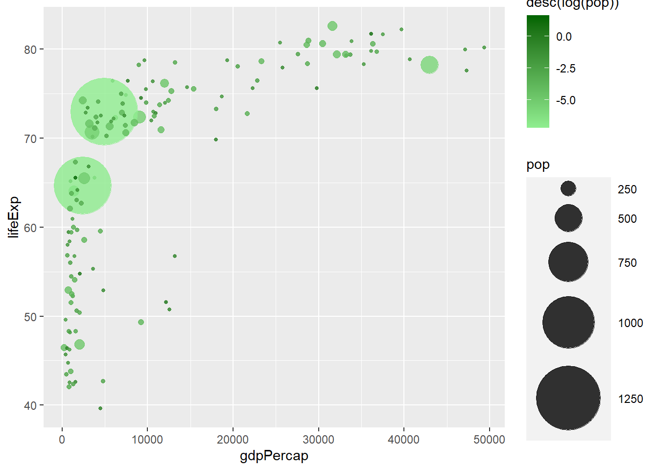
# three colour gradient
ggplot(gapminder_2007) +
  geom_point(aes(y = lifeExp, x = gdpPercap, size = pop, col = pop),
           shape = 19, alpha = 0.8) +
  scale_radius(range = c(1, 24)) +
  scale_colour_gradient2(low = 'blue', mid = 'red', high = 'green',
                         midpoint = mean(gapminder_2007$pop))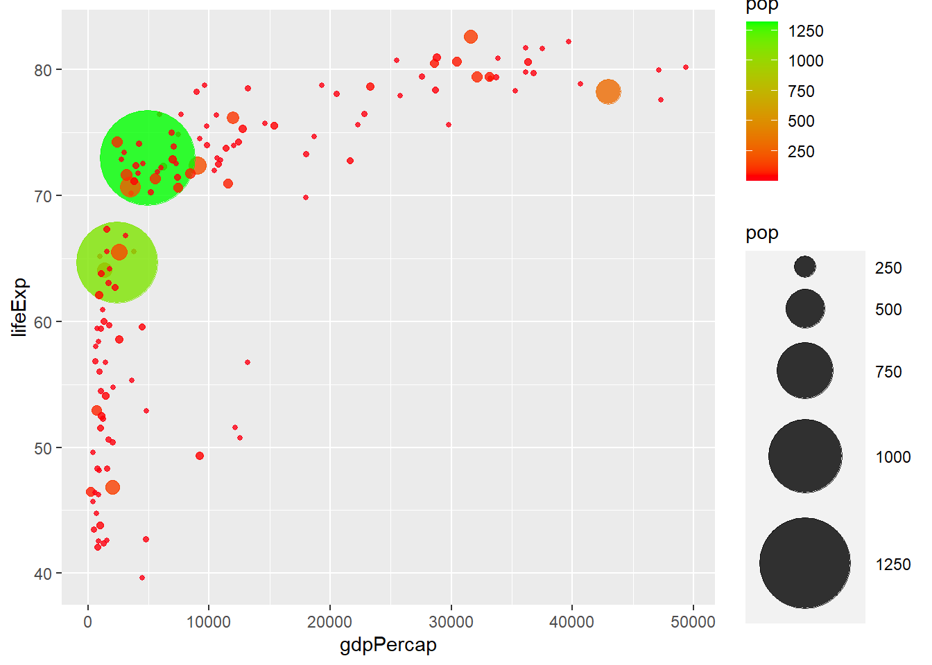
# five colour gradient
ggplot(gapminder_2007) +
  geom_point(aes(y = lifeExp, x = gdpPercap, size = pop, col = pop), shape = 19) +
  scale_radius(range = c(1, 24)) +
  scale_colour_gradientn(colors = c('lightblue', 'lightgreen', 'purple', 'orange', 'pink'))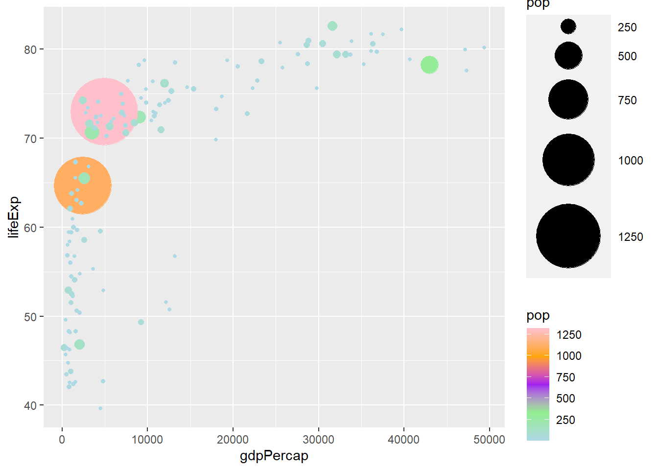
6.7 Colour palettes
6.7.1 rcolorbrewer
RcolorBrewer is R’s implementation of ColorBrewer. It classifies colours into three board classes:
seq (sequential): suited for data which has an order, progressing from low to high div (diverging): suited for data with two extremes, one for positive and the other for negative values qual (qualitative): suited for data which colour bears no meaning. (nominal and categorical data)
library(RColorBrewer)
# displays all the various palettes in RcolorBrewer
display.brewer.all()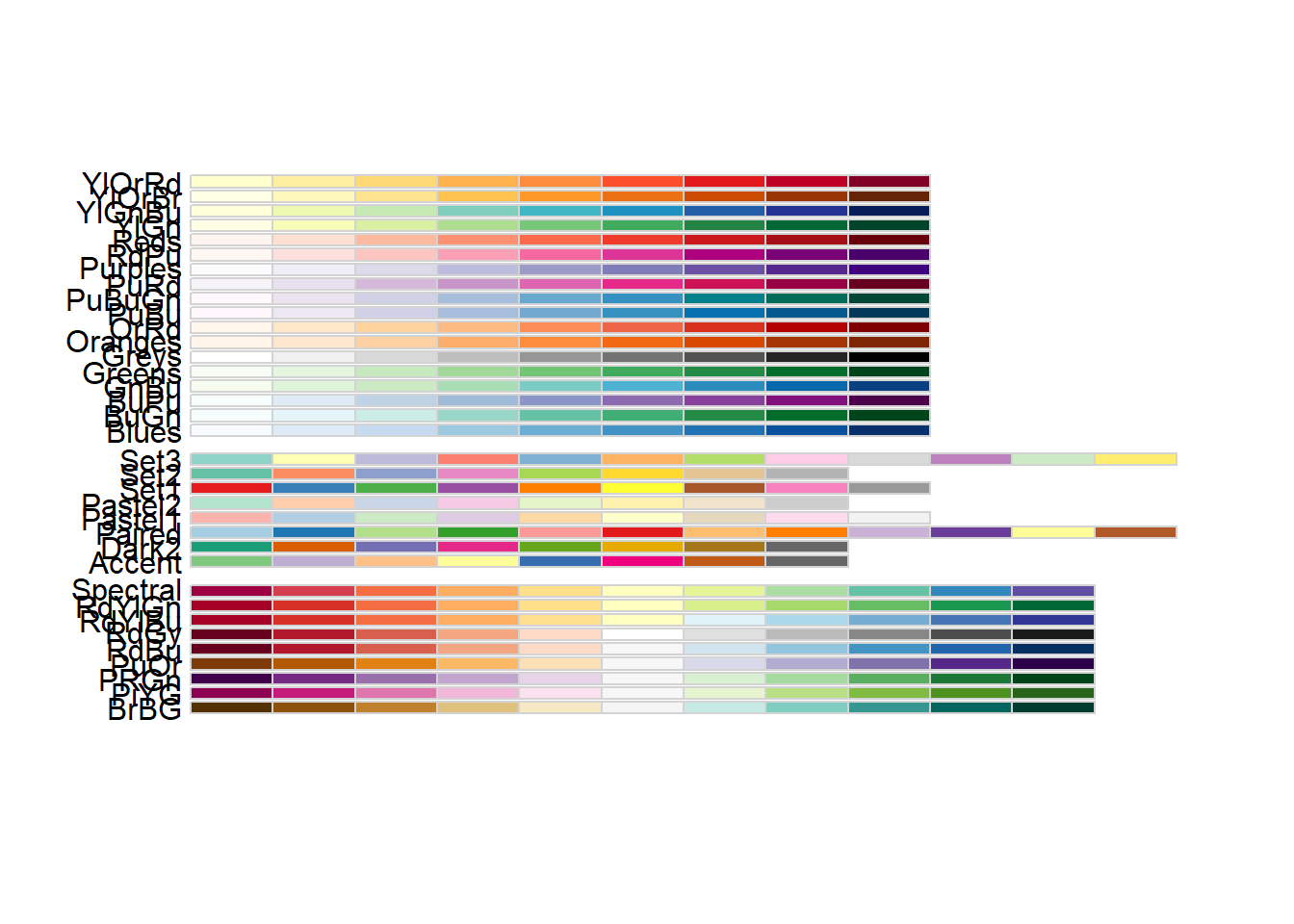
# display sequential colours
display.brewer.all(type = "seq")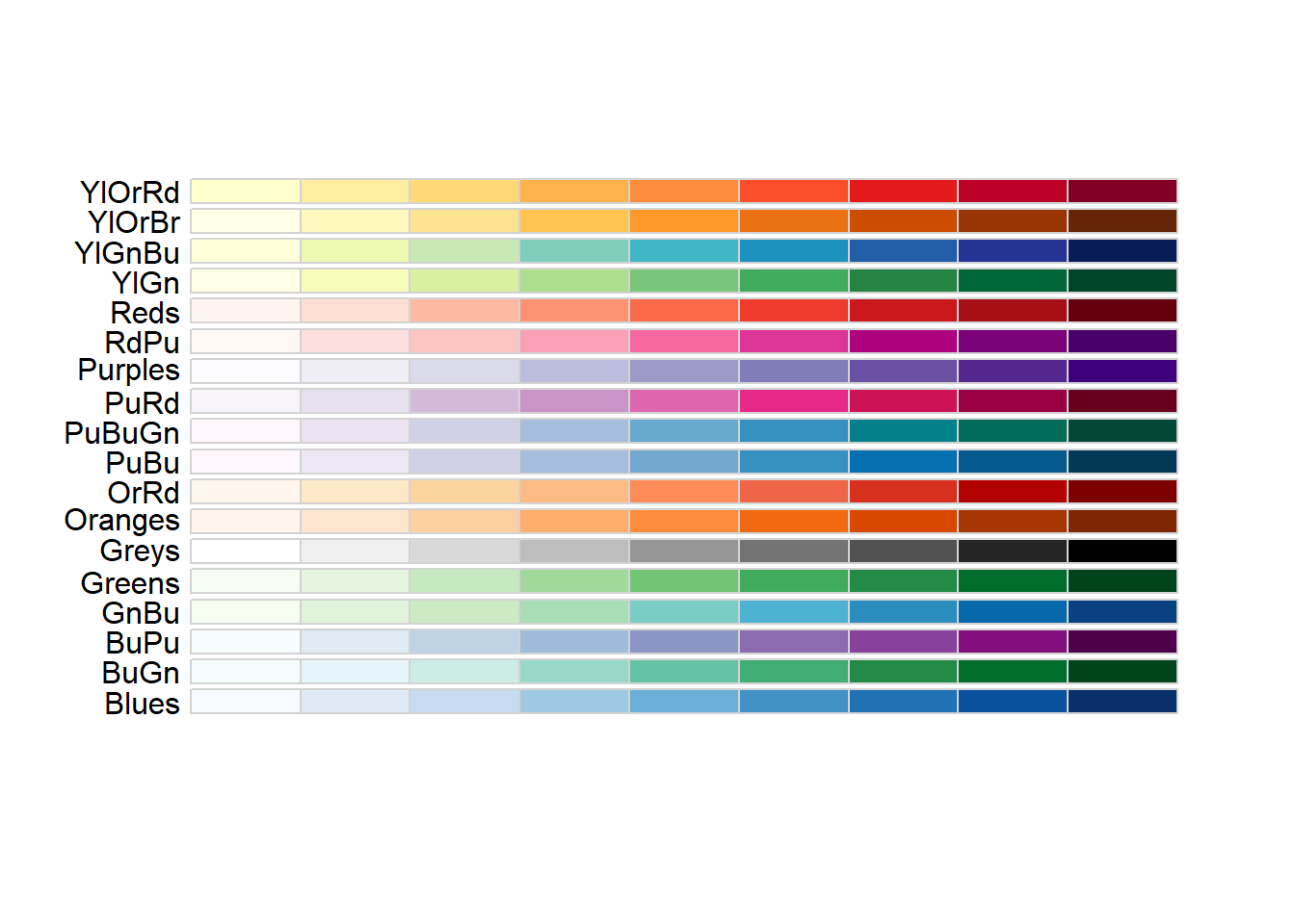
# display diverging colours
display.brewer.all(type = "div")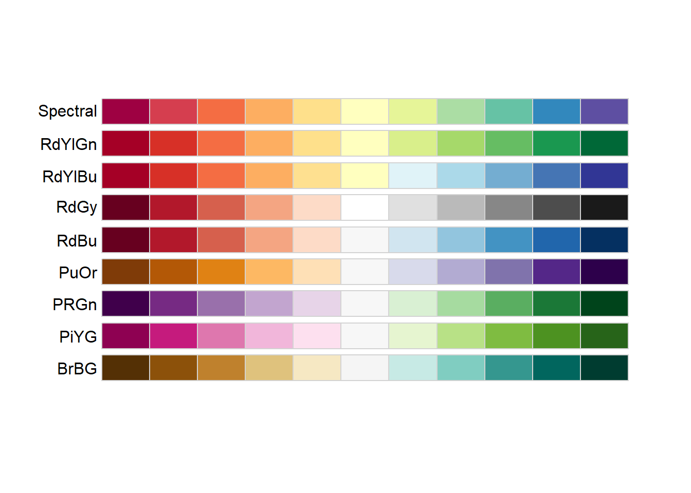
# display qualitative colours
display.brewer.all(type = "qual")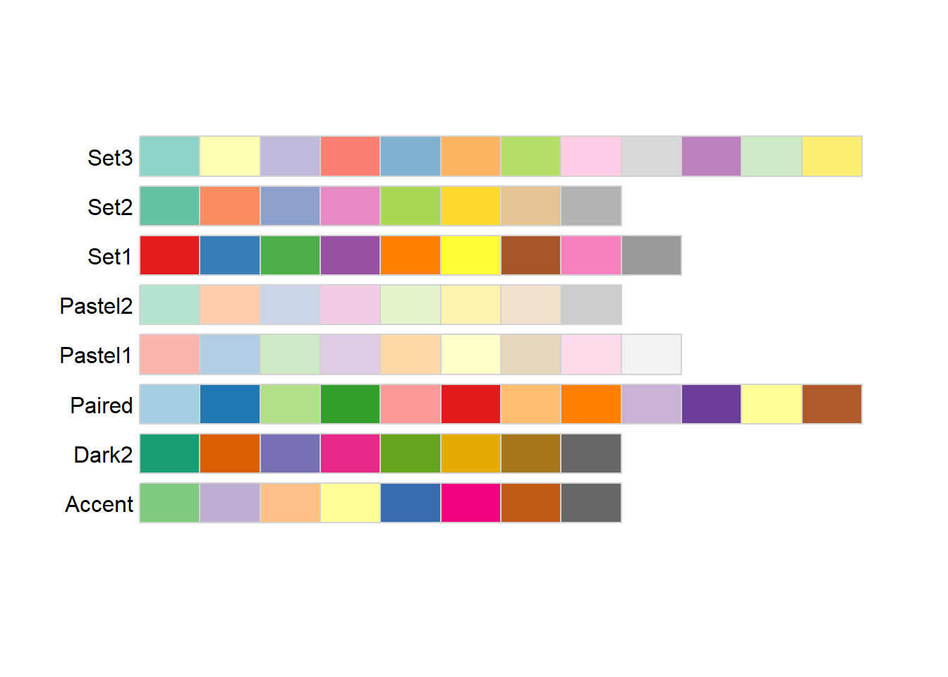
# displaying a particular colour palette
display.brewer.pal(n = 8, name = 'Dark2')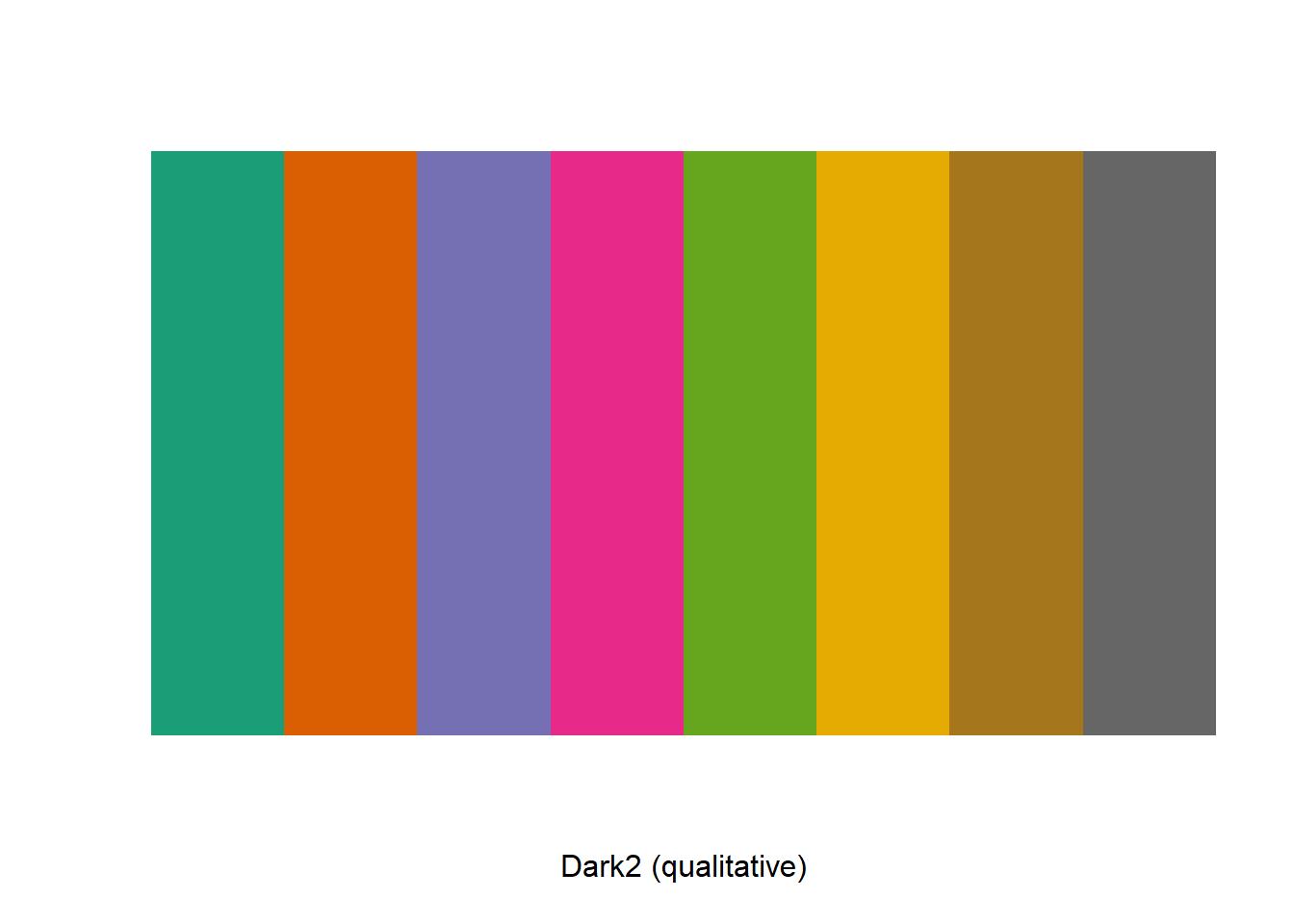
The functions scale_colour_brewer() and scale_fill_brewer() defines colour scale for discrete variables.
# discrete variable
ggplot(gapminder_2007) +
  geom_point(aes(y = lifeExp, x = gdpPercap, colour = continent), size = 3, shape = 19,
             alpha = 0.5) +
  scale_colour_brewer(palette = "Dark2")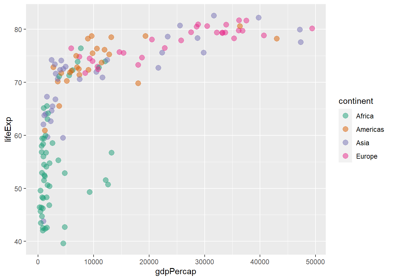
The argument direction reverses the order of the colours.
# reversing colours with direction
ggplot(gapminder_2007) +
  geom_point(aes(y = lifeExp, x = gdpPercap, colour = continent), size = 3, shape = 19,
             alpha = 0.5) +
  scale_colour_brewer(palette = "Dark2", direction = -1)
The type of palette is specified by the argument type.
# specifying palette class
ggplot(gapminder_2007) +
  geom_point(aes(y = lifeExp, x = gdpPercap, colour = continent), size = 3, shape = 19,
             alpha = 0.5) +
  scale_colour_brewer(type = 'qual', palette = 1)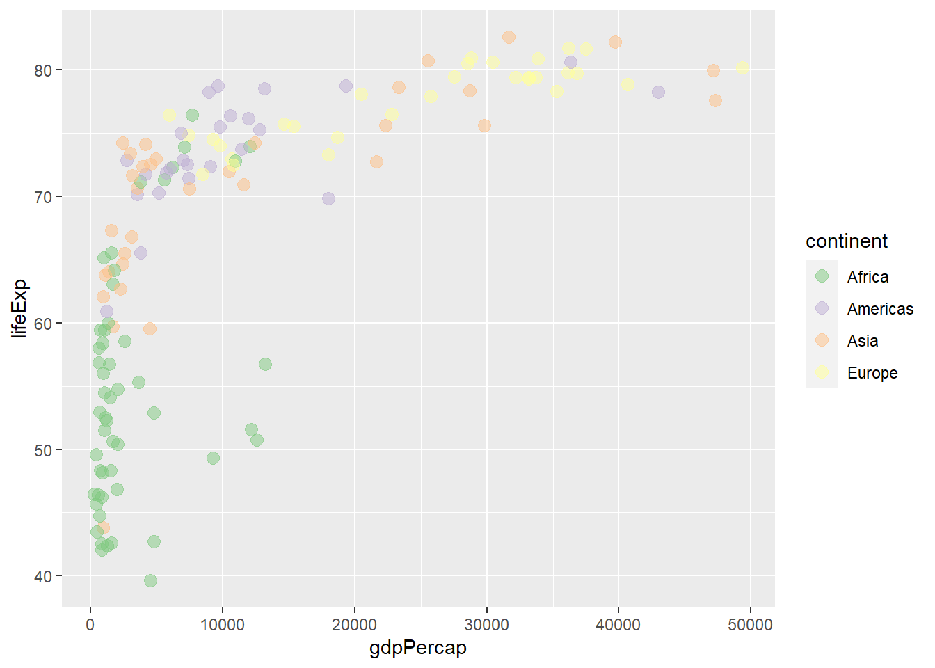
# specifying palette class
ggplot(gapminder_2007) +
  geom_point(aes(y = lifeExp, x = gdpPercap, colour = continent), size = 3, shape = 19,
             alpha = 0.5) +
  scale_colour_brewer(type = 'seq', palette = 3)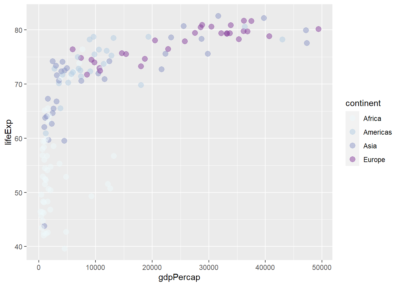
The functions scale_colour_distiller() and scale_fill_distiller() defines colour scale for continuous variables.
# continuous variable
ggplot(gapminder_2007) +
  geom_point(aes(y = lifeExp, x = gdpPercap, size = pop, col = log(pop)), shape = 19) +
  scale_radius(range = c(1, 24)) +
  scale_colour_distiller(palette = 'Blues')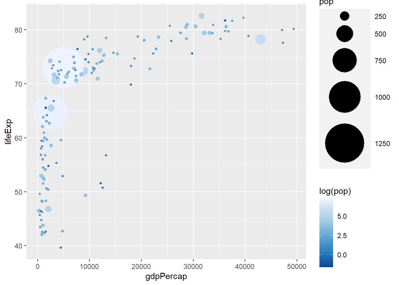
# continuous variable
ggplot(gapminder_2007) +
  geom_point(aes(y = lifeExp, x = gdpPercap, size = pop, col = log(pop)), shape = 19) +
  scale_radius(range = c(1, 24)) +
  scale_colour_distiller(palette = 1, direction = 1)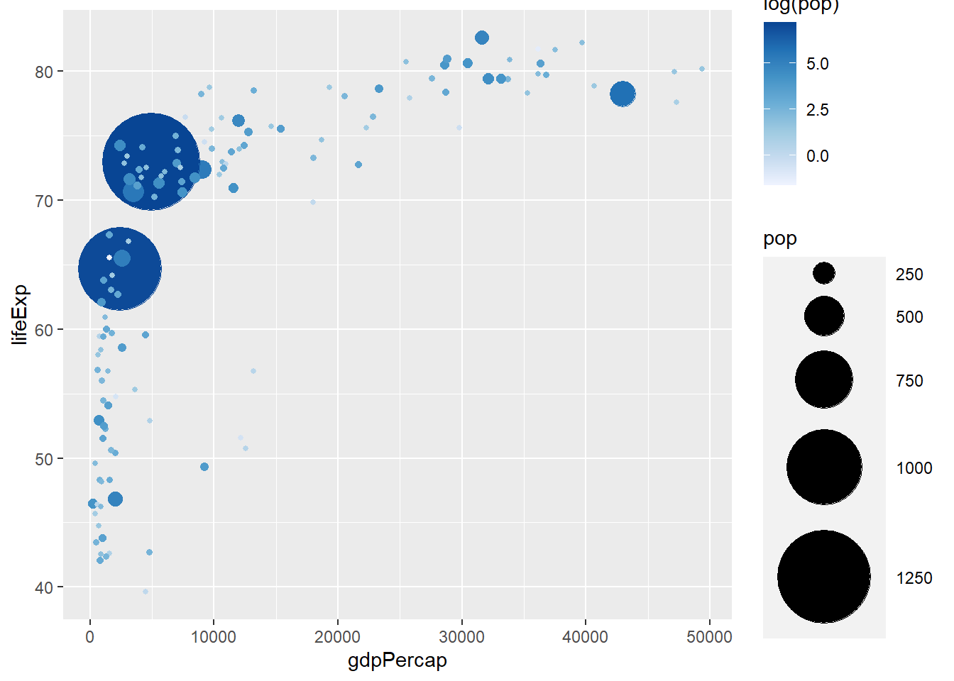
6.7.2 The viridis color palettes
The viridis package brings to R colour scales created by Stéfan van der Walt and Nathaniel Smith for the Python data visualization package matplotlib. viridis comes with the following colour palettes:
- Viridis (default)
- magma
- plasma
- inferno
The functions scale_colour_viridis() and scale_fill_viridis() defines colour scale for both discrete and continuous variables, with discrete = TRUE indicating discrete while discrete = FALSE indicating continuous. To be more specific, use scale_colour_viridis_d() for discrete andscale_colour_viridis_c() for continuous.
library(viridis)
# discrete variable
ggplot(gapminder_2007) +
  geom_point(aes(y = lifeExp, x = gdpPercap, colour = continent), size = 3,
           shape = 19, alpha = 0.8) +
  scale_colour_viridis(discrete = TRUE)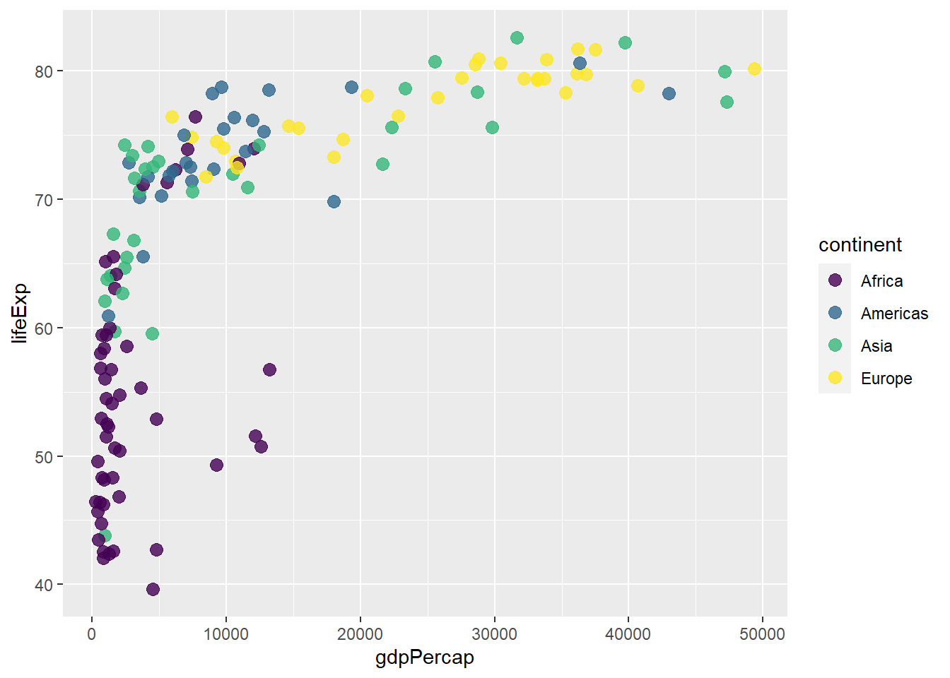
# discrete variable
ggplot(gapminder_2007) +
  geom_point(aes(y = lifeExp, x = gdpPercap, colour = continent), size = 3,
             shape = 19, alpha = 0.8) +
  scale_colour_viridis_d(option = 'plasma')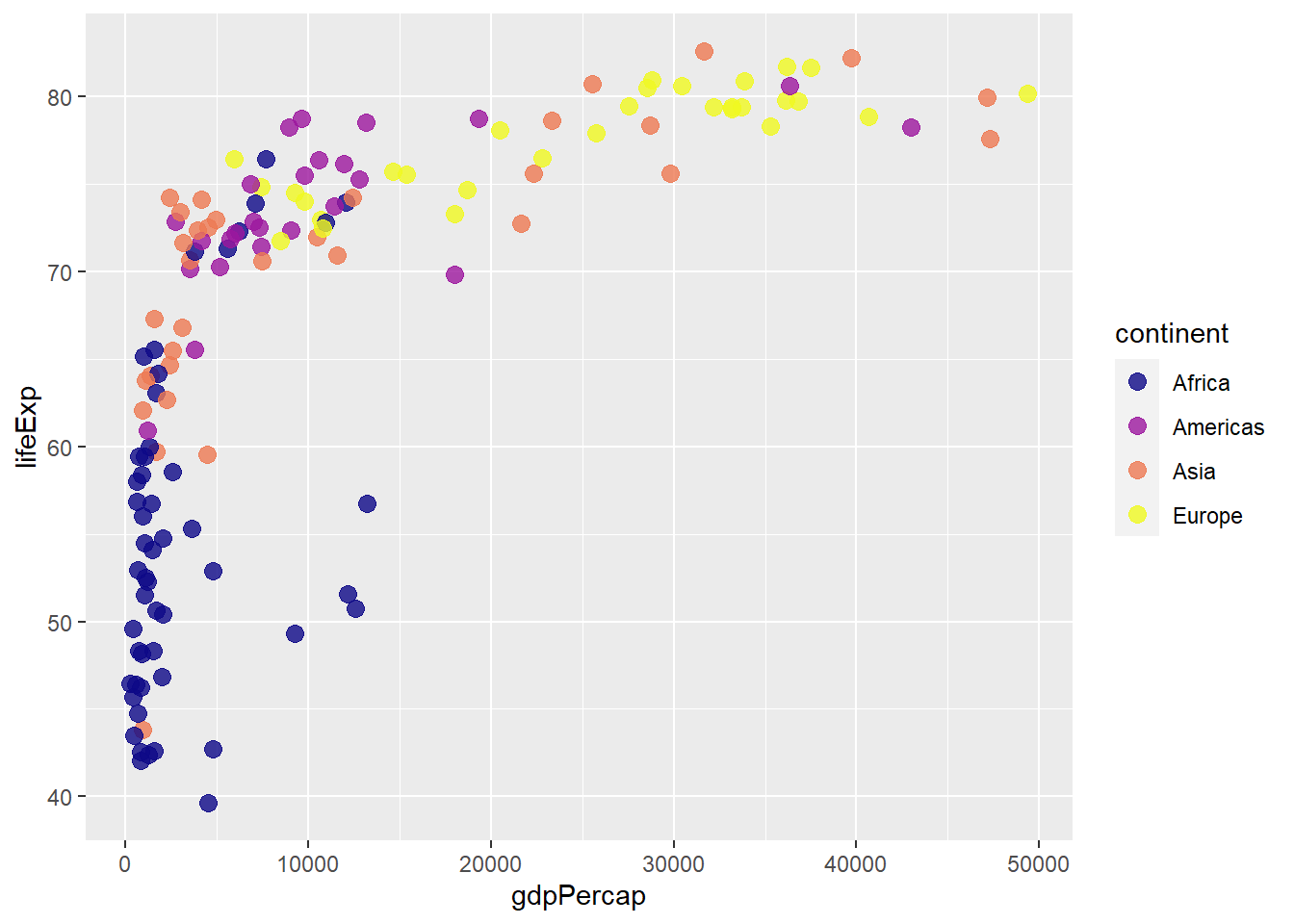
# continuous variable
ggplot(gapminder_2007) +
  geom_point(aes(y = lifeExp, x = gdpPercap, size = pop, col = log(pop)), shape = 19) +
  scale_radius(range = c(1, 24)) +
  scale_colour_viridis()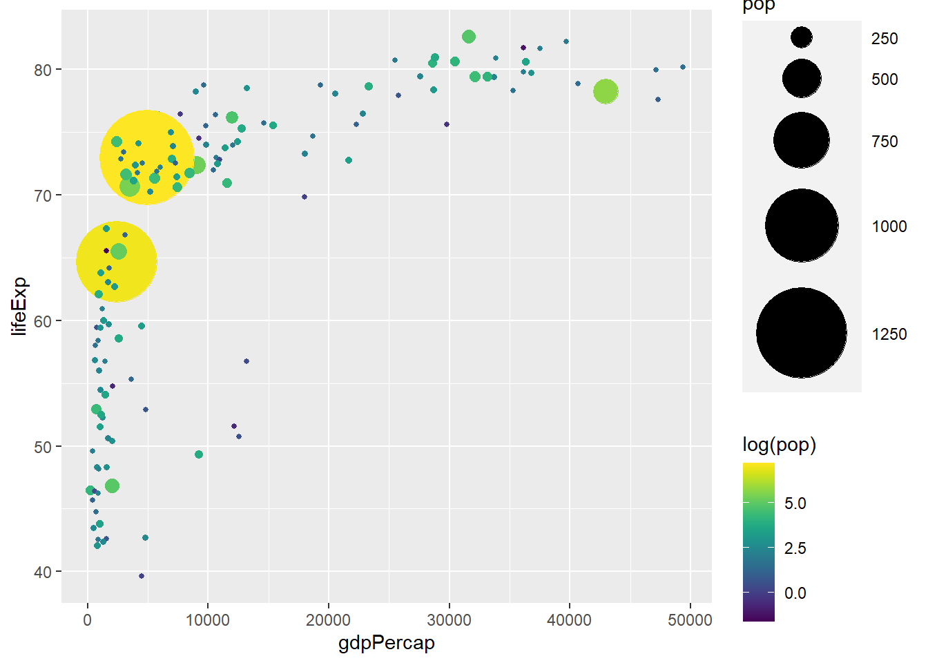
# continuous variable
ggplot(gapminder_2007) +
  geom_point(aes(y = lifeExp, x = gdpPercap, size = pop, col = log(pop)), shape = 19) +
  scale_radius(range = c(1, 24)) +
  scale_colour_viridis_c(option = 'inferno', direction = -1, alpha = 0.5)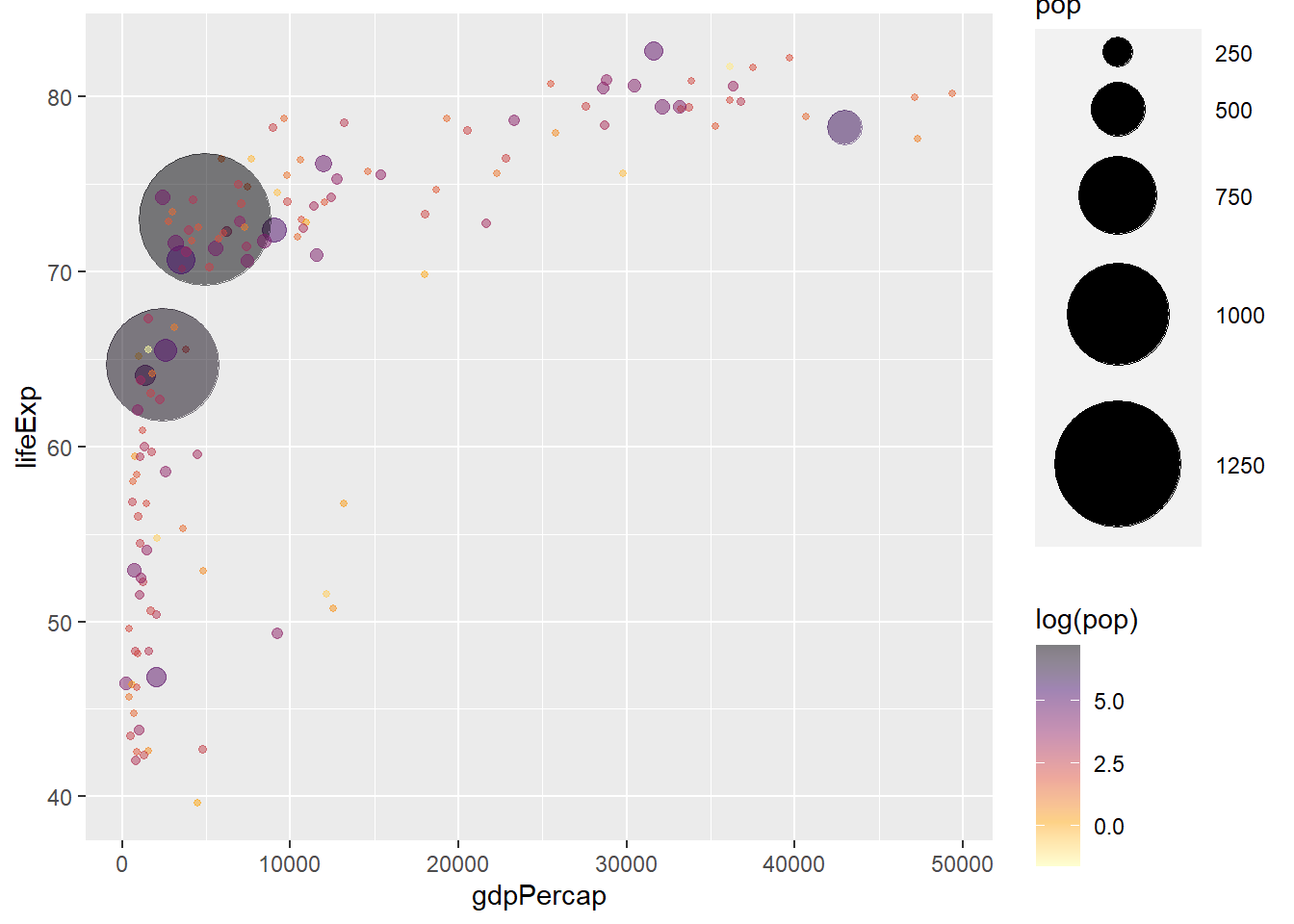
6.8 Text
The function geom_text() adds text to a plot.
ggplot(data = gapminder_2007, aes(y = lifeExp, x = gdpPercap)) +
  geom_point(alpha = 0.5, stroke = 1, aes(size = pop, colour = continent)) +
  scale_size_area(max_size = 12) +
  geom_text(aes(label = country), size = 2, alpha = 0.5)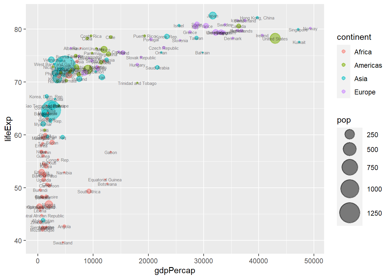
6.9 Fitting a regression line to a plot
The function geom_smooth() adds a regression line to a plot. We use the arguments:
method = lm for linear, method = loess for loess and se = FALSE to remove the confidence intervals.
# adding a linear line
ggplot(data = gapminder_2007, aes(y = lifeExp, x = gdpPercap)) +
  geom_point(colour = 'red', size = 3, shape = 19, alpha = 0.5, stroke = 1) +
  geom_smooth(method = lm)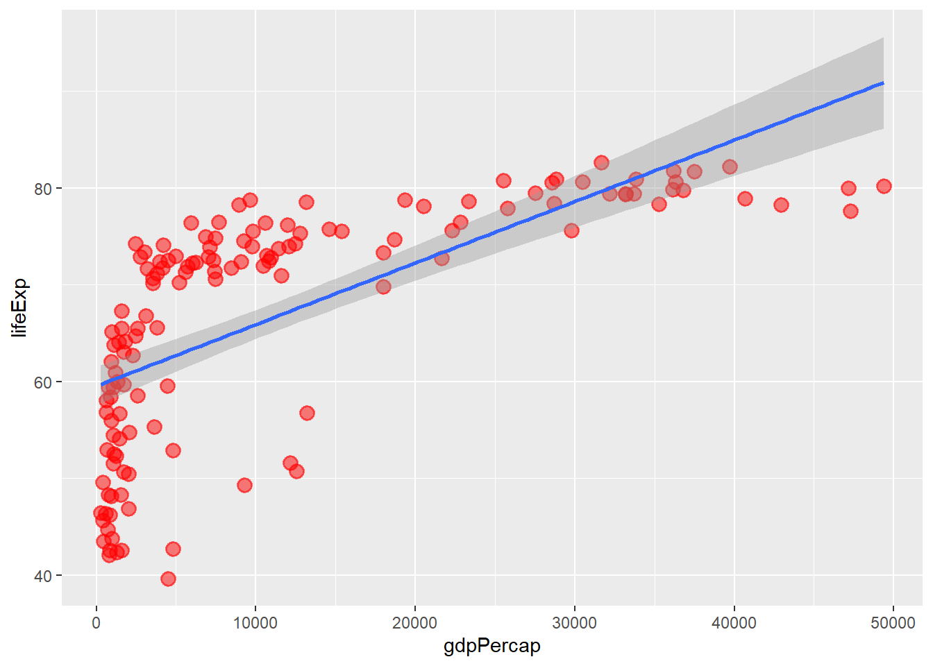
# changing to loess
ggplot(data = gapminder_2007, aes(y = lifeExp, x = gdpPercap)) +
  geom_point(colour = 'red', size = 3, shape = 19, alpha = 0.5, stroke = 1) +
  geom_smooth(method = loess)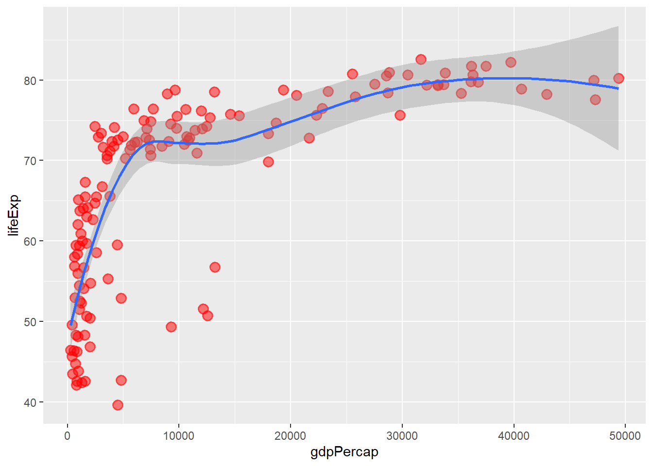
# removing the confidence intervals
ggplot(data = gapminder_2007, aes(y = lifeExp, x = gdpPercap)) +
  geom_point(colour = 'red', size = 3, shape = 19, alpha = 0.5, stroke = 1) +
  geom_smooth(method = loess, se = FALSE)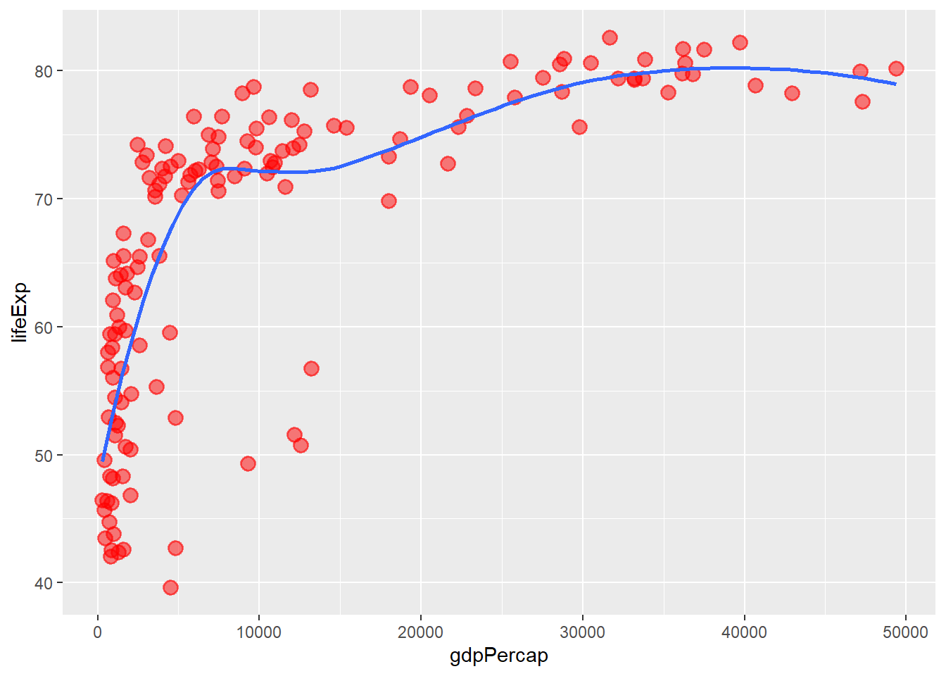
6.10 Adding some rug
The function geom_rug() adds rug to a plot.
ggplot(data = gapminder_2007, aes(y = lifeExp, x = gdpPercap)) +
  geom_point(colour = 'red', size = 3, shape = 19, alpha = 0.5, stroke = 1) +
  geom_smooth(method = loess, se = FALSE) +
  geom_rug()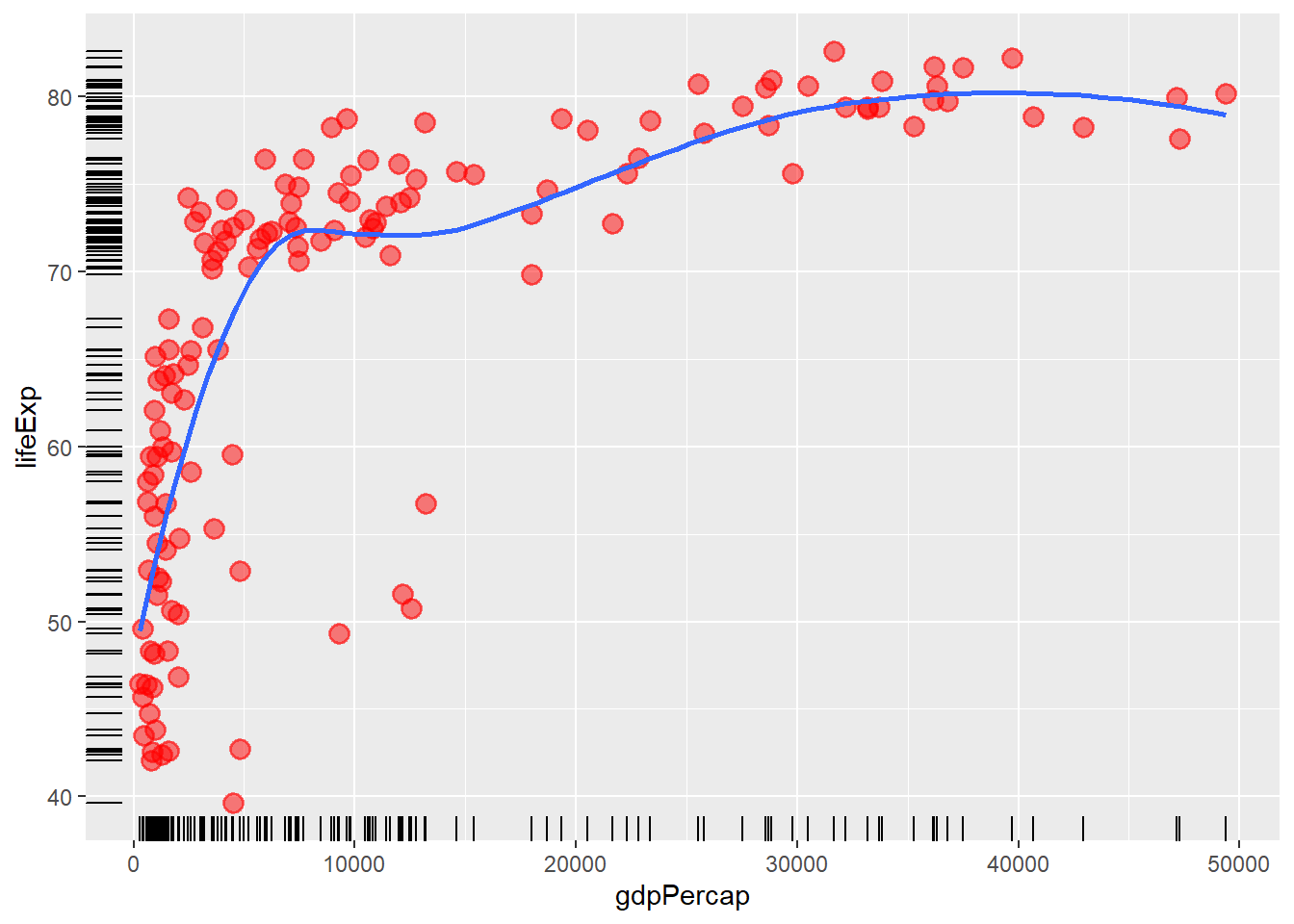
6.11 Position adjustment
Position adjustments determine how to arrange geoms that would otherwise occupy the same space.
ggplot() +
  geom_point(data = gapminder_2007, aes(y = 0, x = gdpPercap, colour = continent),
             alpha = 0.5, size = 3)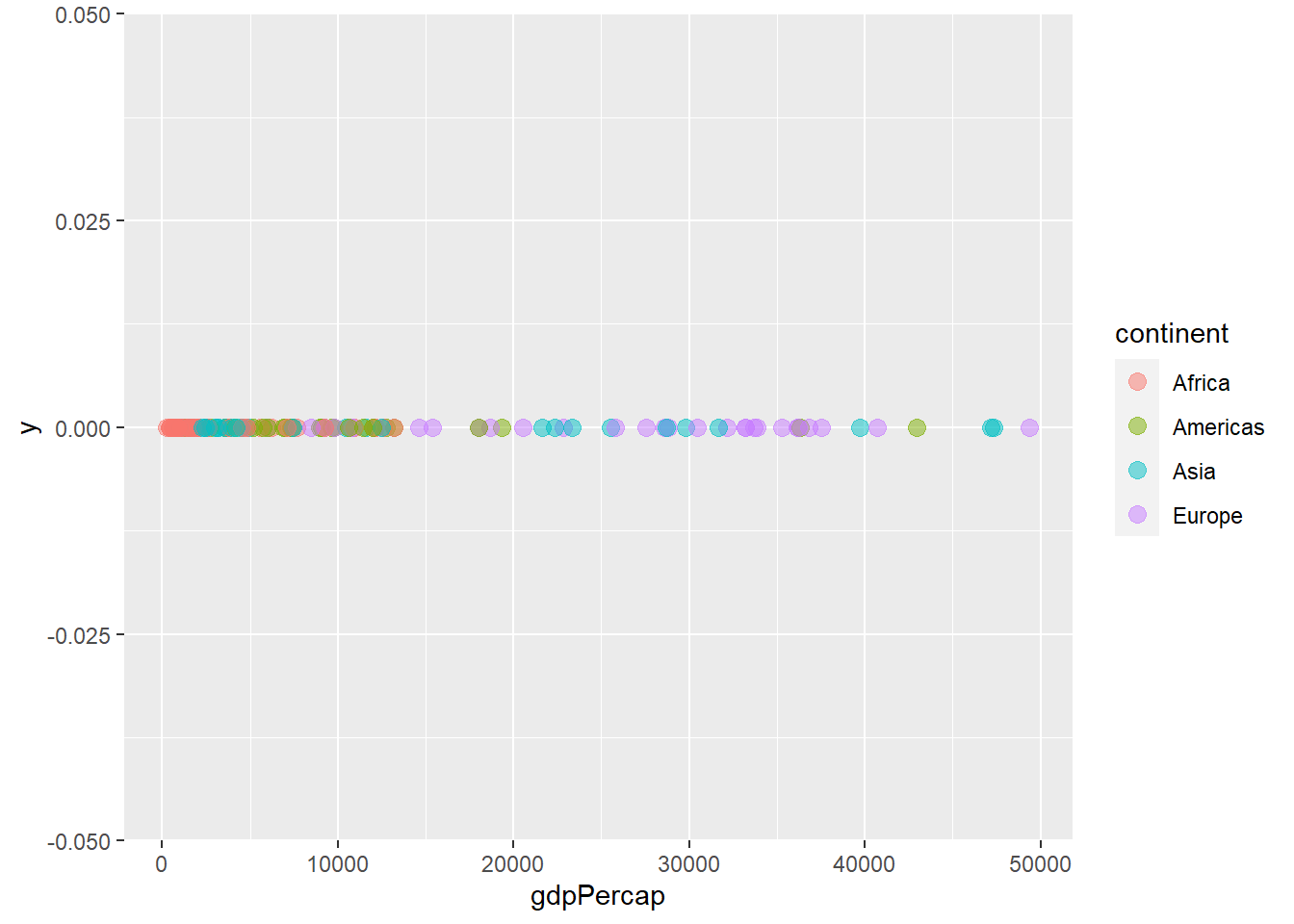
# changing the position to jitter
ggplot() +
  geom_point(data = gapminder_2007, aes(y = 0, x = gdpPercap, colour = continent),
             alpha = 0.5, size = 3, position = "jitter")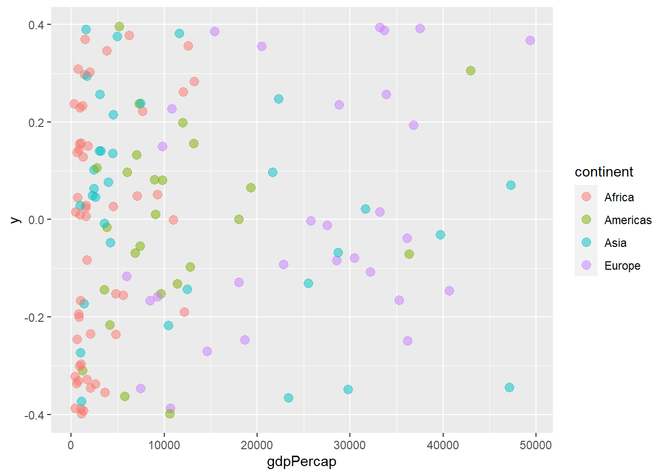
6.12 Coordinate system
The function coord_cartesian() zooms a plot. It expects ylim and/or xlim arguments.
ggplot(data = gapminder_2007, aes(y = lifeExp, x = gdpPercap)) +
  geom_point(alpha = 0.5, stroke = 1, aes(size = pop, colour = continent)) +
  scale_size_area(max_size = 12) +
  geom_text(aes(label = country), size = 2, alpha = 0.5) +
  coord_cartesian(ylim = c(60, 85), xlim = c(0, 10000))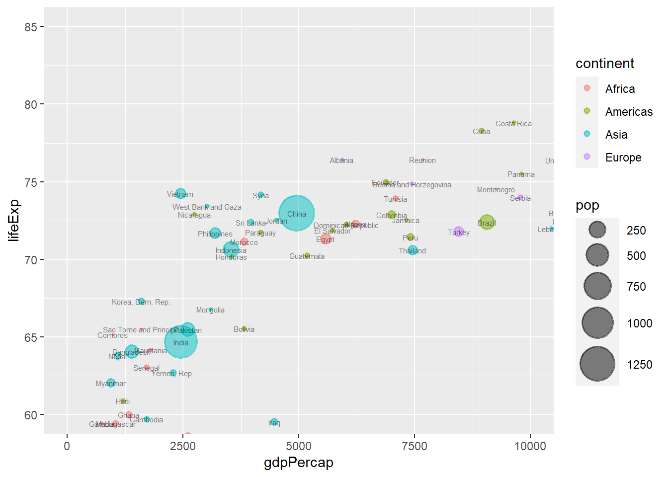
The function coord_fixed() controls the aspect ratio. It expects a ratio of y/x.
ggplot(data = gapminder_2007, aes(y = lifeExp, x = gdpPercap)) +
  geom_point(alpha = 0.5, stroke = 1, aes(size = pop, colour = continent)) +
  scale_size_area(max_size = 12) +
  coord_fixed(ratio = 500)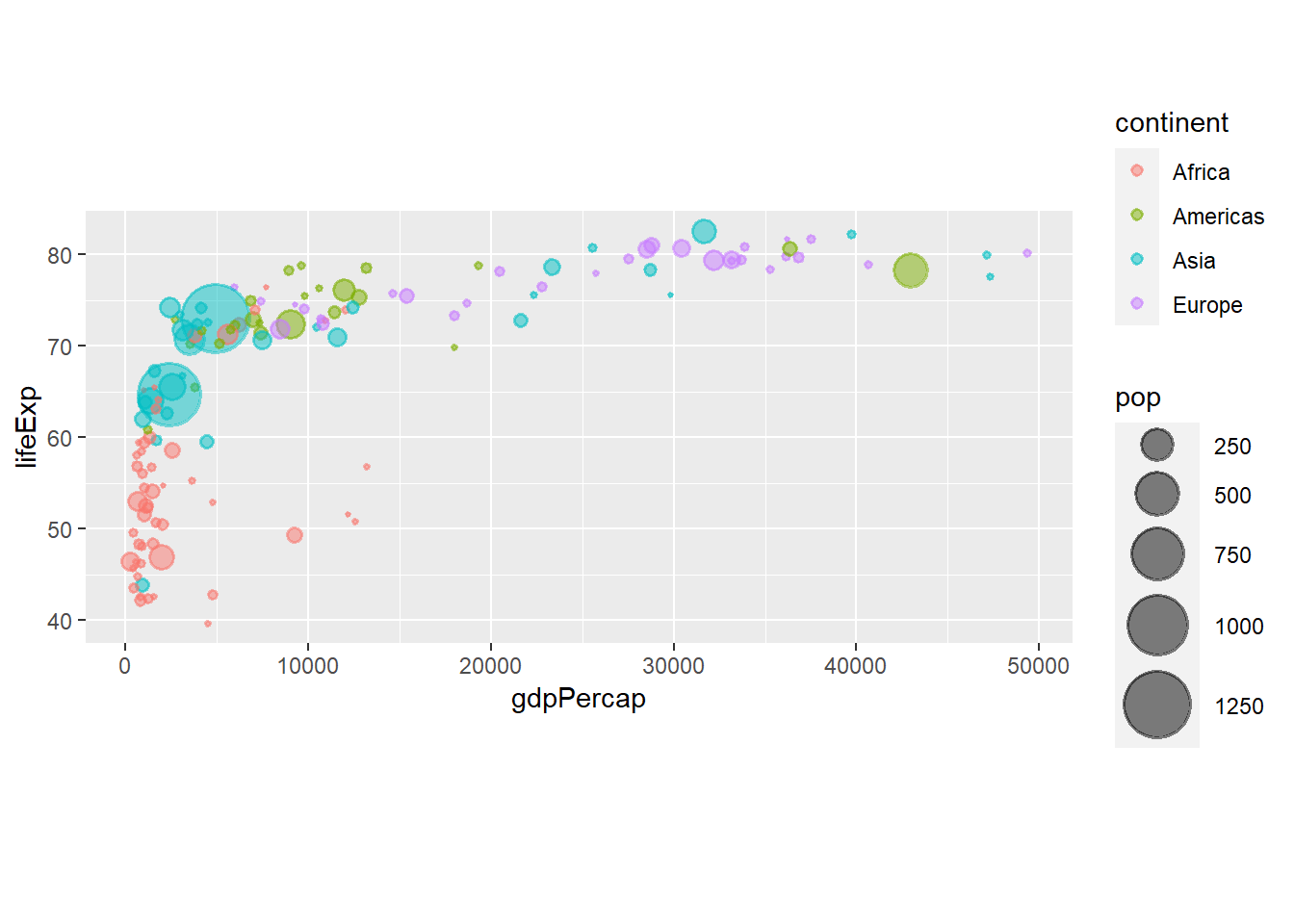
The function coord_flip() flips a plot along its diagonal.
ggplot(data = gapminder_2007, aes(y = lifeExp, x = gdpPercap)) +
  geom_point(alpha = 0.5, stroke = 1, aes(size = pop, colour = continent)) +
  scale_size_area(max_size = 12) +
  coord_flip()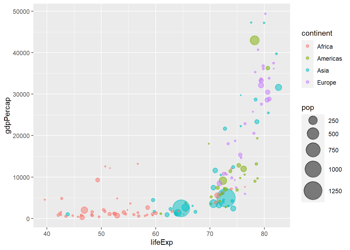
6.13 Faceting layer
The functions facet_grid() and facet_wrap() controls faceting. The former forms a matrix of panels defined by row and column faceting variables while the later wraps a 1d sequence of panels into 2d.
ggplot(data = gapminder_2007, aes(y = lifeExp, x = gdpPercap, colour = continent)) +
  geom_point(size = 3, shape = 19, alpha = 0.5, stroke = 1) +
  scale_colour_brewer(palette = "Dark2") +
  facet_grid(.~ continent)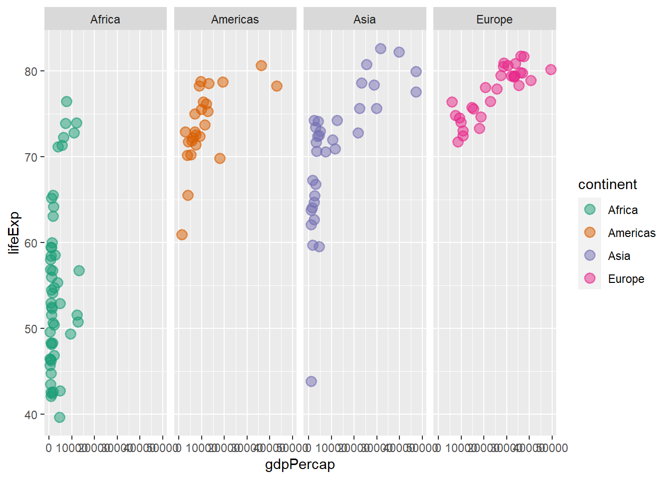
ggplot(data = gapminder_2007, aes(y = lifeExp, x = gdpPercap, colour = continent)) +
  geom_point(size = 3, shape = 19, alpha = 0.5, stroke = 1) +
  scale_colour_brewer(palette = "Dark2") +
  facet_grid(continent ~ .)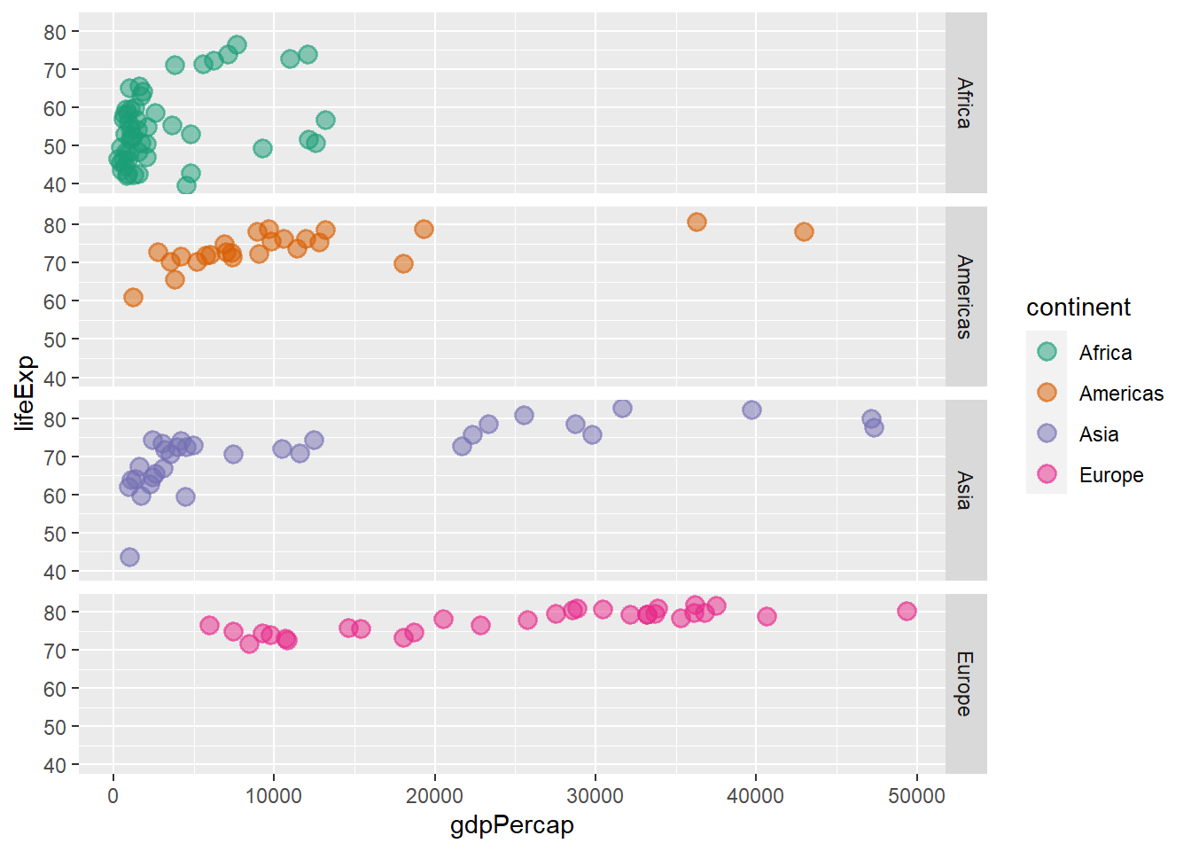
ggplot(data = gapminder_2007, aes(y = lifeExp, x = gdpPercap, colour = continent)) +
  geom_point(size = 3, shape = 19, alpha = 0.5, stroke = 1) +
  scale_colour_brewer(palette = "Dark2") +
  facet_grid(continent ~ ., )
ggplot(data = gapminder_2007, aes(y = lifeExp, x = gdpPercap, colour = continent)) +
  geom_point(size = 3, shape = 19, alpha = 0.5, stroke = 1) +
  scale_colour_brewer(palette = "Dark2") +
  facet_wrap(continent ~ ., )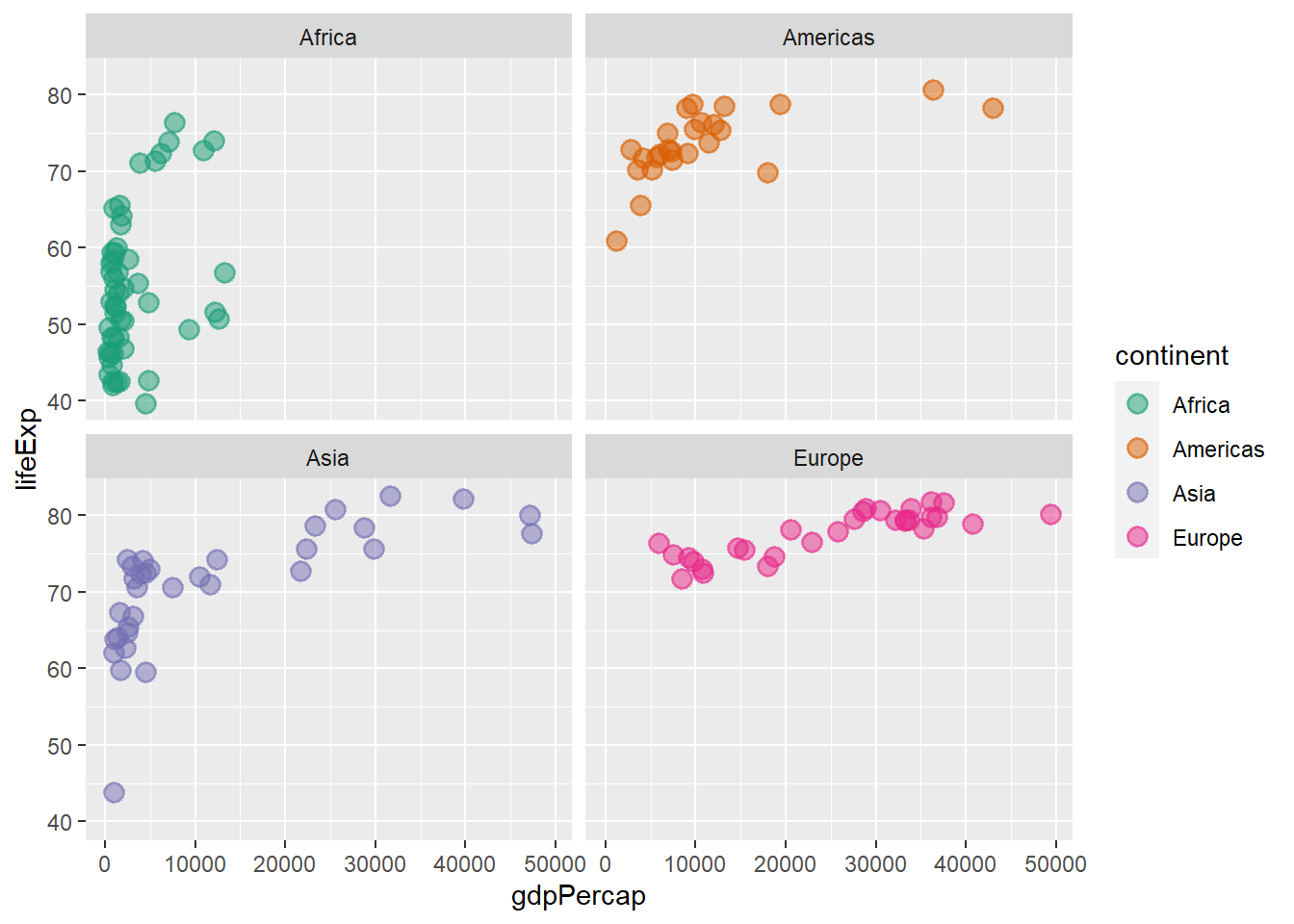
By default, all axis have the same scale, using the argument scales = ‘free’ we can render the scales for each plot independent.
# independent axis
ggplot(data = gapminder_2007, aes(y = lifeExp, x = gdpPercap, colour = continent)) +
  geom_point(size = 3, shape = 19, alpha = 0.5, stroke = 1) +
  scale_colour_brewer(palette = "Dark2") +
  facet_wrap(continent ~ ., scales = 'free')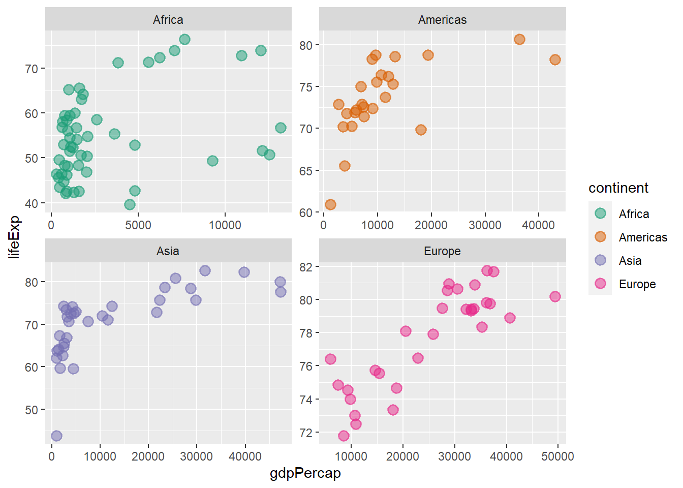
6.14 Plot elements
6.14.1 Title, captions and labels
The function labs() is used to add title and labels.
ggplot(data = gapminder_2007, aes(y = lifeExp, x = gdpPercap)) +
  geom_point(alpha = 0.5, stroke = 1, aes(size = pop, colour = continent)) +
  scale_size_area(max_size = 12) +
  labs(y = 'Life Expectancy', x = 'GDP per capita', title = 'Life Expectancy vs GDP per capita')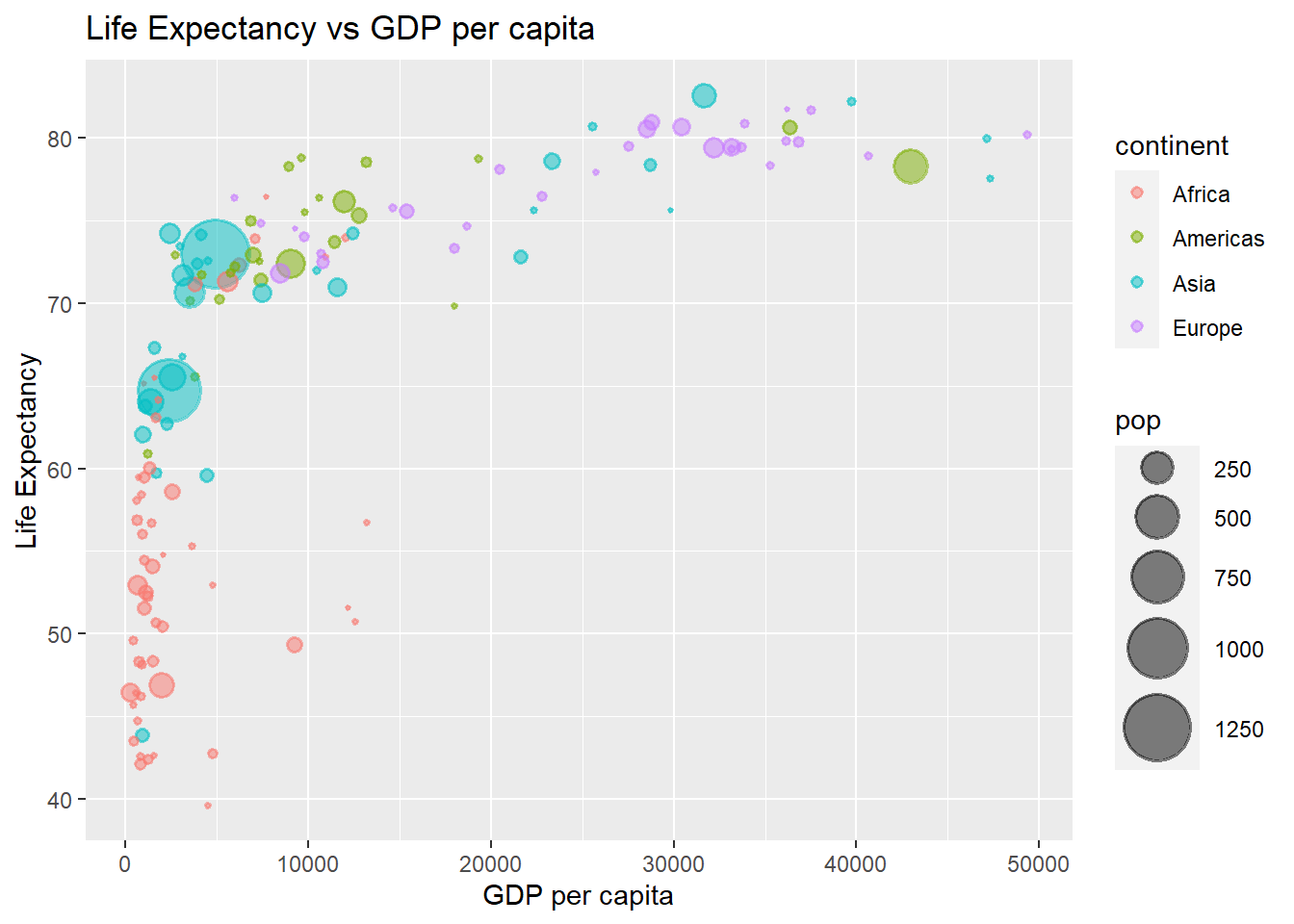
The function:
-
ggtitle()adds title to a plot -
xlab()adds x-axis label -
ylab()adds y-axis label -
labs()adds all of the above
ggplot(data = gapminder_2007, aes(y = lifeExp, x = gdpPercap)) +
  geom_point(alpha = 0.5, stroke = 1, aes(size = pop, colour = continent)) +
  scale_size_area(max_size = 12) +
  ggtitle('Life Expectancy vs GDP per capita',
          subtitle = "Below $4000, Life expectancy does not vary with GDP") +
  ylab('Life Expectancy') +
  xlab('GDP per capita')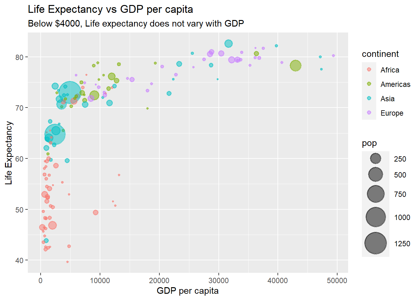
6.14.2 Legend
The function theme() is used to customize the non-data components of a plot. We shall use it to customize legends.
Legend position The argument legend.position determines the position of the legend. It accepts ‘bottom,’ ‘left,’ ‘top’ and ‘right.’
# position legend at the bottom
ggplot(data = gapminder_2007, aes(y = lifeExp, x = gdpPercap)) +
  geom_point(alpha = 0.5, stroke = 1, aes(colour = continent)) +
  theme(legend.position = "bottom")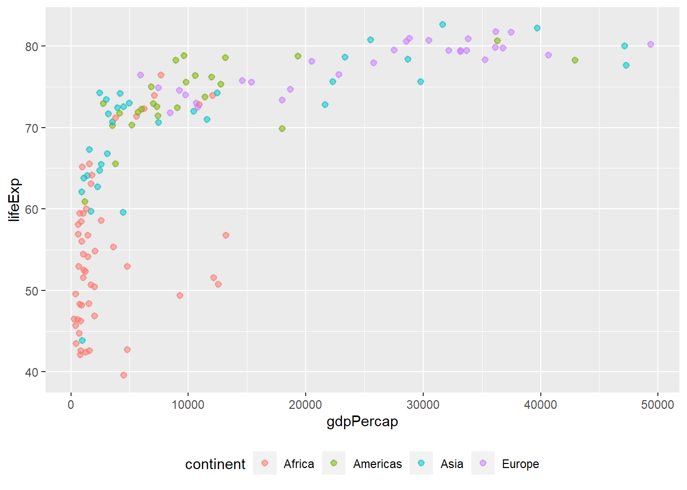
Removing legends using theme() The argument legend.position = “none” removes all the legends in a plot.
# removing legend
ggplot(data = gapminder_2007, aes(y = lifeExp, x = gdpPercap)) +
  geom_point(alpha = 0.5, stroke = 1, aes(size = pop, colour = continent)) +
  scale_size_area(max_size = 12) +
  theme(legend.position = "none")
6.14.3 Removing legends using guides()
The function guides() removes legends by a specific scale. The legend of each scale can be removed by passing either ‘none’ or FALSE to it.
# removing the size legend
ggplot(data = gapminder_2007, aes(y = lifeExp, x = gdpPercap)) +
  geom_point(alpha = 0.5, stroke = 1, aes(size = pop, colour = continent)) +
  scale_size_area(max_size = 12) +
  theme(legend.position = "top") +
  guides(size = FALSE)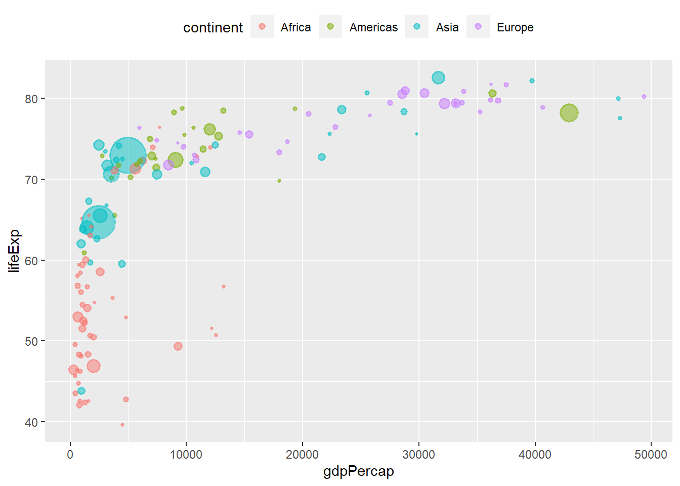
6.14.4 Removing legend using geom
The argument show.legend = F within a geom, removes the legend of that geom.
ggplot(data = gapminder_2007, aes(y = lifeExp, x = gdpPercap)) +
  geom_point(alpha = 0.5, stroke = 1, aes(size = pop, colour = continent), show.legend = F) +
  scale_size_area(max_size = 12) +
  theme(legend.position = "top")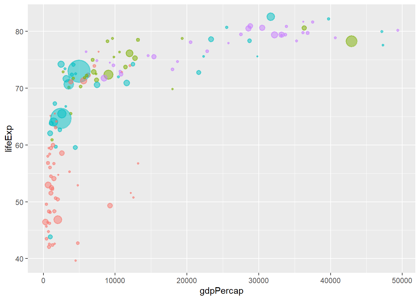
6.14.4.1 Legend title
The argument name within scale_* is used to control the legend title.
# renaming legend
ggplot(data = gapminder_2007, aes(y = lifeExp, x = gdpPercap)) +
  geom_point(alpha = 0.5, stroke = 1, aes(colour = continent)) +
  scale_colour_brewer(palette = "Dark2", name = 'Continents:') +
  theme(legend.position = "top")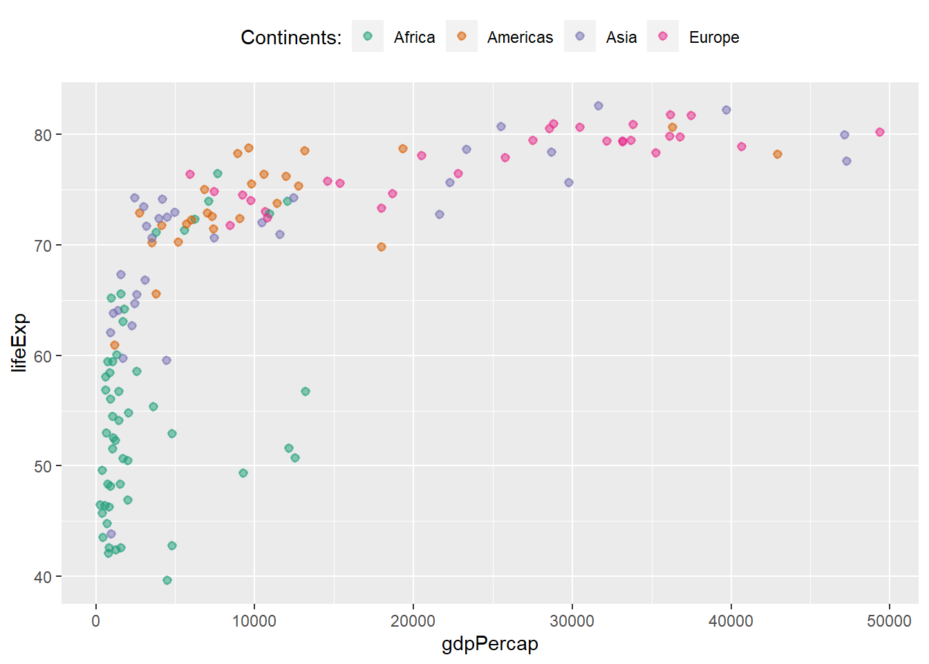
# drop legend title
ggplot(data = gapminder_2007, aes(y = lifeExp, x = gdpPercap)) +
  geom_point(alpha = 0.5, stroke = 1, aes(colour = continent)) +
  scale_colour_brewer(palette = "Dark2", name = '') +
  theme(legend.position = "top")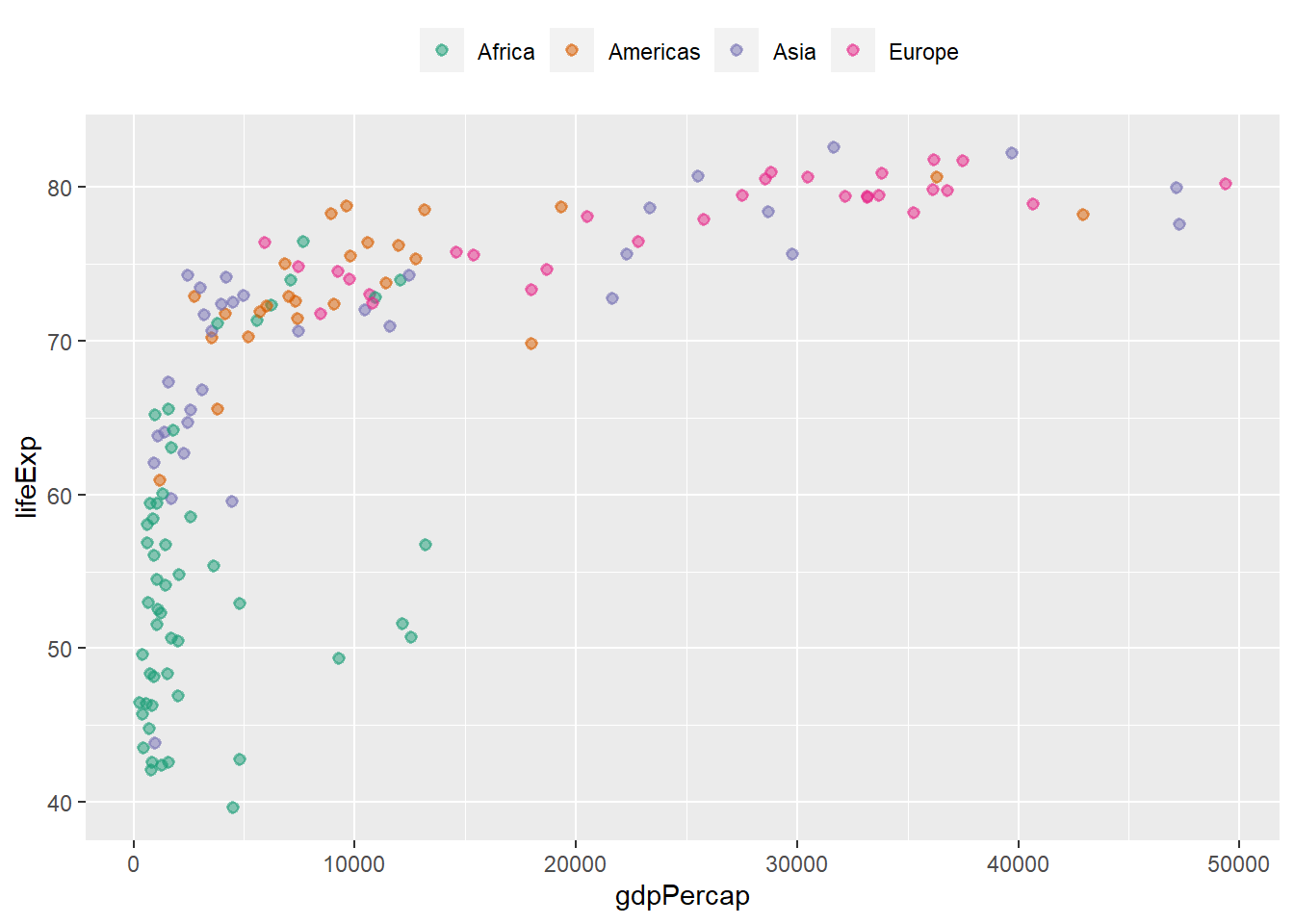
####Changing legend labels
The argument label within scale_* is used to change legend labels.
ggplot(data = gapminder_2007, aes(y = lifeExp, x = gdpPercap)) +
  geom_point(alpha = 0.5, stroke = 1, aes(colour = continent)) +
  scale_colour_brewer(palette = "Dark2", name = '', label = c('AF', 'AM', 'AS', 'EU', 'OC')) +
  theme(legend.position = "top")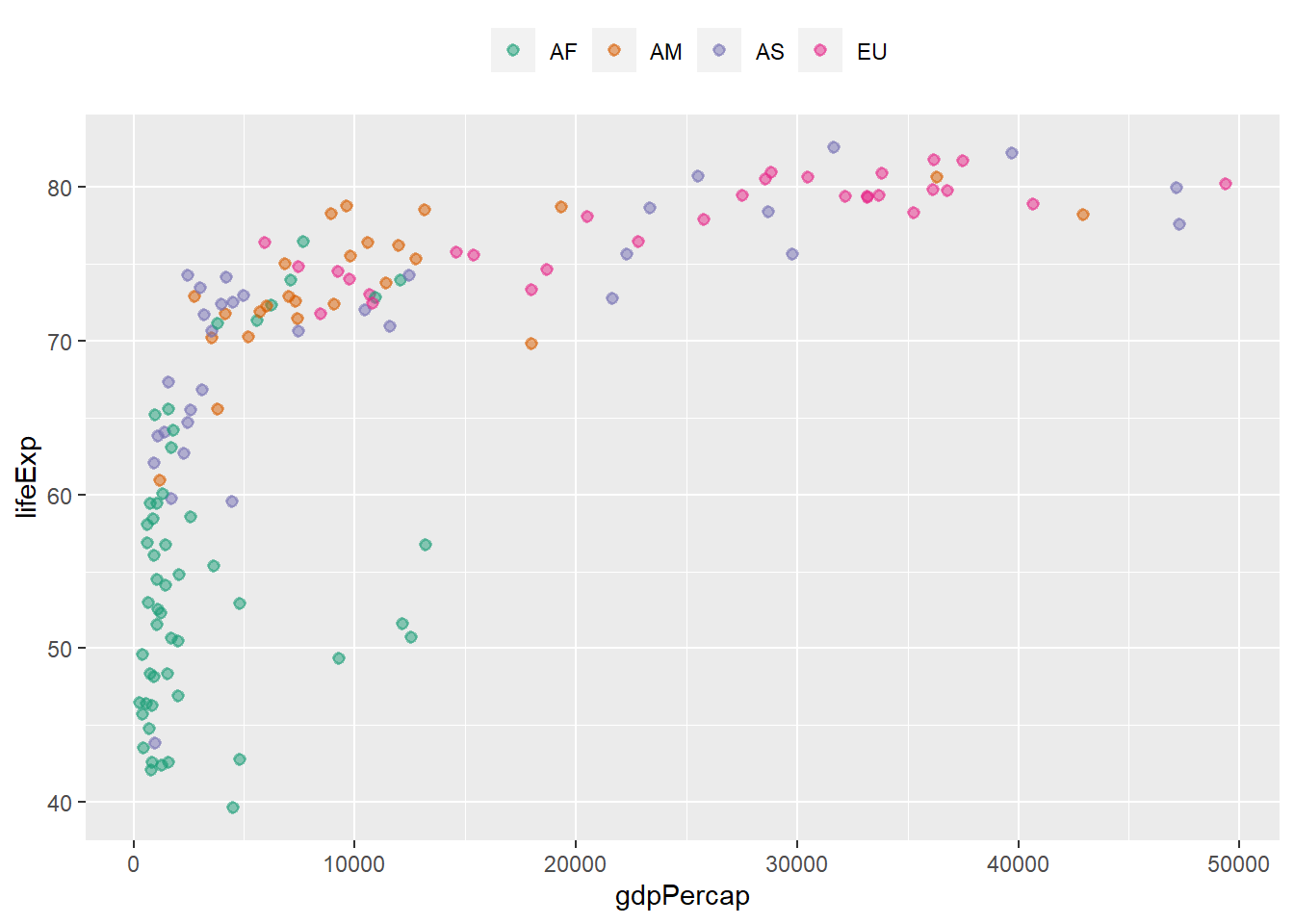
6.14.5 Built-in themes
ggplot2 comes with some built-in themes for customizing plots. These includes:
theme_grey() theme_bw() theme_linedraw() theme_light() theme_dark() theme_minimal() theme_classic() theme_void() theme_test()
ggplot(data = gapminder_2007, aes(y = lifeExp, x = gdpPercap)) +
  geom_point(alpha = 0.5, stroke = 1, aes(colour = continent)) +
  scale_colour_brewer(palette = "Dark2") +
  theme_bw() +
  theme(legend.position = "top")
ggplot(data = gapminder_2007, aes(y = lifeExp, x = gdpPercap)) +
  geom_point(alpha = 0.5, stroke = 1, aes(colour = continent)) +
  scale_colour_brewer(palette = "Dark2") +
  theme_bw() +
  theme_classic() +
  theme(legend.position = "bottom")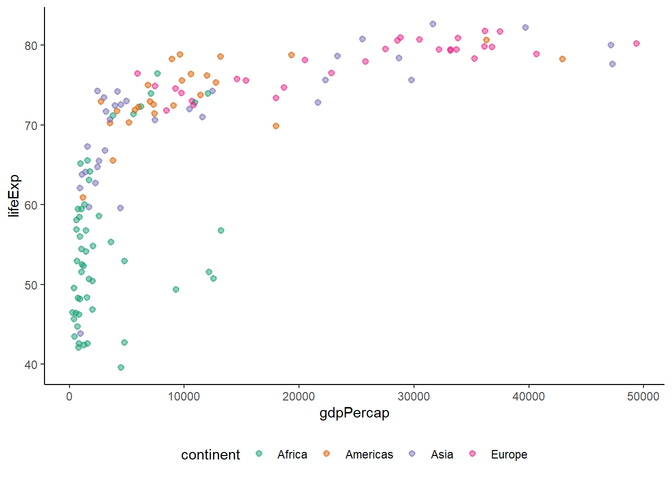
6.15 Saving plots
There are two ways of saving plots in ggplot2 which are using:
- graphic devices
ggsave()
6.15.1 Saving plots using graphic devices
With this method, we must first open the graphic device using any of the following rendering functions:
Then we produce the plot and finally, we close the device using dev.off().
# preparing plot
plt <-
ggplot(data = gapminder_2007, aes(y = lifeExp, x = gdpPercap)) +
  geom_point(alpha = 0.5, stroke = 1, aes(size = pop, colour = continent)) +
  scale_size_area(max_size = 12) +
  theme(legend.position = "top") +
  guides(size = FALSE)

# initiating device
pdf('world.pdf', width = 8, height = 8)

# saving plot
print(plt)

# closing device
dev.off()
#> png
#>   2

# initiating device
png('world.png', width = 800, height = 600)

# saving plot
print(plt)

# closing device
dev.off()
#> png
#>   2

# checking files
file.exists(c('world.pdf', 'world.png'))
#> [1] TRUE TRUE

# removing files
file.remove(c('world.pdf', 'world.png'))
#> [1] TRUE TRUE
6.15.2 Saving plots using ggsave()
The function ggsave() saves a plot directly to disc.
ggsave('world.pdf', plt, width = 16, height = 16, units = 'cm')
ggsave('world.png', plt, width = 8, height = 8, units = 'cm')

# checking files
file.exists(c('world.pdf', 'world.png'))
#> [1] TRUE TRUE

# removing files
file.remove(c('world.pdf', 'world.png'))
#> [1] TRUE TRUE
6.16 Statistical plots with ggplot2
6.16.1 Bar and column chart
The functions geom_bar() and geom_col() are used to create bar charts. While the former works on a categorical column, returning a bar for the count of each category, the later requires a numeric column for the y-axis and category names for the x-axis.
library(ggplot2)
library(dplyr)
library(gapminder)
library(RColorBrewer)

gapminder_2007 <-
gapminder %>%
filter(year == '2007' & continent != 'Oceania') %>%
mutate(pop = round(pop/1e6, 1)) %>%
select(-year)
head(gapminder_2007)
#> # A tibble: 6 x 5
#>   country     continent lifeExp   pop gdpPercap
#>   <fct>       <fct>       <dbl> <dbl>     <dbl>
#> 1 Afghanistan Asia         43.8  31.9      975.
#> 2 Albania     Europe       76.4   3.6     5937.
#> 3 Algeria     Africa       72.3  33.3     6223.
#> 4 Angola      Africa       42.7  12.4     4797.
#> 5 Argentina   Americas     75.3  40.3    12779.
#> 6 Austria     Europe       79.8   8.2    36126.

# count of countries by continent
ggplot(gapminder_2007, aes(x = continent)) +
   geom_bar()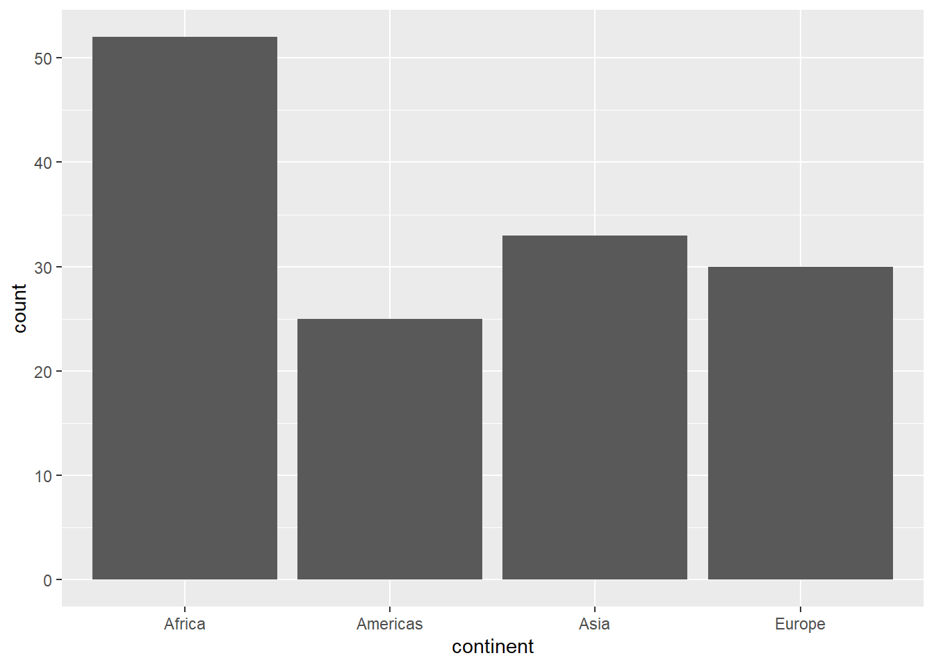
# preparing data
pop_2007 <-
gapminder_2007 %>%
group_by(continent) %>%
summarise(pop = sum(pop, na.rm = T))
pop_2007
#> # A tibble: 4 x 2
#>   continent   pop
#>   <fct>     <dbl>
#> 1 Africa     930.
#> 2 Americas   899.
#> 3 Asia      3812.
#> 4 Europe     586.

# population by continent
pop_2007 %>%
ggplot(aes(x = continent, y = pop)) +
   geom_col()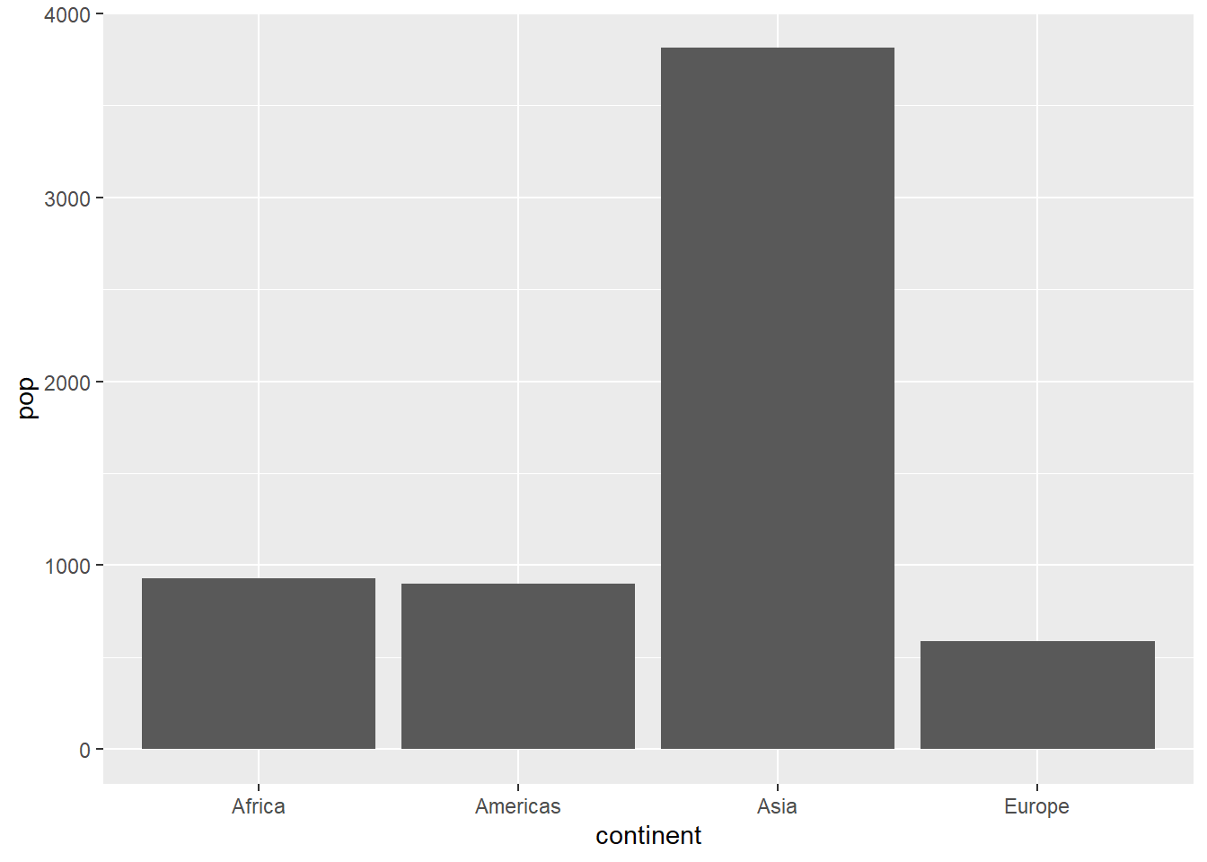
# sorting columns ascending
ggplot(pop_2007, aes(x = reorder(continent, pop), y = pop)) +
   geom_col()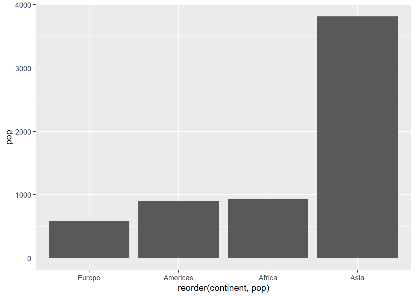
# sorting columns descending
ggplot(pop_2007, aes(x = reorder(continent, desc(pop)), y = pop)) +
   geom_col()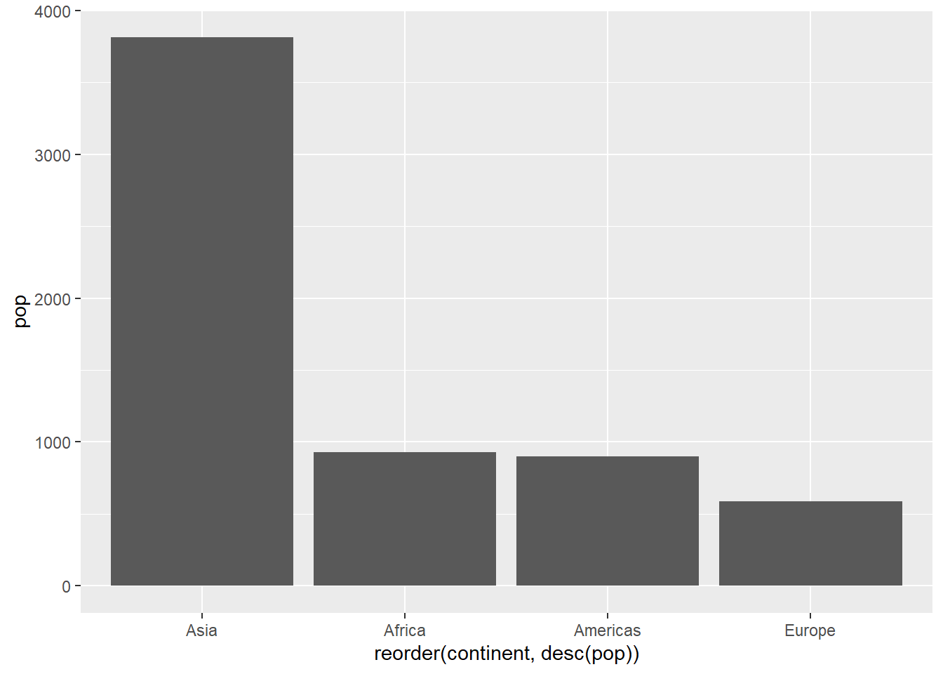
6.16.1.1 Borders and colours
The argument:
-
fill=: fills bars -
colour=: colours borders -
size=: controls border size -
width=: controls bar width
ggplot(pop_2007, aes(x = reorder(continent, desc(pop)), y = pop)) +
   geom_col(fill = 'lightgreen', colour = 'darkgreen', alpha = 0.5, size = 0.8, width = 0.7) +
   theme_classic()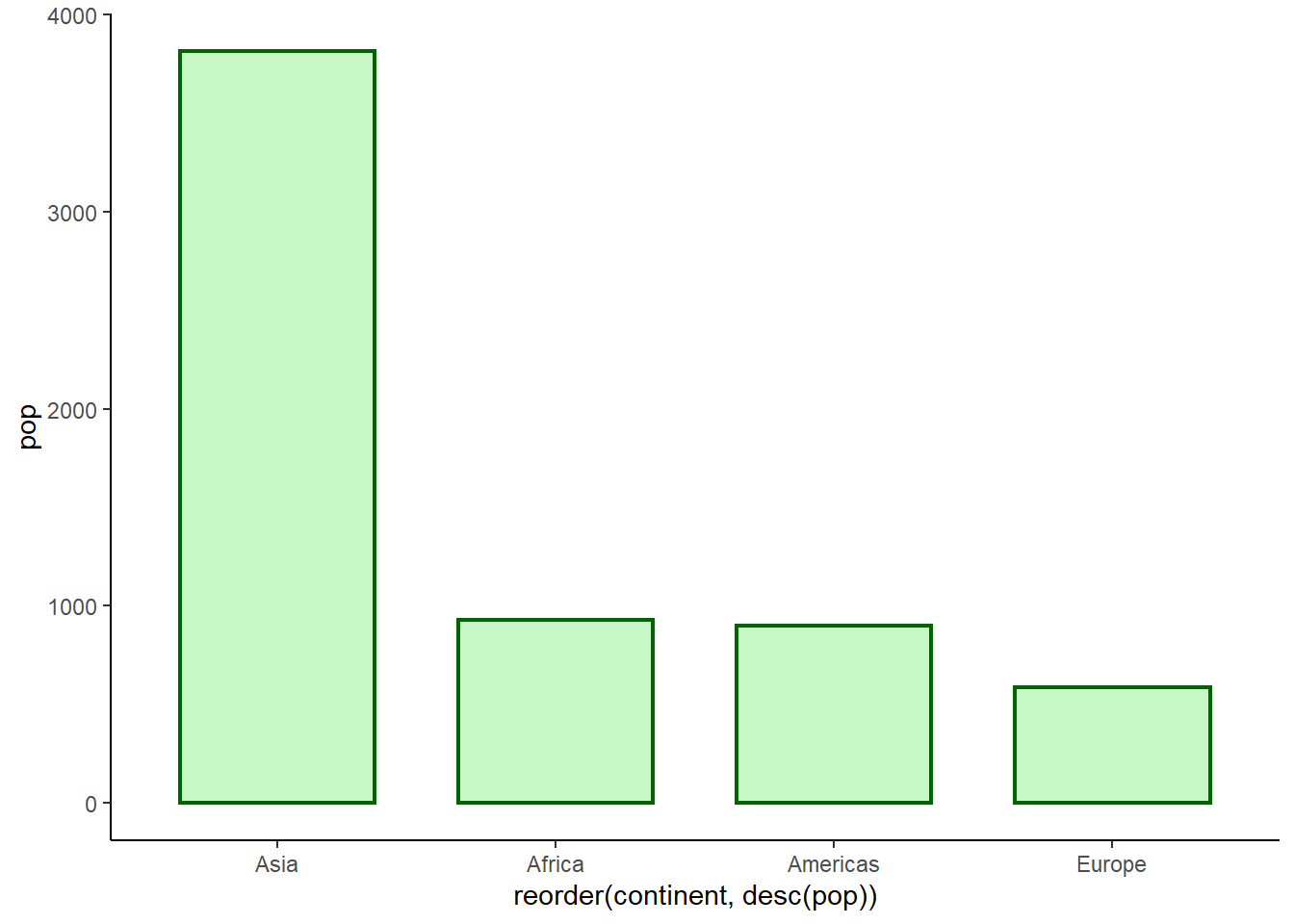
6.16.1.2 Adding labels
The functions geom_text() and geom_label() are used to add data labels.
ggplot(data = pop_2007, aes(x = reorder(continent, desc(pop)), y = pop)) +
   geom_col(fill = 'lightgreen', colour = 'darkgreen', alpha = 0.5) +
   geom_text(aes(label = round(pop)), nudge_y = 90) +
   theme_classic()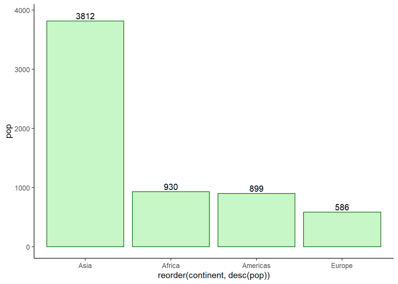
# placing label at centre of bars
ggplot(data = pop_2007) +
geom_col(aes(x = reorder(continent, desc(pop)), y = pop),
         fill = 'lightgreen', colour = 'darkgreen', alpha = 0.5) +
   geom_label(aes(x = reorder(continent, desc(pop)),
                  y = pop/2, label = round(pop)), nudge_y = 100) +
   theme_classic()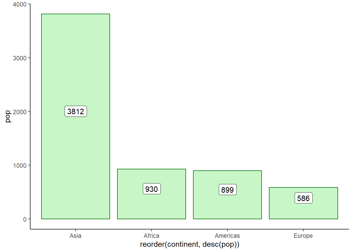
6.16.1.3 Customizing plot
ggplot(pop_2007, aes(x = reorder(continent, desc(pop)), y = pop)) +
   geom_col(fill = 'lightgreen', colour = 'darkgreen', alpha = 0.5) +
   geom_text(aes(label = round(pop)), nudge_y = 90) +
   ggtitle('2007 World Population by Continents',
           subtitle = "Asia accounts for more than half of the world's population") +
   xlab('Continents') +
   ylab('Pop in Millions') +
   theme_classic()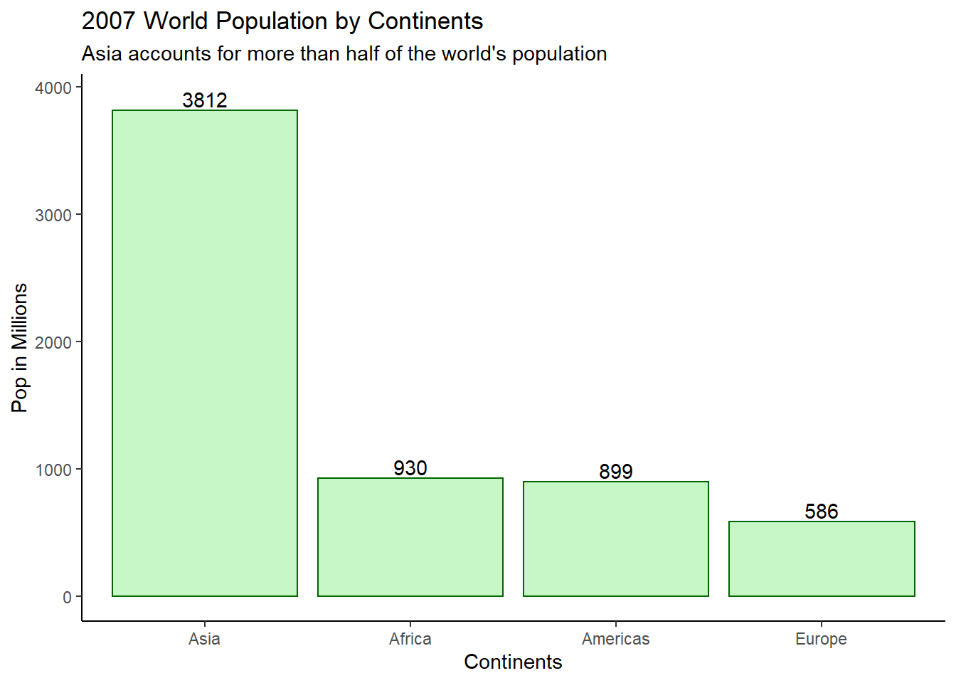
6.16.1.4 Column chart
Using the function coord_flip(), we can flip a bar chart into a column chart.
# producing a column chart
ggplot(pop_2007, aes(x = reorder(continent, pop), y = pop)) +
   geom_col(fill = 'lightgreen', colour = 'darkgreen', alpha = 0.5) +
   labs(x = 'Continents',y = 'Pop in Millions',title = '2007 World Population by Continents') +
   geom_label(aes(label = round(pop), y = pop/2)) +
   theme_classic() +
   coord_flip()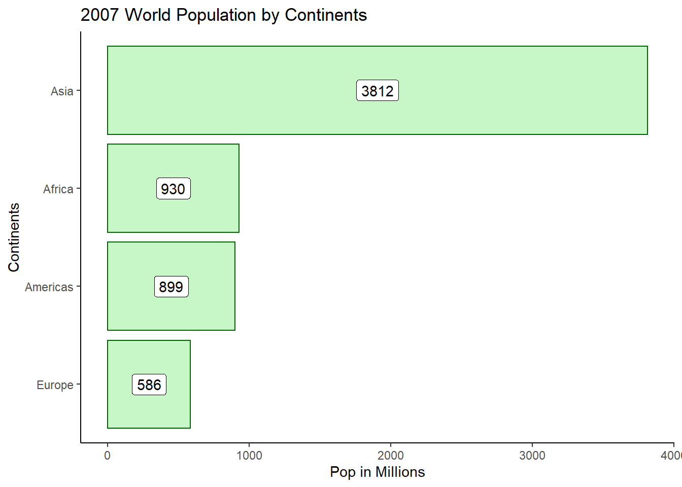
6.16.1.5 Stacked bar chart
To create stacked column bars, we use the fill argument by mapping it to a continuous variable.
# preparing data
dt <-
gapminder %>%
filter(year >= 1992) %>%
group_by(year, continent) %>%
summarise(pop = round(sum(pop/1e6, na.rm = T)))
head(dt)
#> # A tibble: 6 x 3
#> # Groups:   year [2]
#>    year continent   pop
#>   <int> <fct>     <dbl>
#> 1  1992 Africa      659
#> 2  1992 Americas    739
#> 3  1992 Asia       3133
#> 4  1992 Europe      558
#> 5  1992 Oceania      21
#> 6  1997 Africa      744

# producing a stacked bar chart
ggplot(dt, aes(x = as.factor(year), y = pop, fill = reorder(continent, pop))) +
   geom_col() +
   theme_classic() +
   scale_fill_brewer(palette = "Dark2")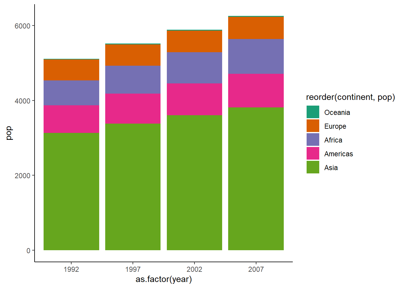
6.16.1.6 The 100% stacked bar chart
To create a 100% stacked bar chart, we set position = "fill" inside geom_col().
ggplot(dt, aes(x = as.factor(year), y = pop, fill = reorder(continent, pop))) +
   geom_col(position = "fill") +
   theme_classic() +
   scale_fill_brewer(palette = "Dark2")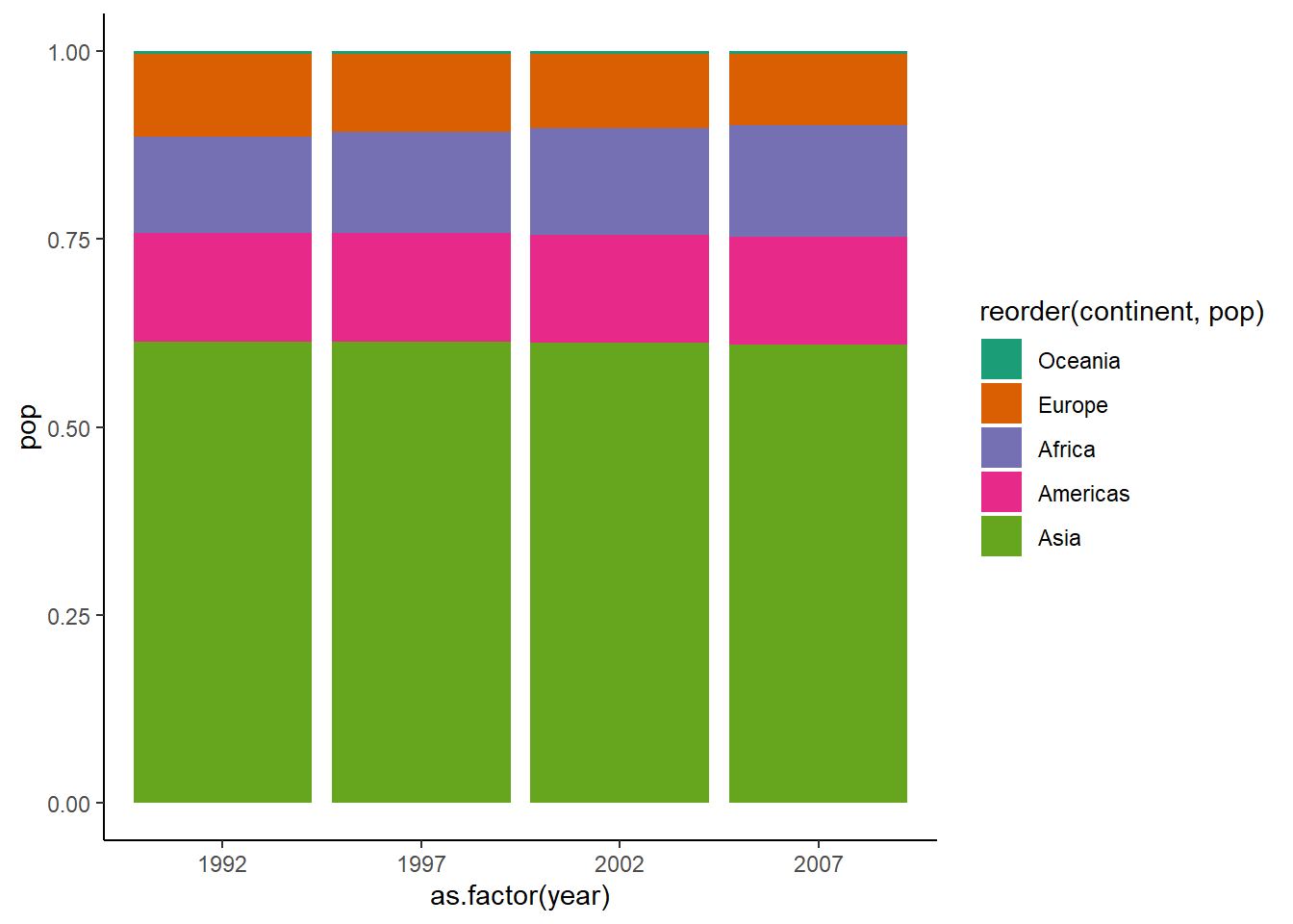
6.16.1.7 Clustered bar chart
To create a clustered bar chart, we set position = "dodge" inside geom_col().
ggplot(dt, aes(x = as.factor(year), y = pop, fill = reorder(continent, pop))) +
   geom_col(position = "dodge") +
   theme_classic() +
   scale_fill_brewer(palette = "Dark2")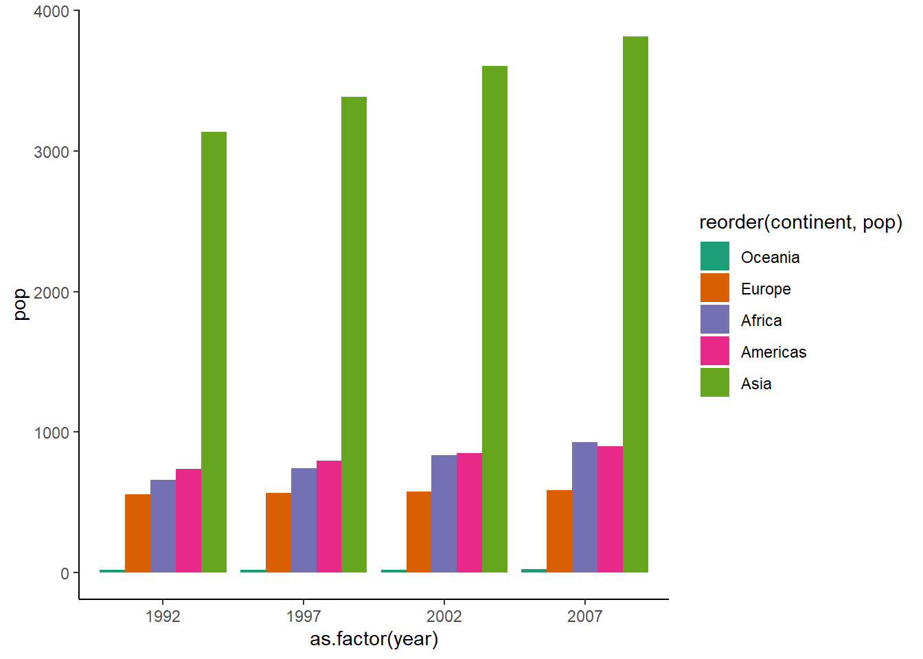
# adding space between bars
ggplot(dt, aes(x = as.factor(year), y = pop, fill = reorder(continent, pop))) +
   geom_col(position = position_dodge(width = 1)) +
   theme_classic() +
   scale_fill_brewer(palette = "Dark2")
# adding data labels
ggplot(dt, aes(x = as.factor(year), y = pop, fill = reorder(continent, pop))) +
   geom_col(position = position_dodge(width = 1)) +
   theme_classic() +
   scale_fill_brewer(palette = "Dark2") +
   geom_text(aes(label = round(pop), y = pop), position = position_dodge(0.9),
             size = 3, vjust = -0.5, hjust = 0.5)
6.16.2 Pie chart
There is no geom for producing pie charts but by using coord_polar(), we can produce pie charts.
# data
pop_2007
#> # A tibble: 4 x 2
#>   continent   pop
#>   <fct>     <dbl>
#> 1 Africa     930.
#> 2 Americas   899.
#> 3 Asia      3812.
#> 4 Europe     586.

ggplot(pop_2007, aes(y = pop, x = '', fill = continent)) +
   geom_col() +
   coord_polar("y", start = 0)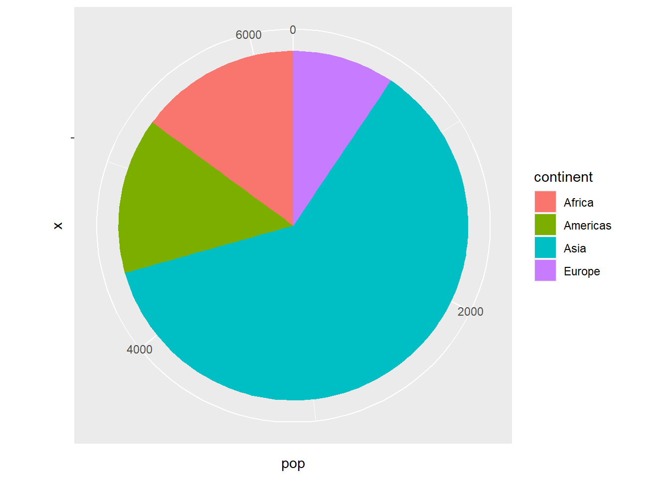
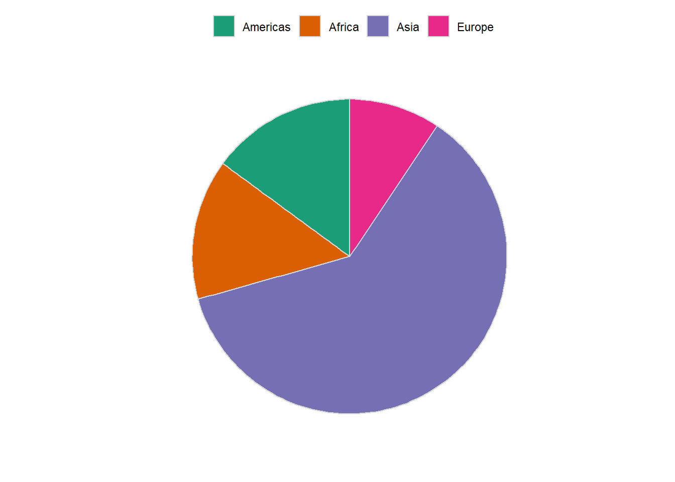
6.16.2.1 Customizing plot
ggplot(pop_2007, aes(y = pop, x = '', fill = continent)) +
   geom_col(colour = grey(0.85), size = 0.5) +
   coord_polar("y", start = 0) +
   scale_fill_brewer(palette = "Dark2", label = c('Americas', 'Africa', 'Asia', 'Europe')) +
   theme_minimal() +
   labs(x = '', y = '') +
   theme(legend.position = "top",
         axis.ticks = element_blank(),
         panel.grid=element_blank(),
         axis.text.x=element_blank(),
         legend.title = element_blank()
)
6.16.2.2 Adding data labels
# preparing label
pop_2007 %>%
arrange(desc(pop)) %>%
mutate(label_y = cumsum(pop))
#> # A tibble: 4 x 3
#>   continent   pop label_y
#>   <fct>     <dbl>   <dbl>
#> 1 Asia      3812.   3812.
#> 2 Africa     930.   4742.
#> 3 Americas   899.   5640.
#> 4 Europe     586.   6227.

pop_2007 %>%
arrange(desc(pop)) %>%
mutate(label_y = cumsum(pop)) %>%

ggplot(aes(y = pop, x = '', fill = continent)) +
   geom_col(colour = grey(0.85), size = 0.5) +
   coord_polar("y", start = 0) +
   scale_fill_brewer(palette = "Dark2", label = c('Americas', 'Africa', 'Asia', 'Europe')) +
   theme_minimal() +
   labs(x = '', y = '') +
   theme(legend.position = "top",
         axis.ticks = element_blank(),
         panel.grid=element_blank(),
         axis.text.x=element_blank(),
         legend.title = element_blank()) +
   geom_text(aes(y = label_y, label = round(pop)), hjust = -0.5)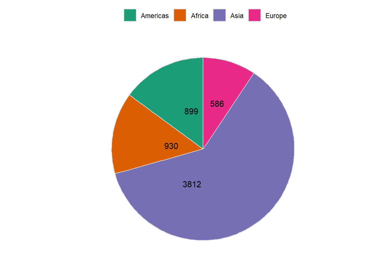
# preparing data
pop_2007 %>%
arrange(desc(pop)) %>%
mutate(label_y = cumsum(pop)) %>%
mutate(label_per = round(pop/sum(pop),3))
#> # A tibble: 4 x 4
#>   continent   pop label_y label_per
#>   <fct>     <dbl>   <dbl>     <dbl>
#> 1 Asia      3812.   3812.     0.612
#> 2 Africa     930.   4742.     0.149
#> 3 Americas   899.   5640.     0.144
#> 4 Europe     586.   6227.     0.094

pop_2007 %>%
arrange(desc(pop)) %>%
mutate(label_y = cumsum(pop)) %>%
mutate(label_per = round(pop/sum(pop),3)) %>%

ggplot(aes(y = pop, x = '', fill = continent)) +
   geom_col(colour = grey(0.85), size = 0.5) +
   coord_polar("y", start = 0) +
   scale_fill_brewer(palette = "Dark2") +
   theme_minimal() +
   labs(x = '', y = '') +
   theme(legend.position = "none",
         axis.ticks = element_blank(),
         panel.grid=element_blank(),
         axis.text.x=element_blank(),
         legend.title = element_blank()) +
geom_text(aes(y = label_y, label = paste0(continent,':- ', scales::percent(label_per, 0.1))),
          hjust = 0.1, size = 4, colour = grey(0.25))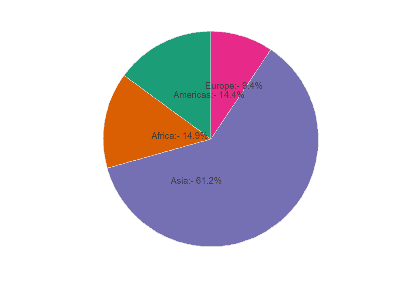
6.16.3 Dot plot
6.16.3.1 Wilkinson dot plot
The function geom_dotplot() is used to create a dot plot.
ggplot(gapminder_2007, aes(x = lifeExp)) +
   geom_dotplot() +
   theme_classic()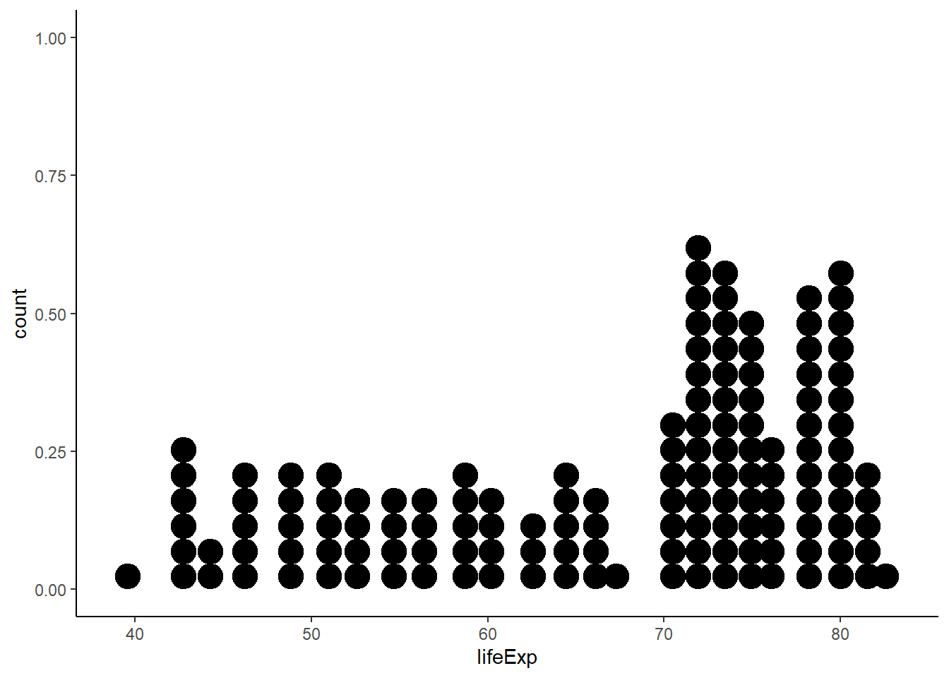
ggplot(gapminder_2007, aes(x = lifeExp)) +
   geom_dotplot(aes(fill = continent), alpha = 0.5, colour = NA) +
   theme_classic()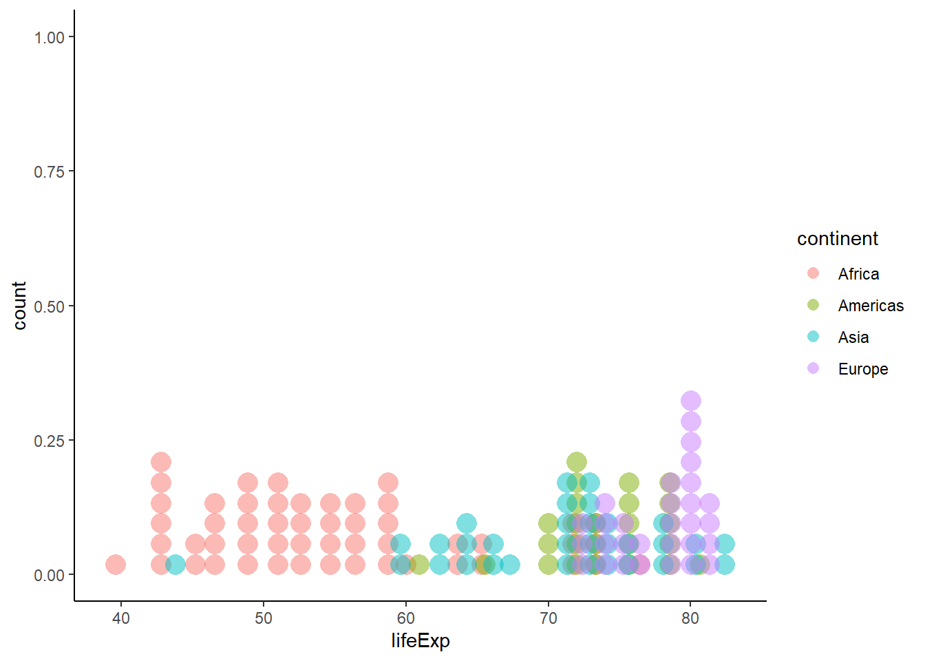
ggplot(gapminder_2007, aes(x = lifeExp)) +
   geom_dotplot(aes(fill = continent), alpha = 0.5, colour = NA, method = 'histodot') +
   theme_classic()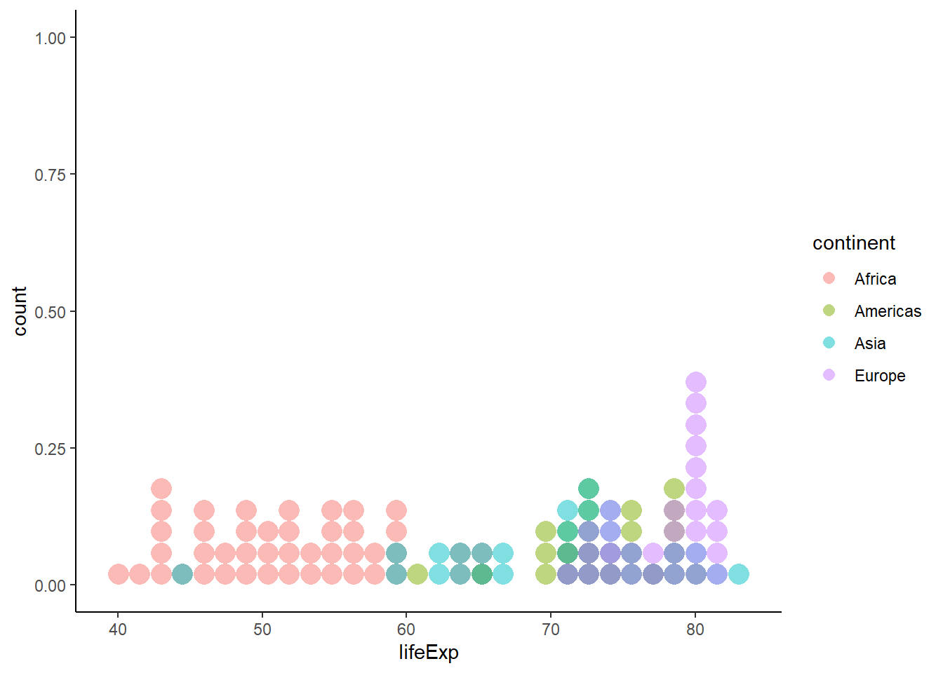
6.16.3.2 Grouped dot plot
ggplot(data = gapminder_2007, aes(y = lifeExp, x = continent)) +
   geom_dotplot(binaxis = 'y', stackdir = 'center') +
   theme_classic()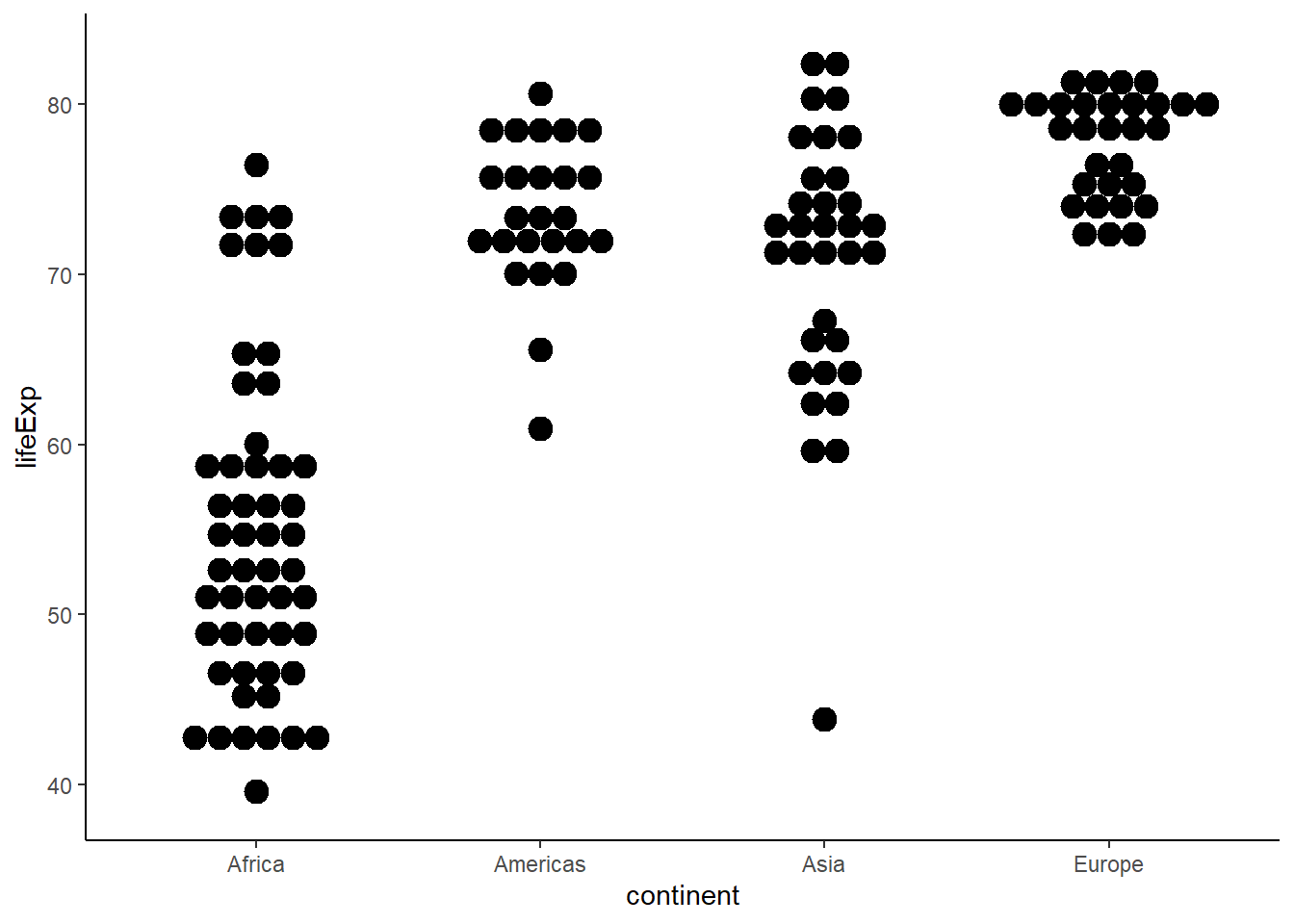
6.16.3.3 Customizing plot
ggplot(data = gapminder_2007,
aes(y = lifeExp, x = continent, colour = continent, fill = continent)) +
   geom_dotplot(binaxis = 'y', stackdir = 'center', dotsize = 0.6, alpha = 0.5) +
   theme(legend.position = "none") +
   theme_classic()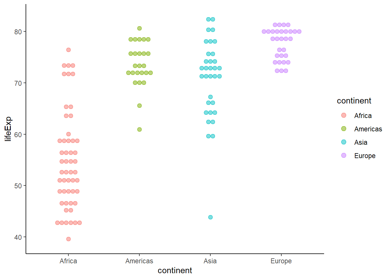
6.16.4 Histogram
The function geom_histogram() is used to create histograms.
ggplot(gapminder_2007) +
   geom_histogram(aes(x = lifeExp)) +
   theme_classic()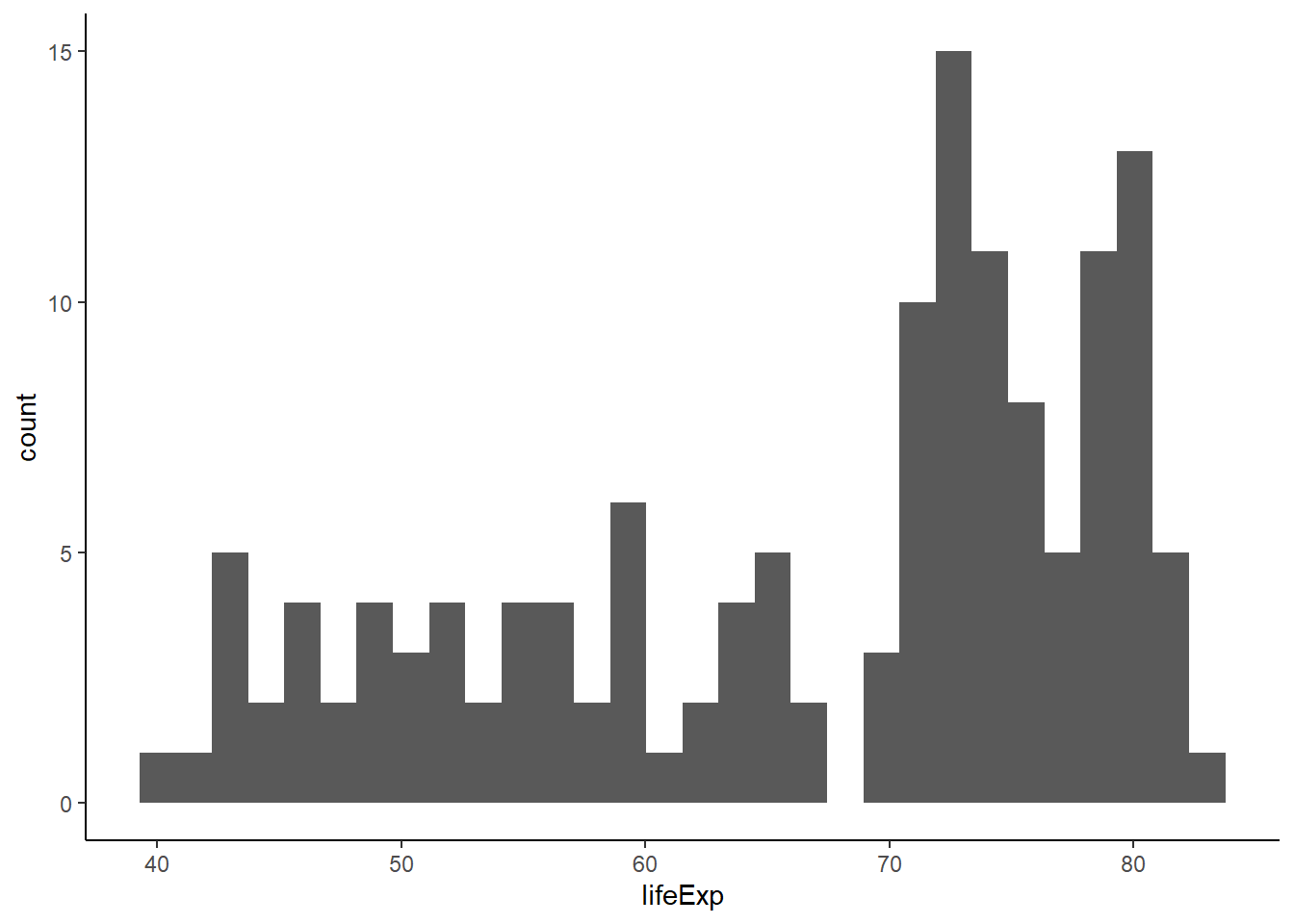
6.16.4.1 Controlling the number of bins
The argument bins controls the number of bins.
ggplot(gapminder_2007) +
   geom_histogram(aes(x = lifeExp), bins = 10) +
   theme_classic()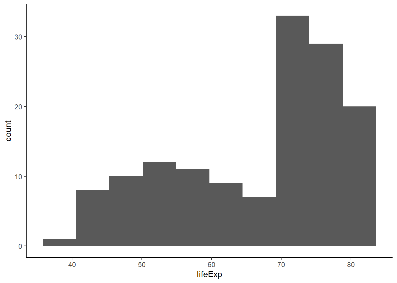
6.16.4.2 Controlling bin size
The argument binwidth controls the width of the bins.
ggplot(gapminder_2007) +
   geom_histogram(aes(x = lifeExp), binwidth = 5) +
   theme_classic()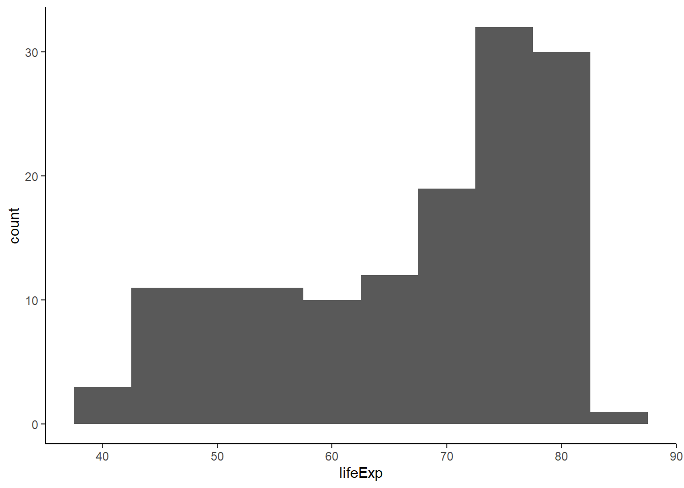
6.16.4.3 Colour and fill
ggplot(gapminder_2007, aes(x = lifeExp)) +
   geom_histogram(binwidth = 3, fill = 'black', colour = 'white') +
   theme_classic()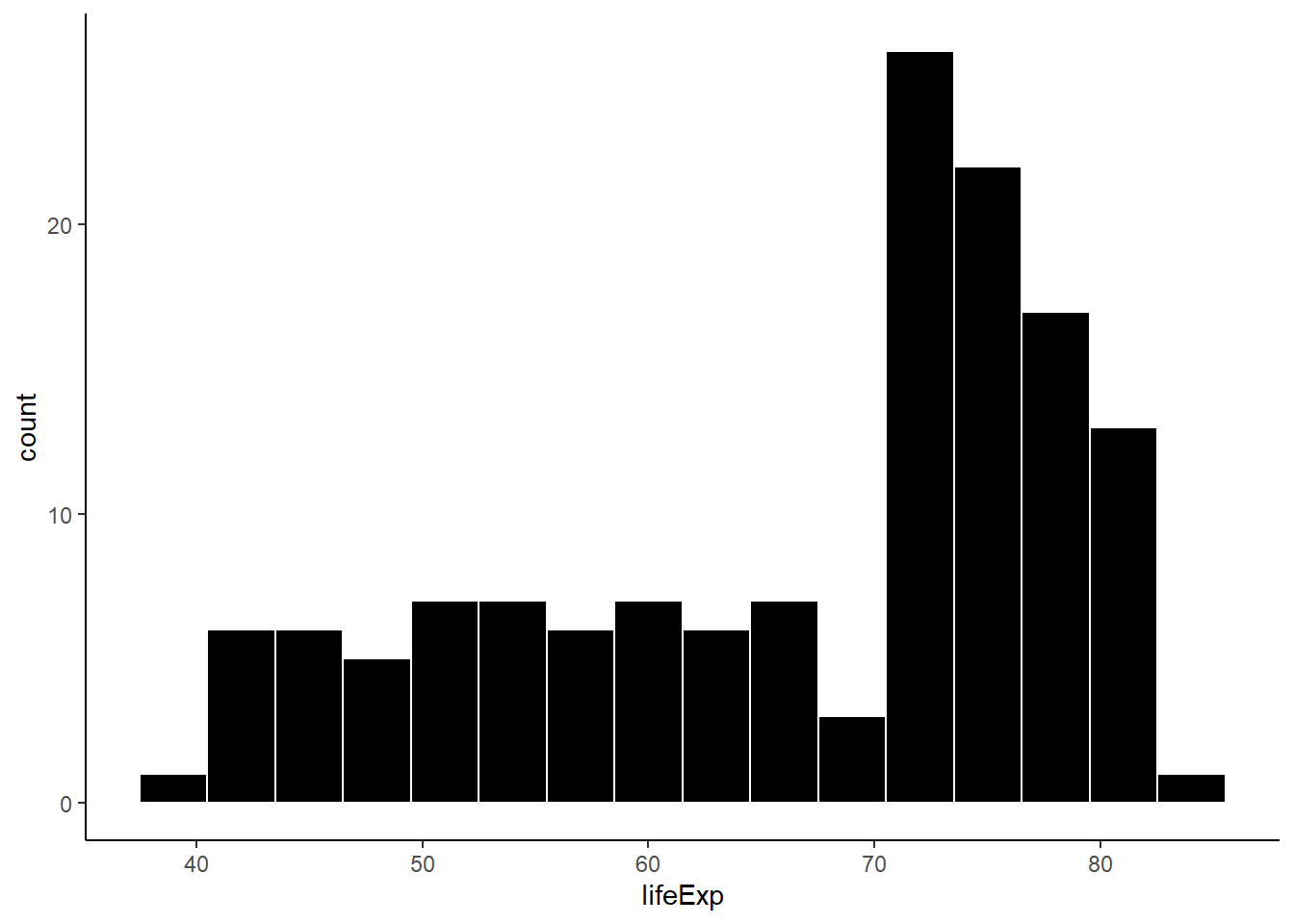
6.16.4.4 Density Histogram
The argument y = ..density.. is used to create a density histogram. By default, histograms are count but to combine them with density plot, we need to convert them to density histograms.
ggplot(gapminder_2007, aes(x = lifeExp, y = ..density..)) +
   geom_histogram(fill = 'black', colour = 'white', binwidth = 3) +
   theme_classic()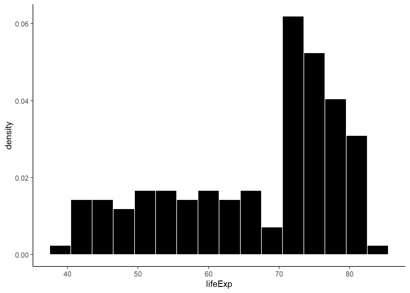
6.16.5 Density plot
The function geom_density() creates density plots.
ggplot(gapminder_2007, aes(x = lifeExp)) +
   geom_density(colour = 'blue', size = 0.5) +
   theme_classic()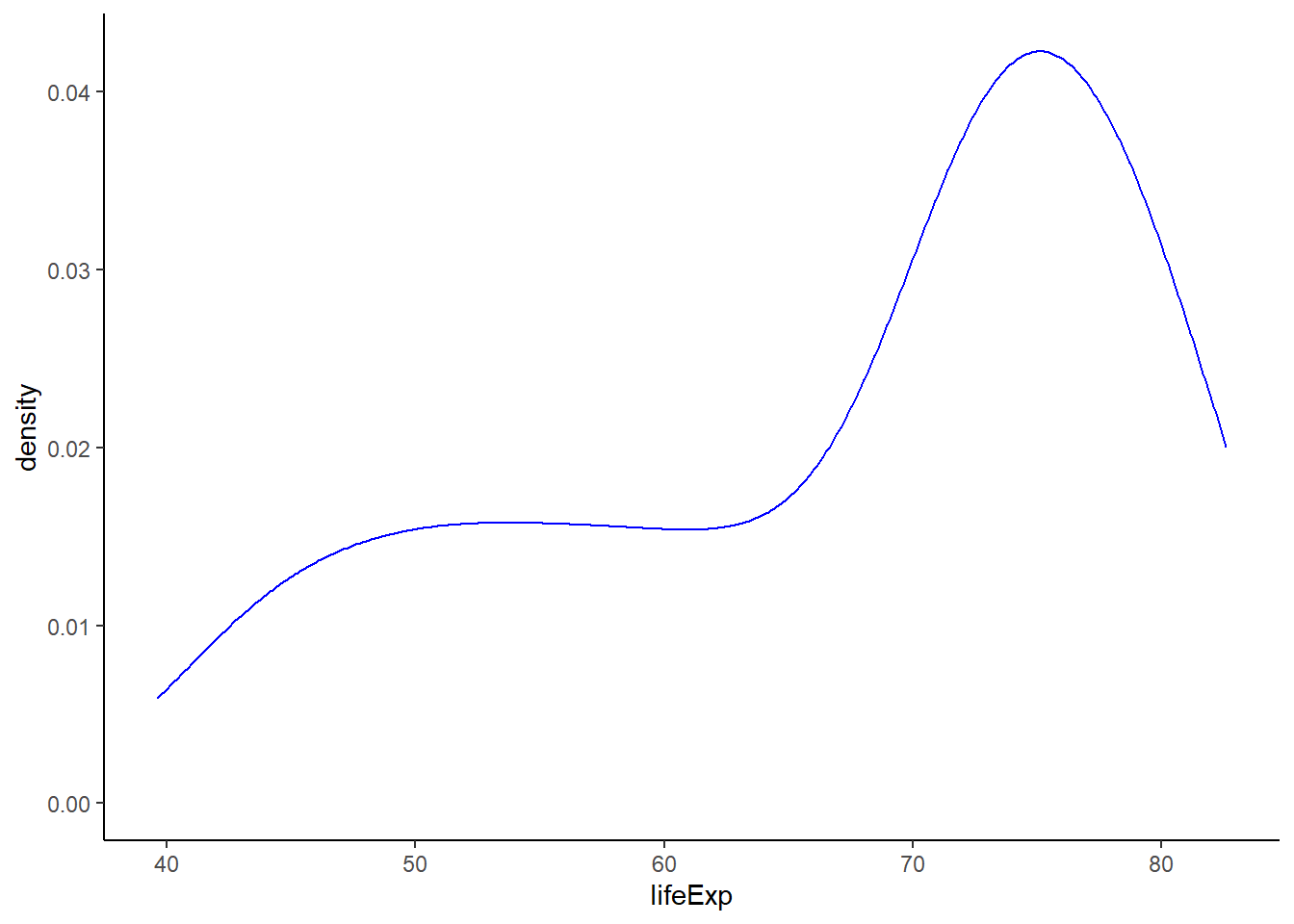
# expanding x-axis
ggplot(gapminder_2007, aes(x = lifeExp)) +
   geom_density(colour = 'blue', size = 0.5) +
   theme_classic() +
xlim(30, 95)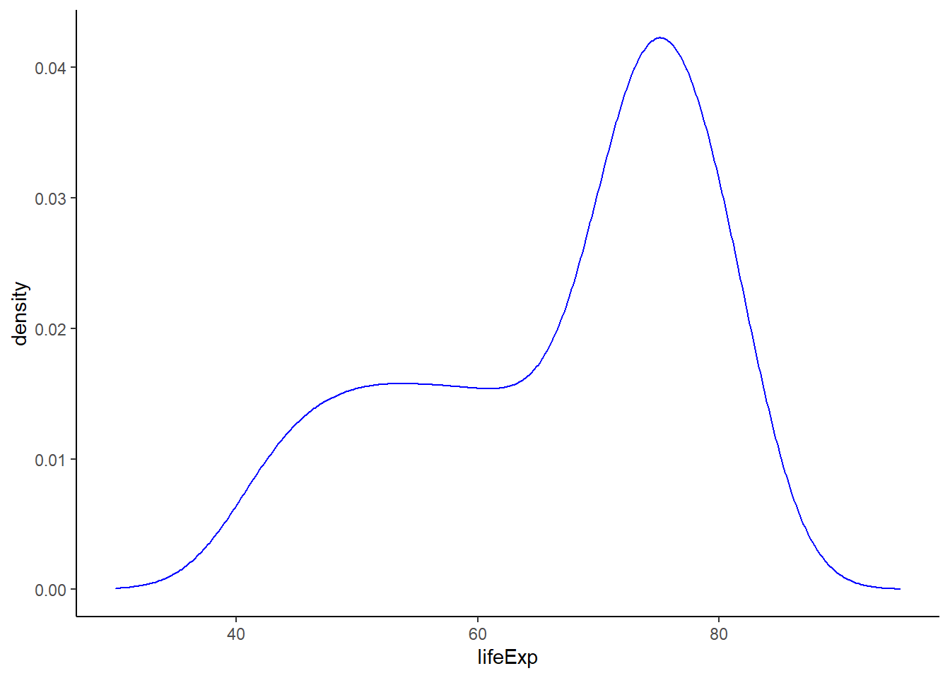
# filling area under the curve
ggplot(gapminder_2007, aes(x = lifeExp)) +
   geom_density(colour = NA, fill = 'lightgreen', alpha = 0.7) +
   theme_classic() +
   xlim(30, 95)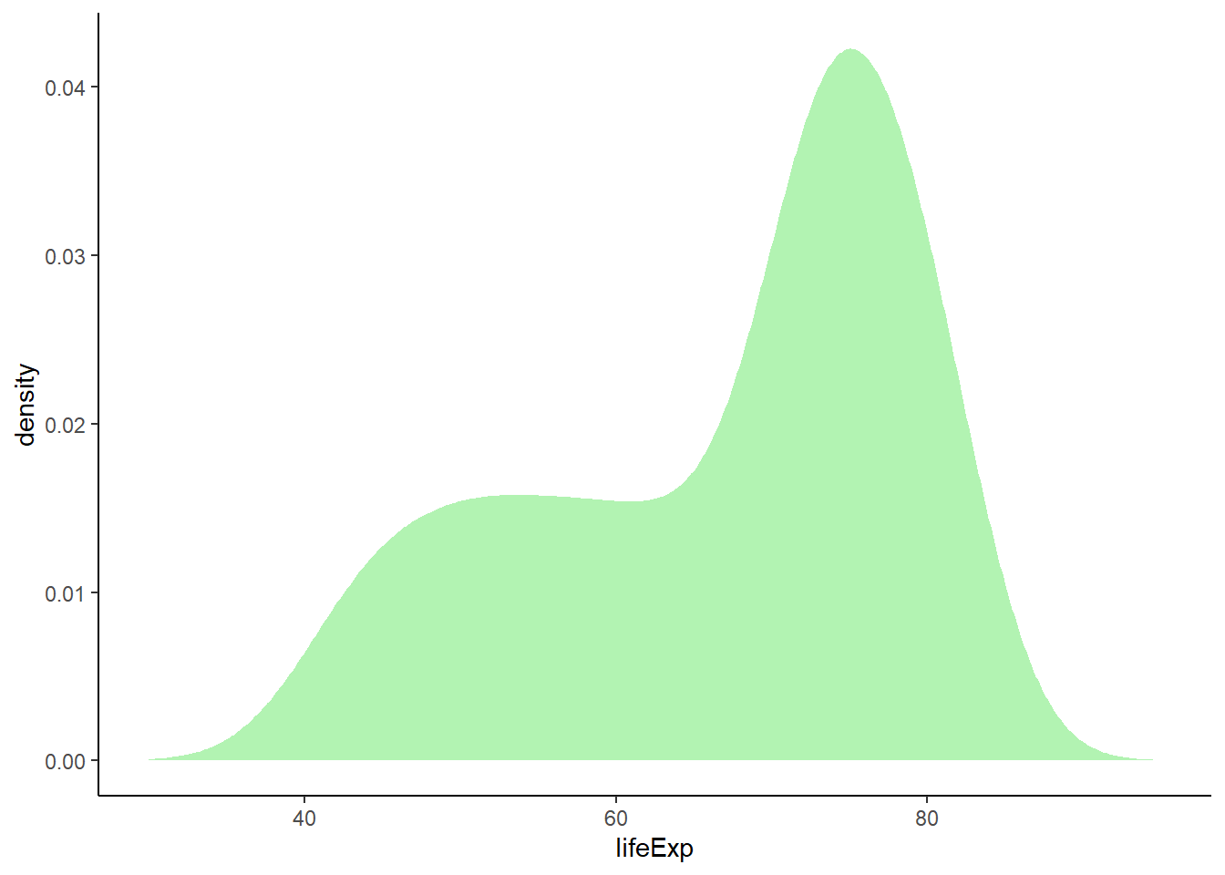
# fill and colour
ggplot(gapminder_2007, aes(x = lifeExp)) +
   geom_density(colour = 'blue', fill = 'lightgreen', alpha = 0.7) +
   theme_classic() +
   xlim(30, 95)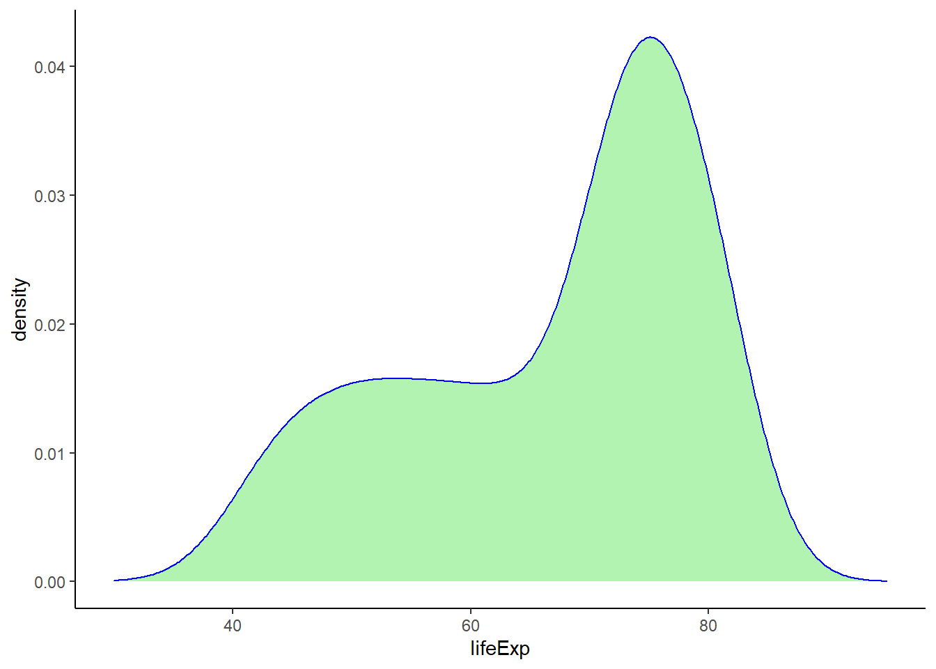
# plotting density with geom_line()
ggplot(gapminder_2007, aes(x = lifeExp)) +
   geom_line(colour = 3, stat = 'density', size = 0.8, adjust = 0.5) +
   geom_line(colour = 4, stat = 'density', size = 0.8, adjust = 1) +
   geom_line(colour = 5, stat = 'density', size = 0.8, adjust = 1.5) +
   geom_line(colour = 6, stat = 'density', size = 0.8, adjust = 2) +
   theme_classic() +
   xlim(25, 95)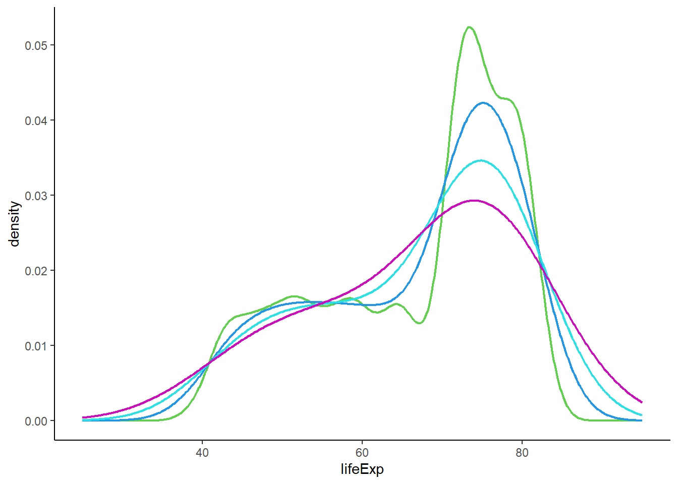
6.16.5.1 Adding rug
# adding rug
ggplot(gapminder_2007, aes(x = lifeExp)) +
   geom_density(colour = 3) +
   xlim(30, 95) +
   theme_classic() +
geom_rug() 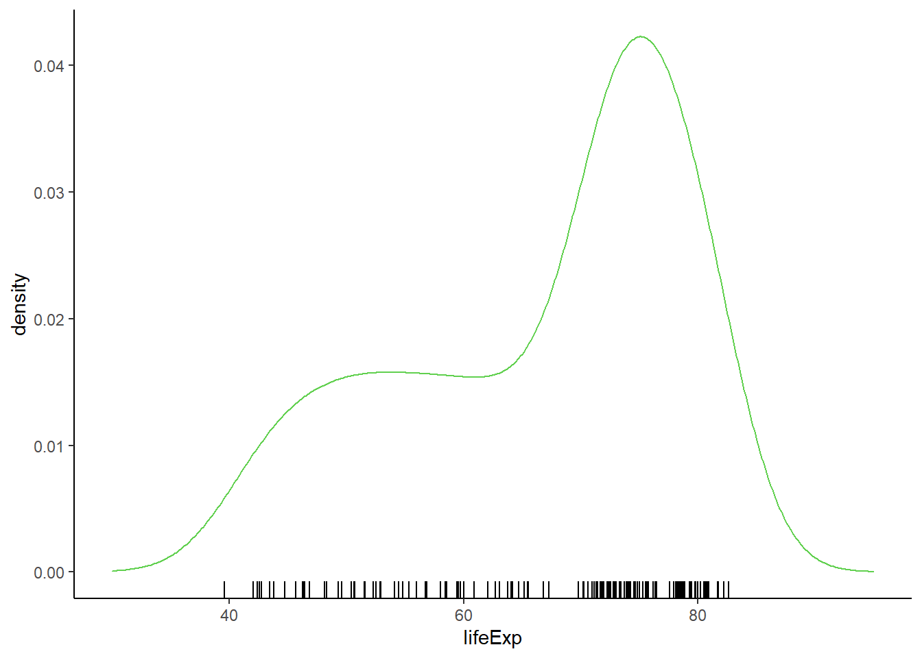
6.16.5.2 Density plot by groups
# by groups
ggplot(gapminder_2007, aes(x = lifeExp, colour = continent)) +
   geom_density(size = 0.5, alpha = 0.5) +
   xlim(30, 95) +
   geom_rug() +
theme_classic() 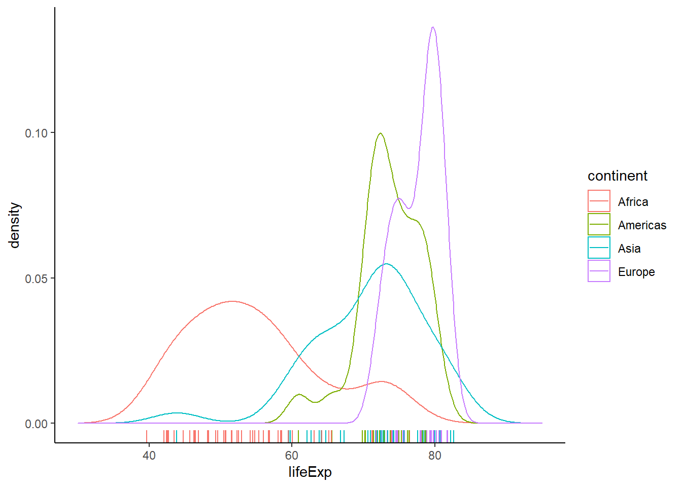
# subplots
ggplot(gapminder_2007, aes(x = lifeExp, colour = continent)) +
   geom_density(size = 0.5, alpha = 0.5) +
   xlim(30, 95) +
   theme_light() +
   facet_wrap(continent ~ ., nrow = 5, ncol = 1, scales = 'free_y')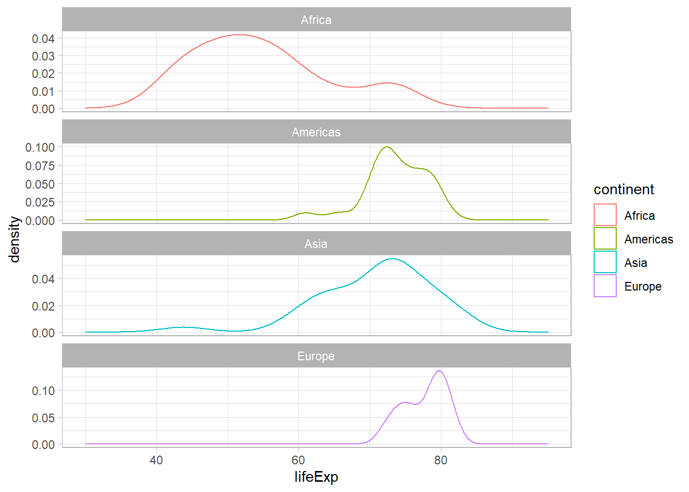
6.16.5.3 Combining density and histogram
# combining density and histogram
ggplot(gapminder_2007, aes(x = lifeExp, y = ..density..)) +
   geom_density(colour = 3, size = 0.5) +
   geom_histogram(alpha = 0.3, bins = 15) +
   theme_classic() +
   xlim(30, 95)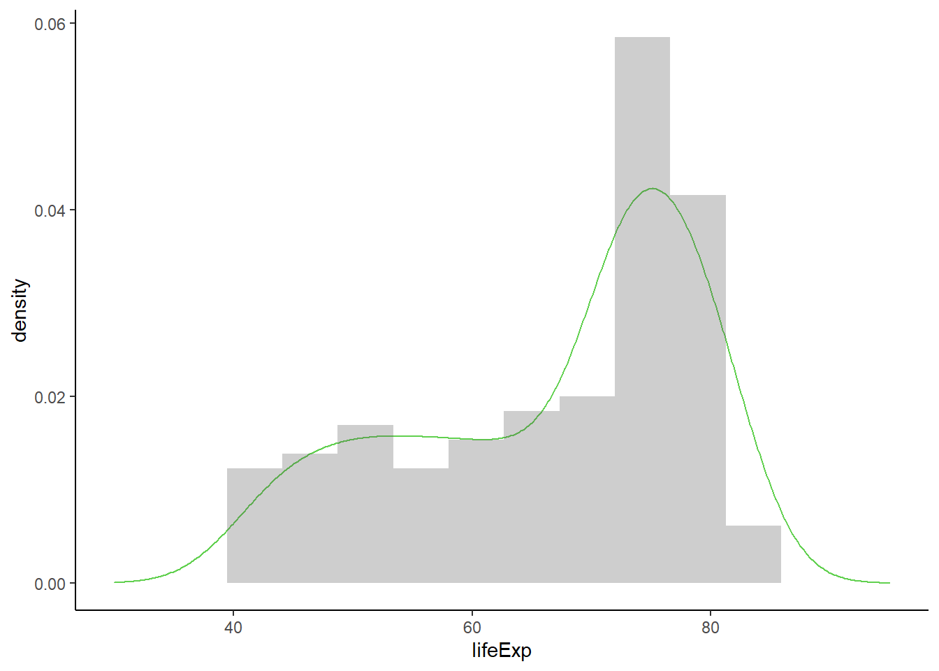
6.16.6 Q-Q plot
The function geom_qq() creates a q-q plot.
ggplot(data = gapminder_2007) +
geom_qq(aes(sample = lifeExp)) +
theme_classic()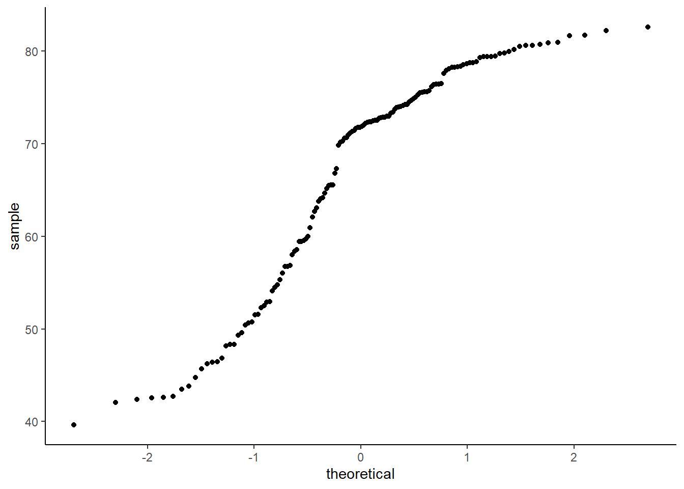
# adding a line
ggplot(data = gapminder_2007, aes(sample = lifeExp)) +
   geom_qq() +
   geom_qq_line() +
   theme_classic()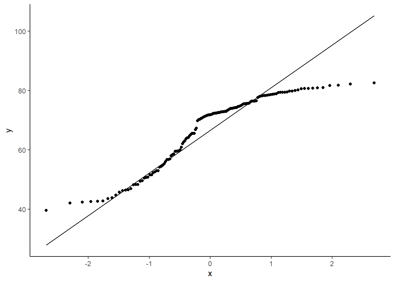
# by groups
ggplot(data = gapminder_2007, aes(sample = lifeExp, colour = continent, shape = continent)) +
   geom_qq(size = 2) +
   geom_qq_line() +
   scale_colour_brewer(palette = "Dark2") +
   scale_shape_manual(values = 15:19) +
   guides(shape = 'none') +
   theme_classic()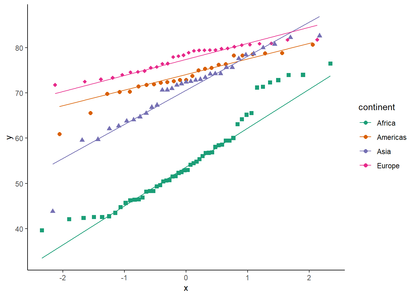
6.16.7 Boxplot
The function geom_boxplot() creates a boxplot.
ggplot(data = gapminder_2007) +
   geom_boxplot(aes(y = lifeExp))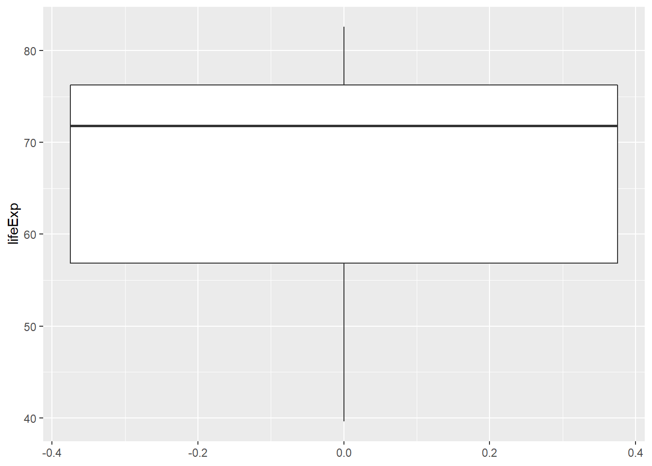
6.16.7.1 Customizing plot
ggplot(data = gapminder_2007, aes(y = lifeExp)) +
   geom_boxplot(width = 20,
                fill = 'lightgreen',
                colour = 'darkgreen',
                alpha = 0.7,
                size = 0.5) +
   theme_classic()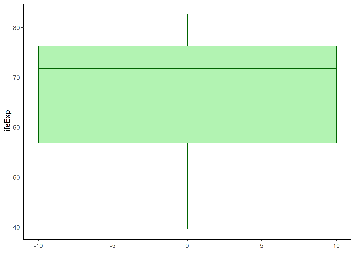
6.16.7.2 Adding notch
The argument notch is used to add notch while notchwidth is used to adjust notch size.
ggplot(data = gapminder_2007, aes(y = lifeExp)) +
   geom_boxplot(fill = 'lightgreen',
                colour = 'darkgreen',
                alpha = 0.5,
                size = 0.6,
                notch = TRUE,
                notchwidth = 0.7) +
   theme_classic()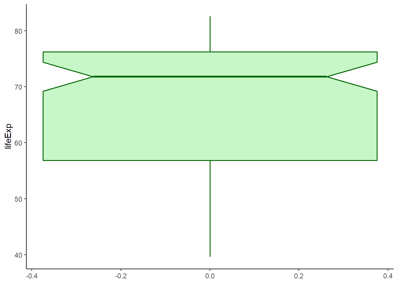
6.16.7.3 Boxplot by groups
ggplot(data = gapminder_2007) +
   geom_boxplot(aes(y = lifeExp, x = continent),
                fill = 'lightgreen',
                colour = 'darkgreen',
                alpha = 0.5,
                size = 0.7) +
   theme_classic()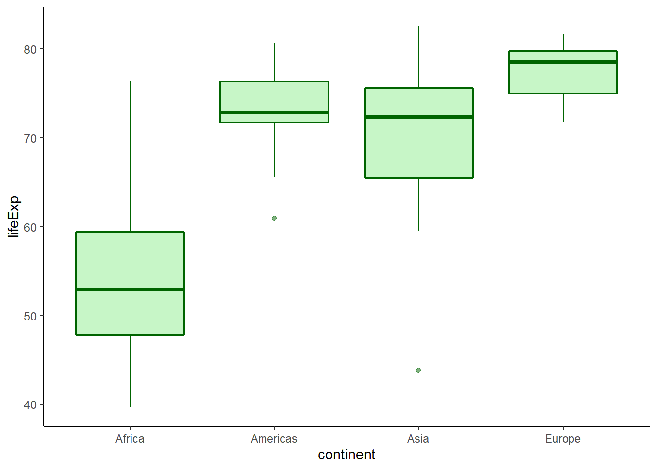
6.16.7.4 Removing outliers
The argument outlier.shape = NA is used to remove outliers.
# removing outliers
ggplot(data = gapminder_2007) +
   geom_boxplot(aes(y = gdpPercap, x = continent),
                fill = 'lightgreen',
                colour = 'darkgreen',
                size = 0.6,
                alpha = 0.6,
                outlier.shape = NA) +
   coord_flip() +
   theme_classic()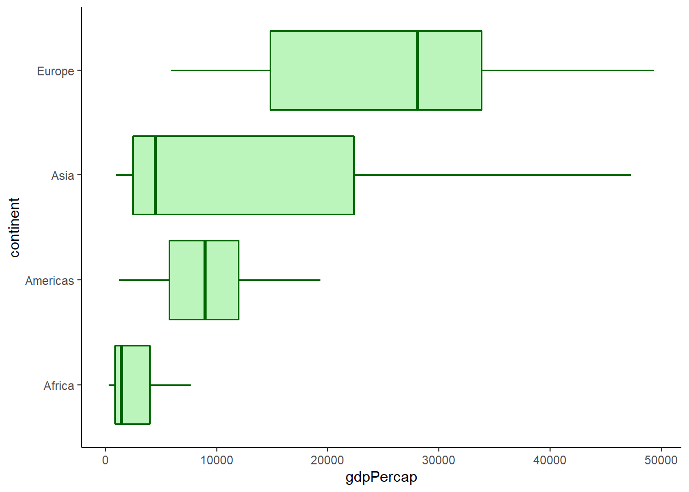
6.16.7.5 Box width
The argument width controls box width.
# box width
ggplot(data = gapminder_2007) +
   geom_boxplot(aes(y = gdpPercap, x = continent),
                fill = 'lightgreen',
                colour = 'darkgreen',
                size = 0.6,
                alpha = 0.6,
                outlier.shape = NA,
                width = 0.3) +
   theme_classic()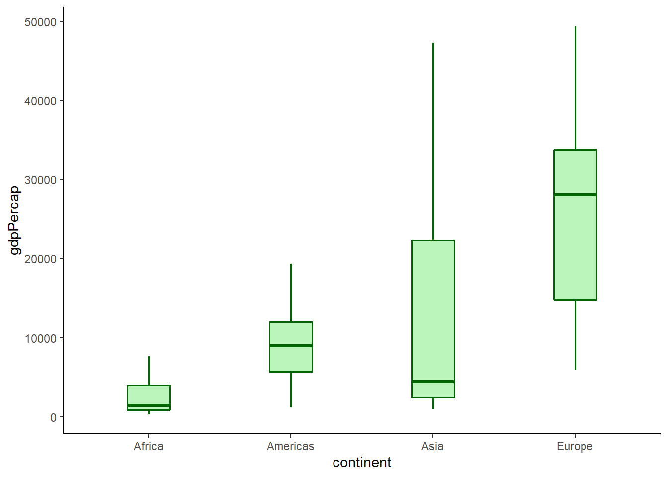
The argument varwidth = TRUE enables box width to be proportionate to the square root of the count of values for each group.
# width by the count of values
ggplot(data = gapminder_2007) +
   geom_boxplot(aes(y = gdpPercap, x = continent),
                fill = 'lightgreen',
                colour = 'darkgreen',
                size = 0.6,
                alpha = 0.6,
                outlier.shape = NA,
                varwidth = TRUE) +
   theme_classic()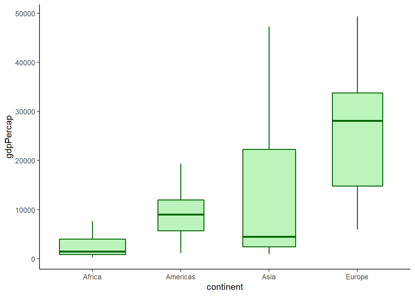
6.16.7.6 Adding mean and median
The function stat_summary() can be used to add both mean and median values.
# adding mean
ggplot(data = gapminder_2007, aes(y = lifeExp, x = continent), ) +
   geom_boxplot(fill = 'lightgreen',
                colour = 'darkgreen',
                size = 0.6,
                alpha = 0.6,
                width = 0.4) +
   stat_summary(fun.y = mean, geom = 'point', shape = '-', size = 10, colour = 'white') +
   theme_classic()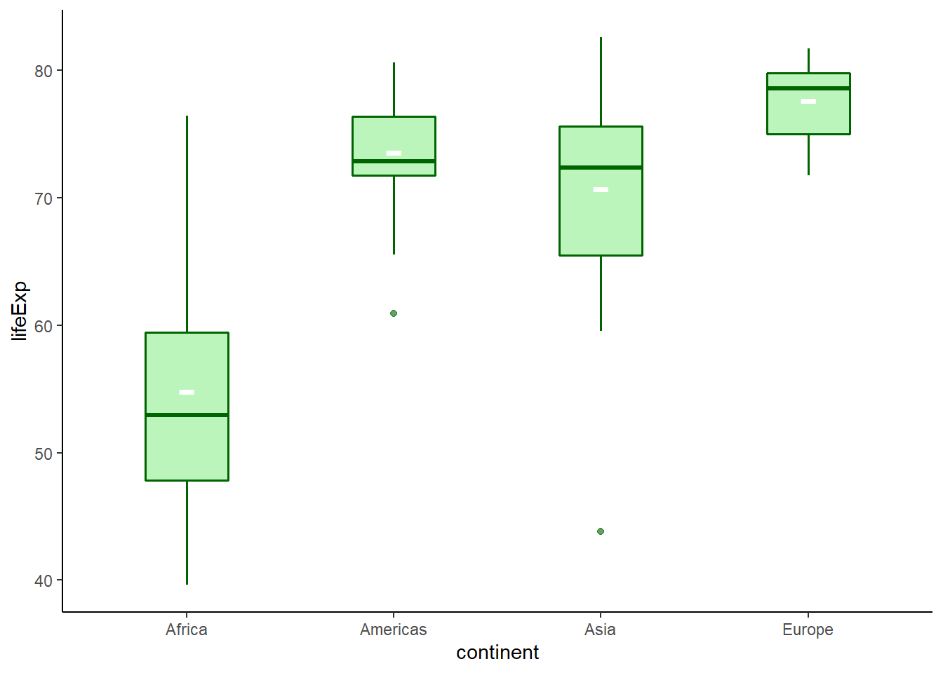
6.16.7.7 Adding jitter
The function geom_jitter() is used to add jitter to a plot.
ggplot(data = gapminder_2007, aes(y = lifeExp, x = continent)) +
   geom_boxplot(fill = 'lightgreen',
                colour = 'darkgreen',
                size = 0.6,
                alpha = 0.6,
                width = 0.3) +
   stat_summary(fun.y = mean, geom = 'point', shape = '-', size = 10, colour = 'white') +
   geom_jitter(width = 0.2, alpha = 0.7, colour = 'darkgreen') +
   theme_classic()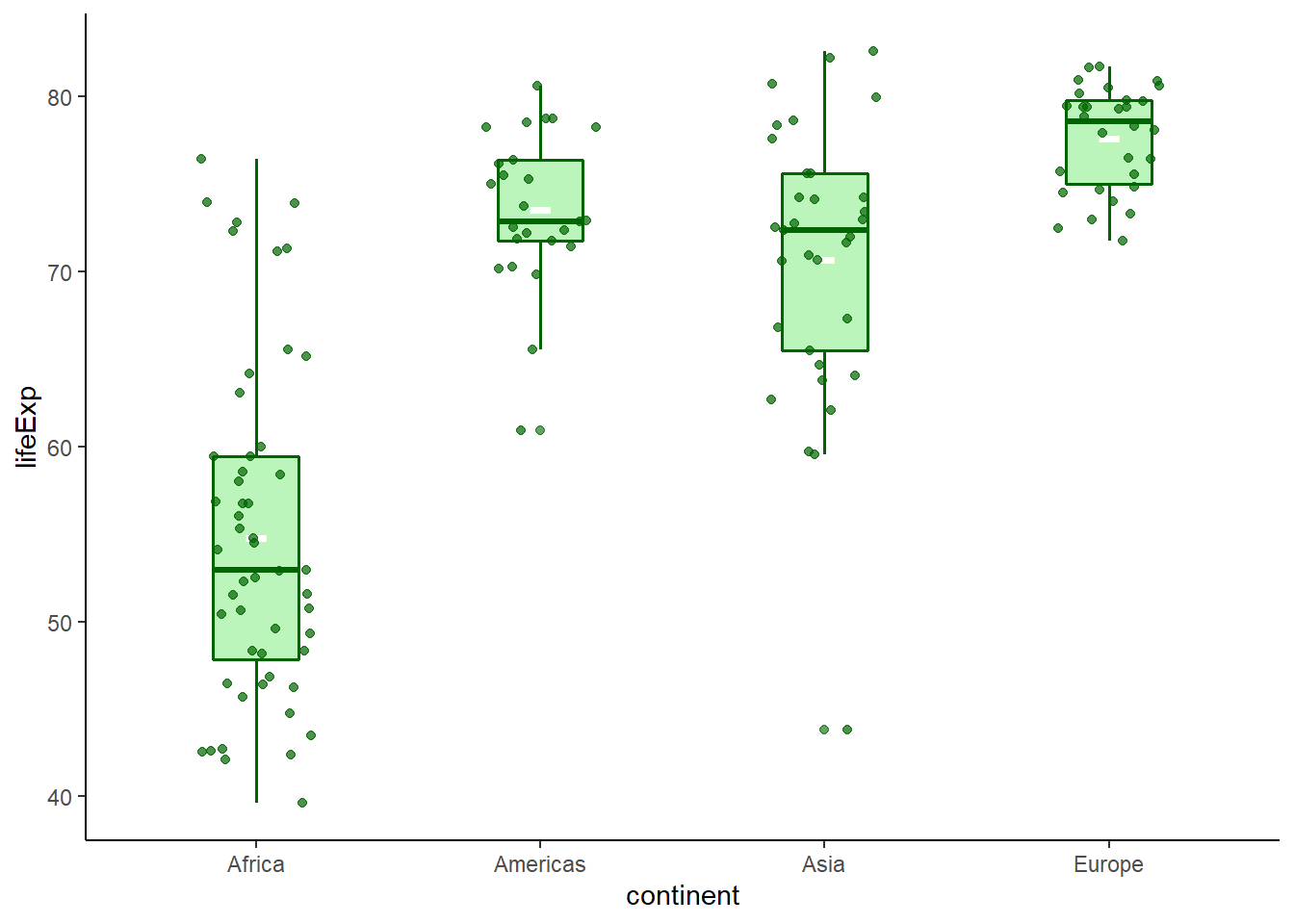
6.16.8 Strip plot
There is no specific geom to create a strip plot but using geom_jitter(), we can create a strip plot.
ggplot(data = gapminder_2007, aes(x = lifeExp, y = continent, colour = continent)) +
   geom_jitter() +
   theme_classic() +
   theme(legend.position = "none")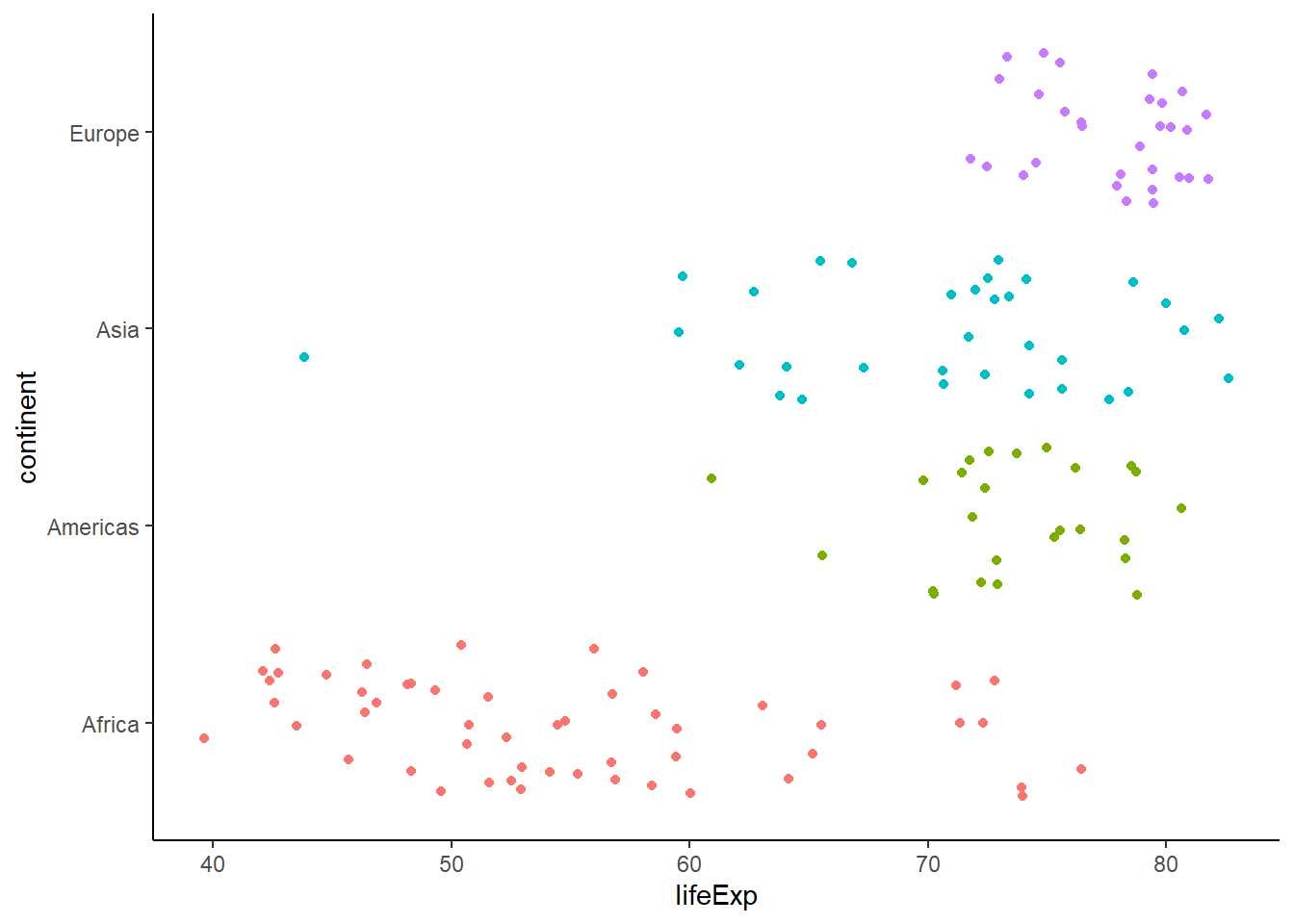
ggplot(data = gapminder_2007, aes(x = lifeExp, y = continent, colour = continent)) +
   geom_jitter(position = position_jitter(height = 0.1)) +
   theme_classic() +
   theme(legend.position = "none")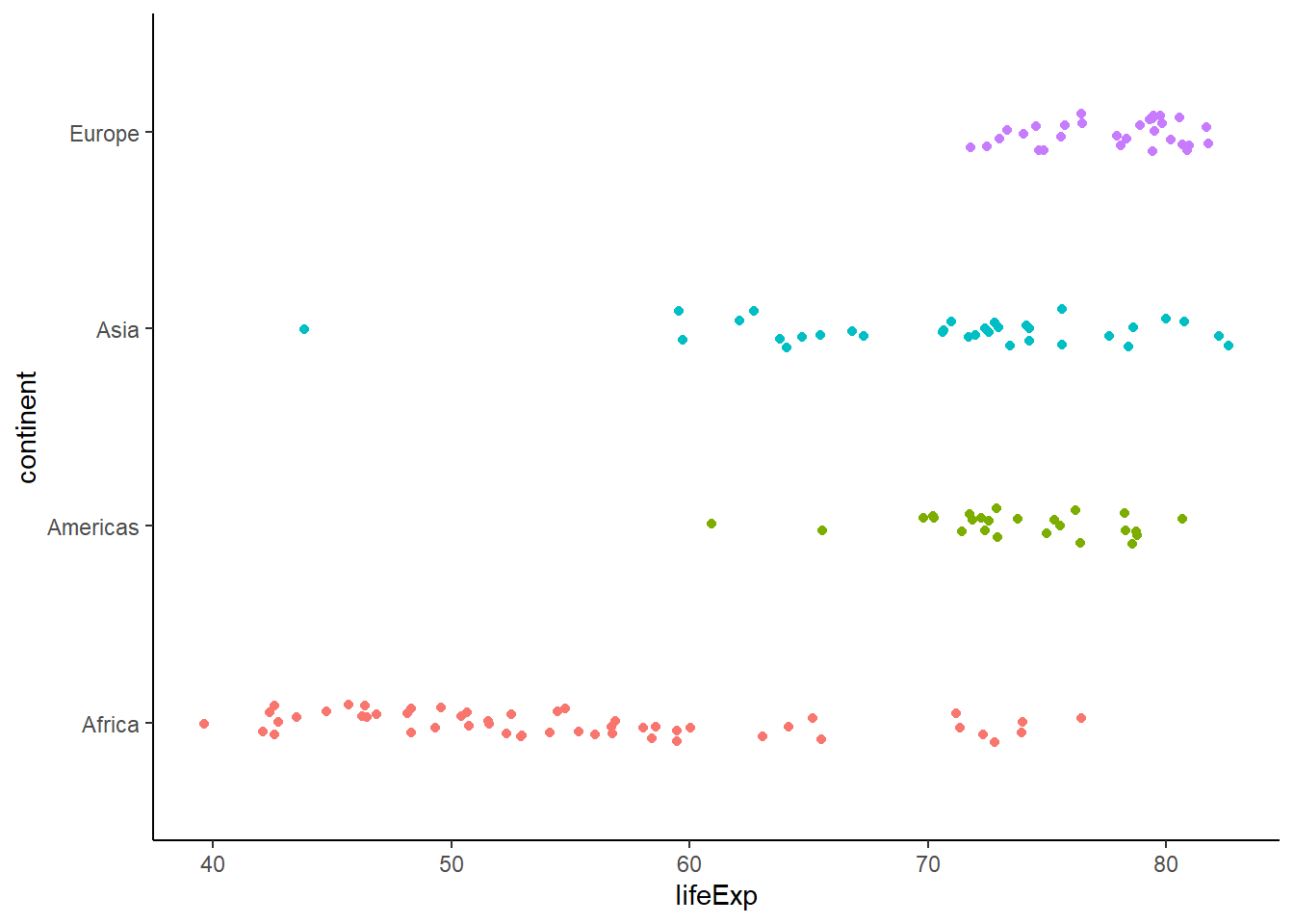
ggplot(data = gapminder_2007, aes(y = lifeExp, x = continent, colour = continent)) +
   geom_jitter(position = position_jitter(width = 0.2)) +
   theme_classic() +
   theme(legend.position = "none")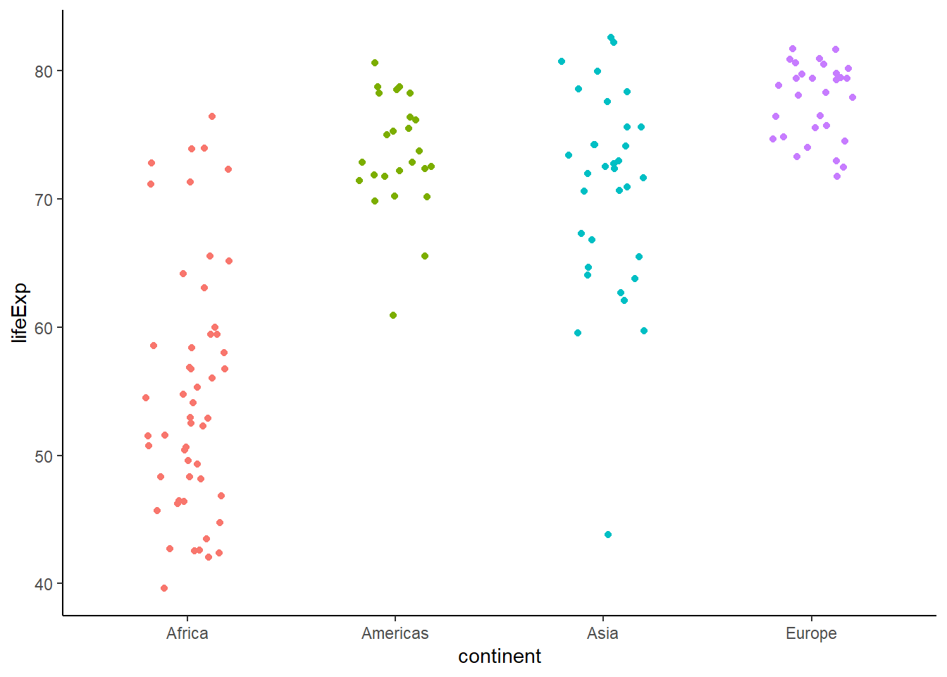
ggplot(data = gapminder_2007,
       aes(y = lifeExp, x = continent, colour = continent, fill = continent)) +
   geom_boxplot(size = 0.3, alpha = 0.6, width = 0.3) +
   stat_summary(fun.y = mean, geom = 'point', shape = '-', size = 8) +
   geom_jitter(position = position_jitter(width = 0.2), alpha = 0.5) +
   scale_colour_brewer(palette = "Dark2") +
   scale_fill_brewer(palette = "Dark2") +
   theme_classic() +
   theme(legend.position = "none")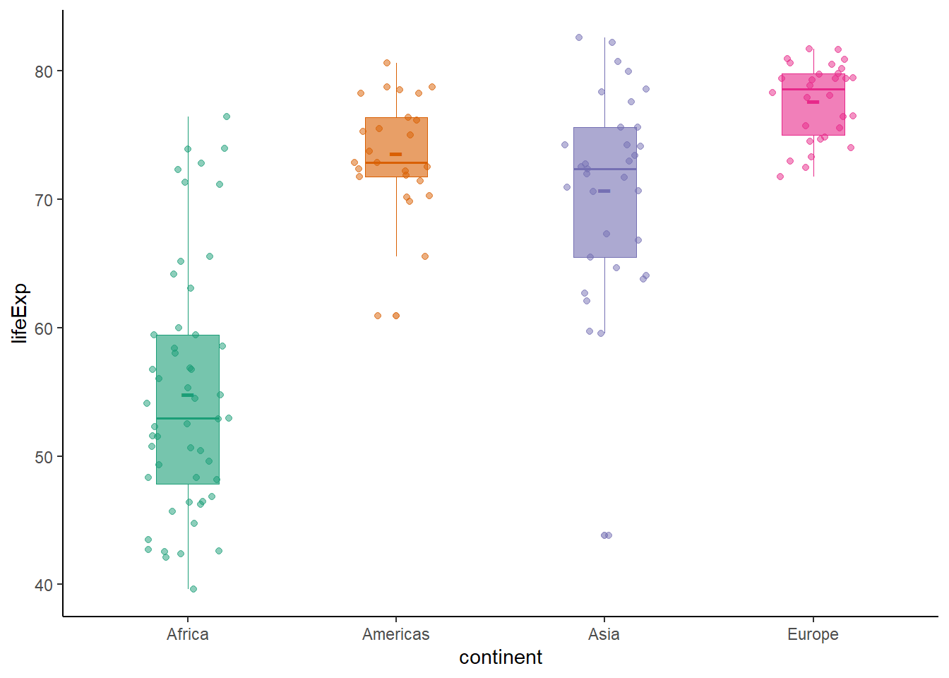
6.16.9 Violin plot
The function geom_violin() creates a violin plot.
ggplot(data = gapminder_2007, aes(y = lifeExp, x = '')) +
   geom_violin() +
   theme_classic()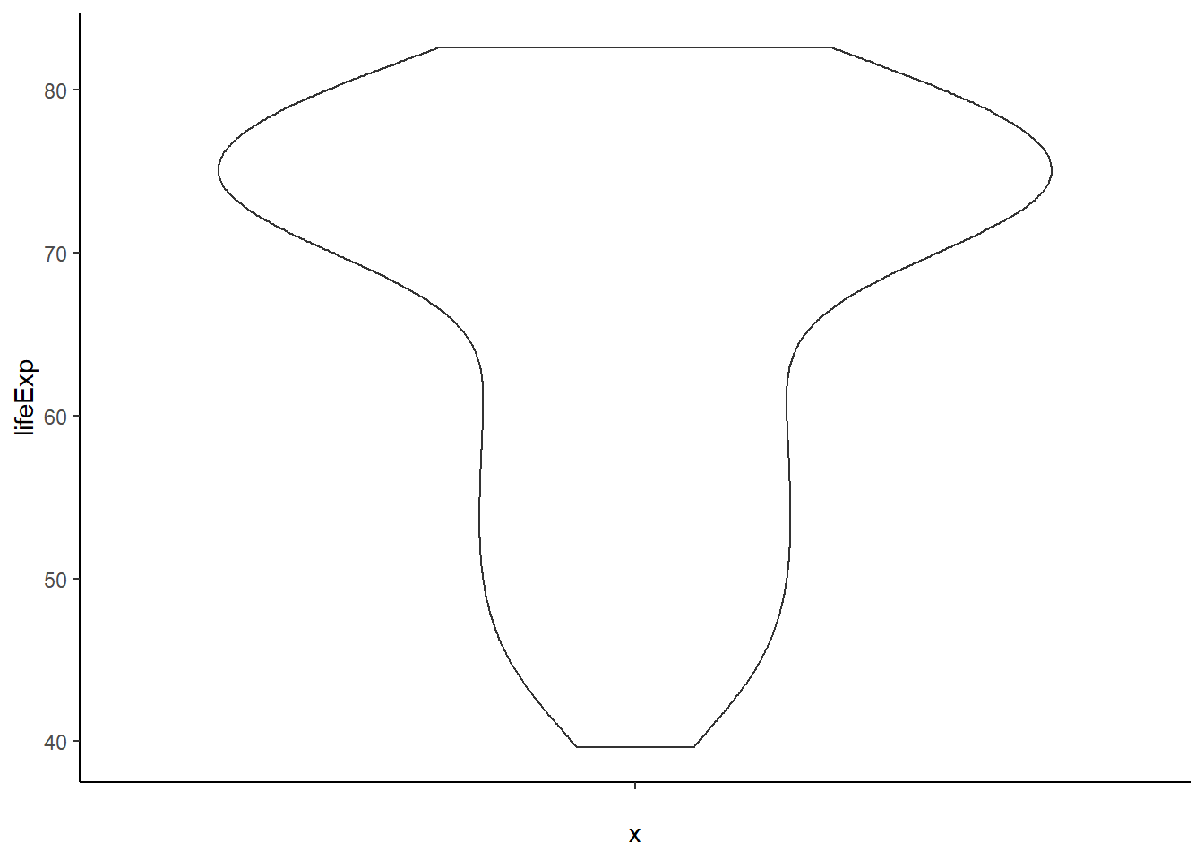
6.16.9.1 Remove trimming
The argument trim = FALSE removes trimming.
# removing trim
ggplot(data = gapminder_2007, aes(y = lifeExp, x = '')) +
   geom_violin(trim = FALSE) +
   theme_classic()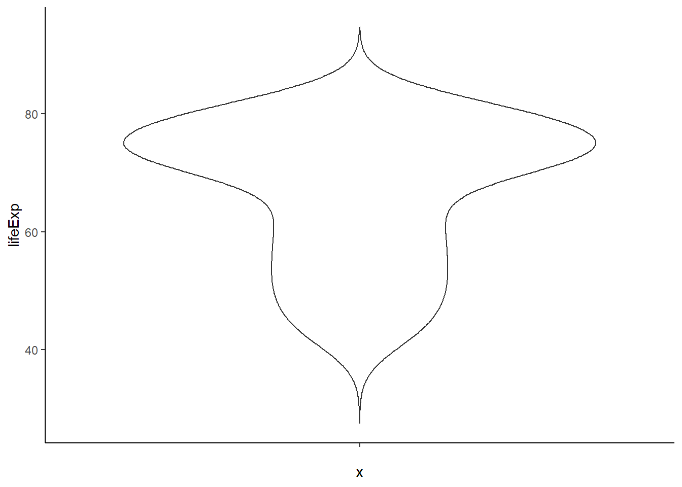
6.16.9.2 Adding mean and median
# adding mean and median
ggplot(data = gapminder_2007, aes(y = lifeExp, x = '')) +
   geom_violin(trim = FALSE) +
   stat_summary(fun.y = mean, geom = 'point', shape = '-', size = 10) +
   stat_summary(fun.y = median, geom = 'point', shape = 19, size = 3) +
theme_classic() 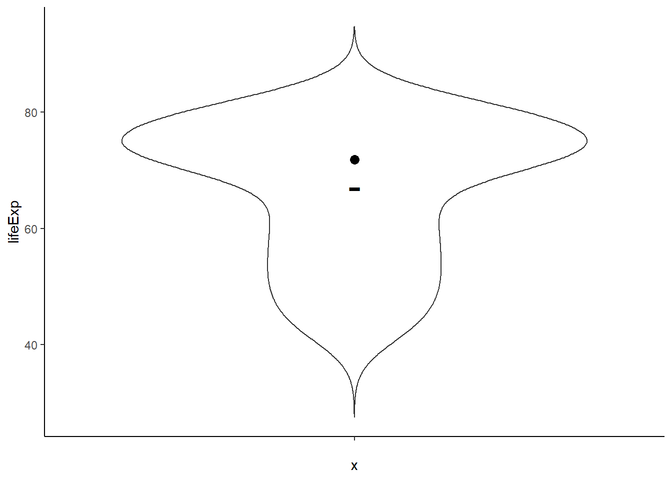
ggplot(data = gapminder_2007, aes(y = lifeExp, x = continent)) +
   geom_violin() +
   stat_summary(fun.y = mean, geom = 'point', shape = '-', size = 10) +
   stat_summary(fun.y = median, geom = 'point', shape = 19, size = 3) +
   theme_classic()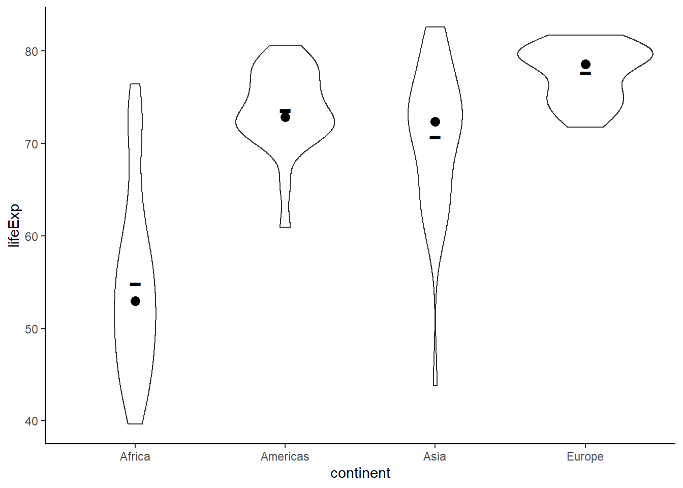
ggplot(data = gapminder_2007,
       aes(y = lifeExp, x = continent, color = continent, shape = continent)) +
   geom_violin(size = 0.8) +
   stat_summary(fun.y = mean, geom = 'point', shape = '-', size = 10) +
   stat_summary(fun.y = median, geom = 'point', shape = 19, size = 3) +
   geom_jitter(position = position_jitter(width = 0.2), alpha = 0.7) +
   scale_colour_brewer(palette = "Dark2") +
   theme_classic() +
   theme(legend.position = "none")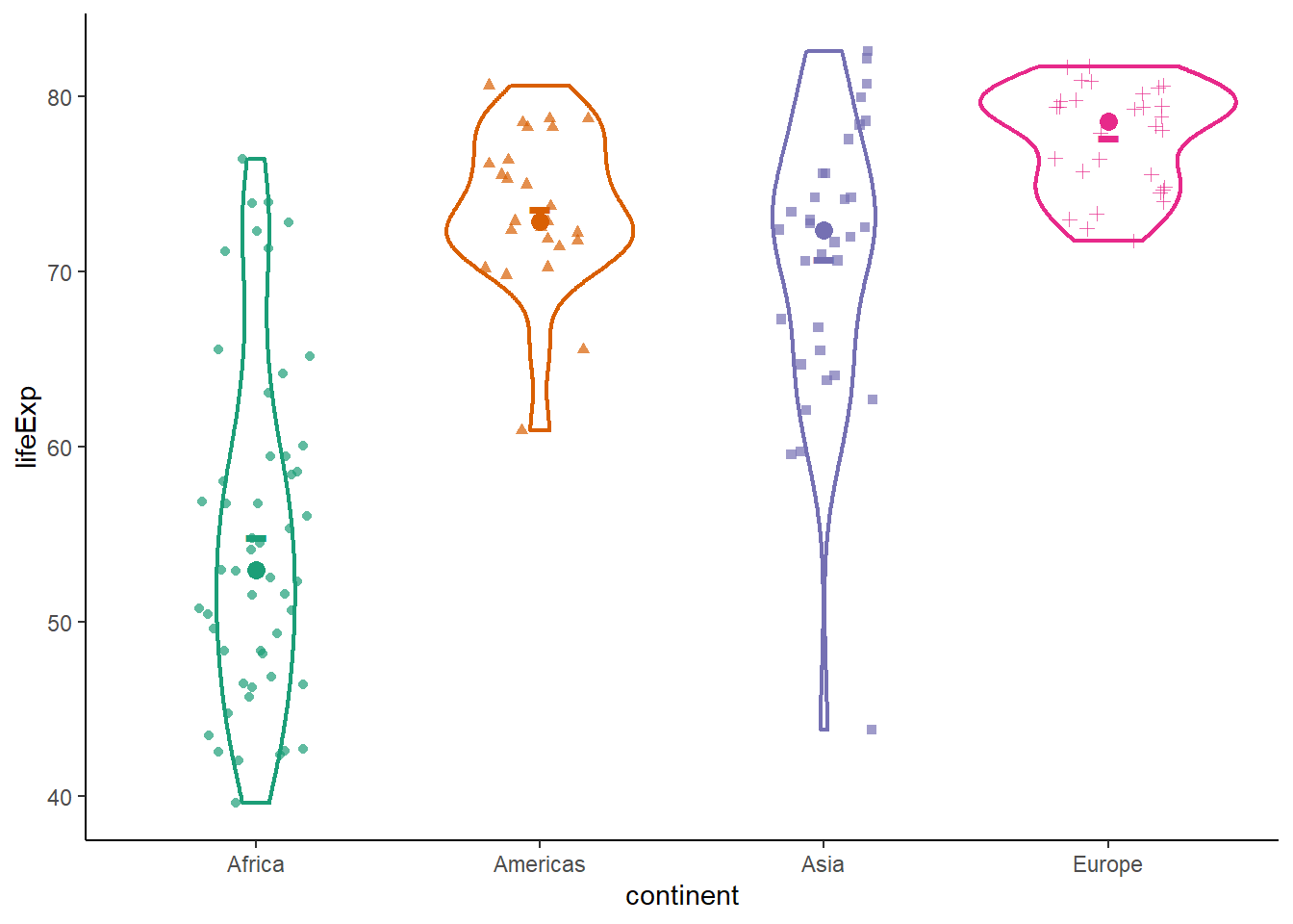
6.16.10 Line graph
The function geom_line() produces a line plot.
# preparing plot
pop_growth <-
gapminder %>%
group_by(year) %>%
summarise(pop = round(sum(pop/1e9, na.rm = T), 2))
pop_growth
#> # A tibble: 12 x 2
#>     year   pop
#>    <int> <dbl>
#>  1  1952  2.41
#>  2  1957  2.66
#>  3  1962  2.9
#>  4  1967  3.22
#>  5  1972  3.58
#>  6  1977  3.93
#>  7  1982  4.29
#>  8  1987  4.69
#>  9  1992  5.11
#> 10  1997  5.52
#> 11  2002  5.89
#> 12  2007  6.25

ggplot(data = pop_growth, aes(y = pop/1e9, x = year)) +
  geom_point()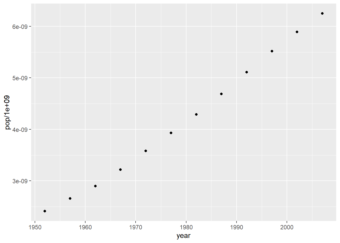
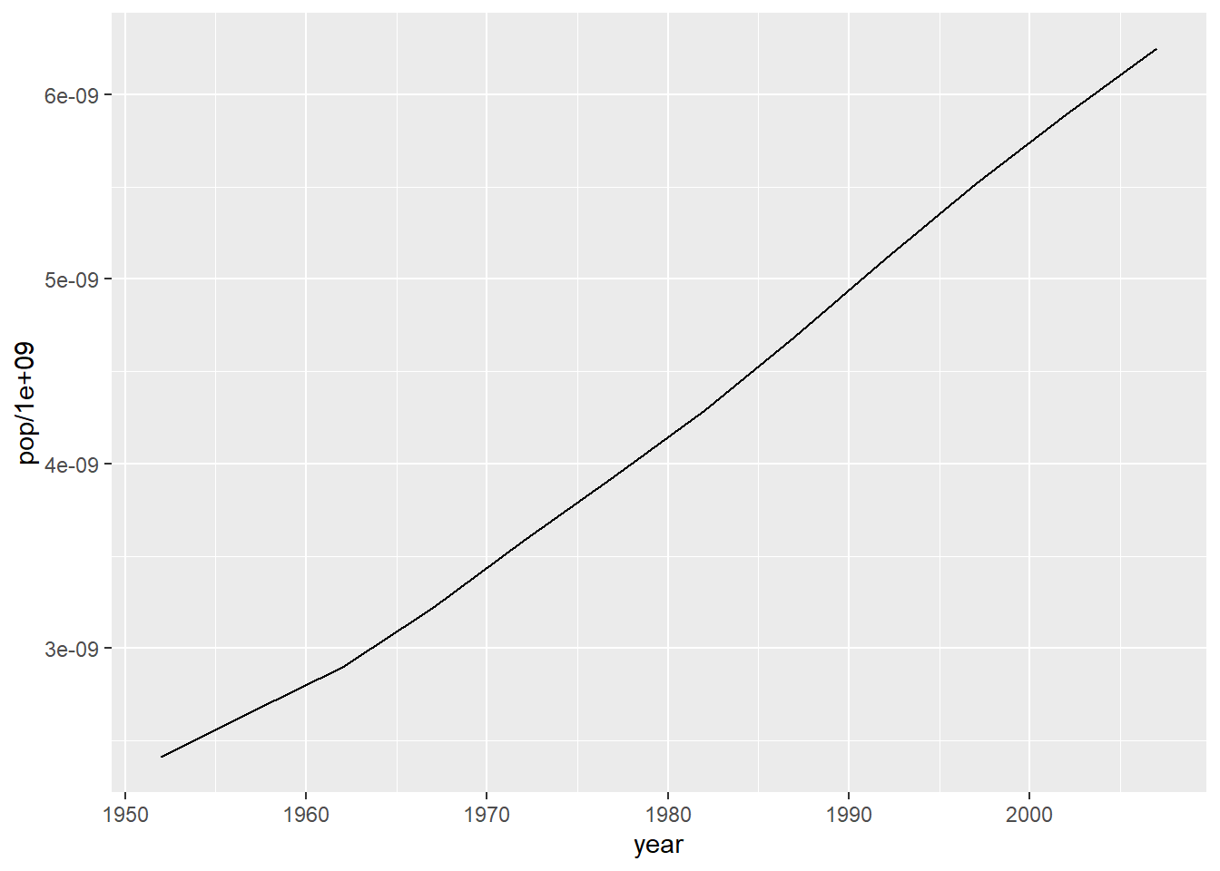
# combining line and points
ggplot(data = pop_growth, aes(y = pop/1e9, x = year)) +
  geom_line() +
  geom_point()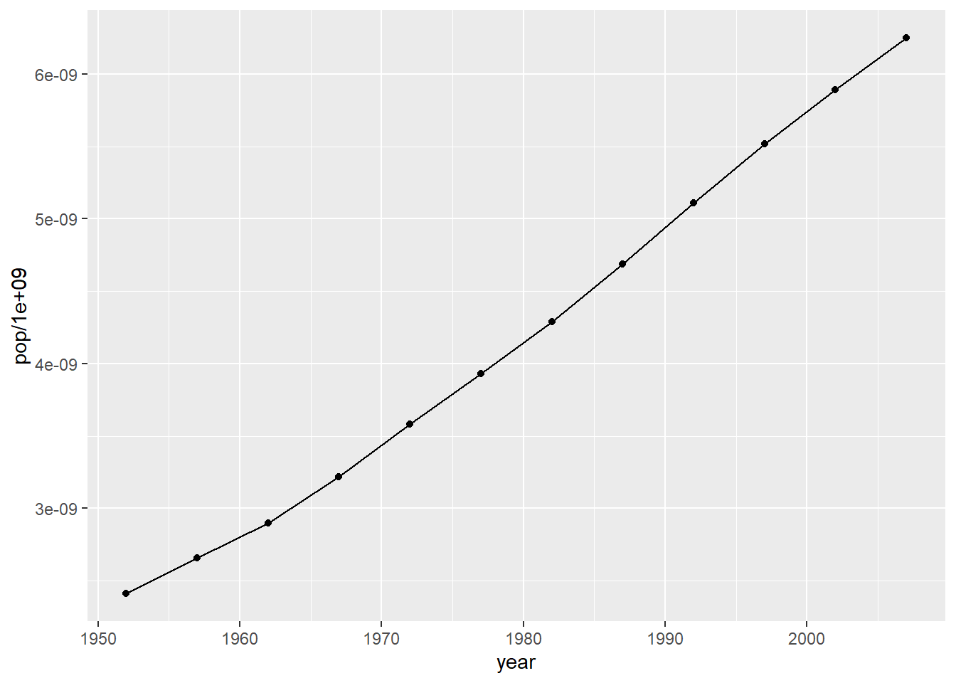
# adding data label
ggplot(data = pop_growth, aes(y = pop, x = year)) +
  geom_line() +
  geom_point() +
  geom_text(aes(label = round(pop, 2)), nudge_x = -3) +
  theme_classic()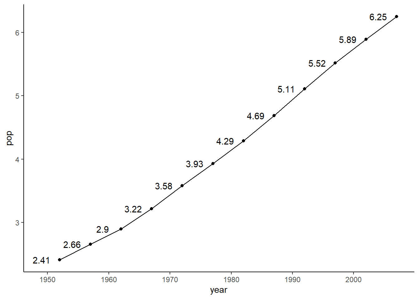
ggplot(data = pop_growth, aes(y = pop, x = year)) +
  geom_segment(aes(y = pop, x = year, yend = 0, xend = year)) +
  theme_classic()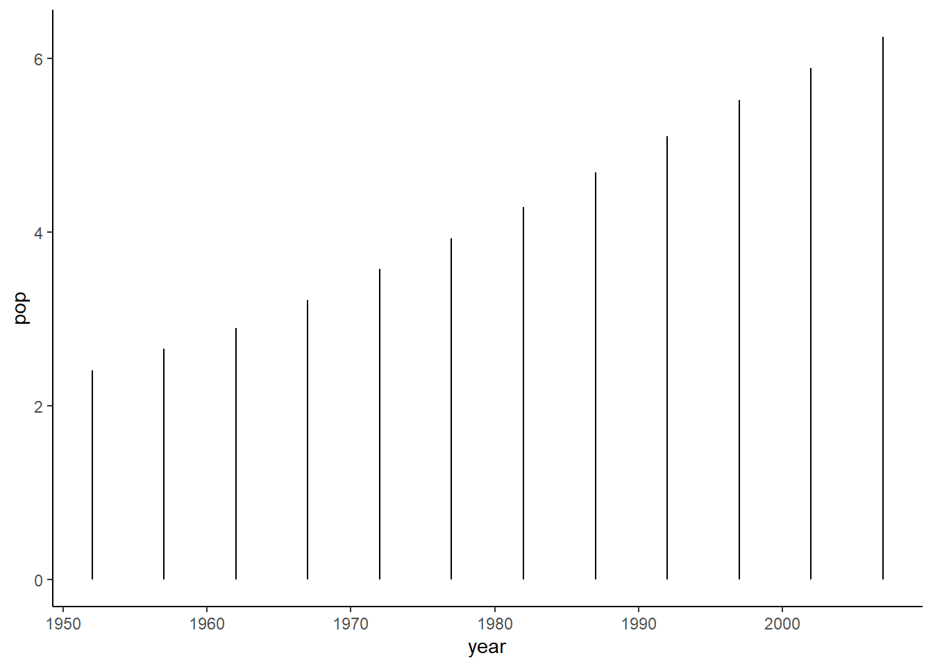
6.16.10.1 Line width
The argument size=, control line width.
ggplot(data = pop_growth, aes(y = pop, x = year)) +
  geom_line(size = 1) +
  theme_classic()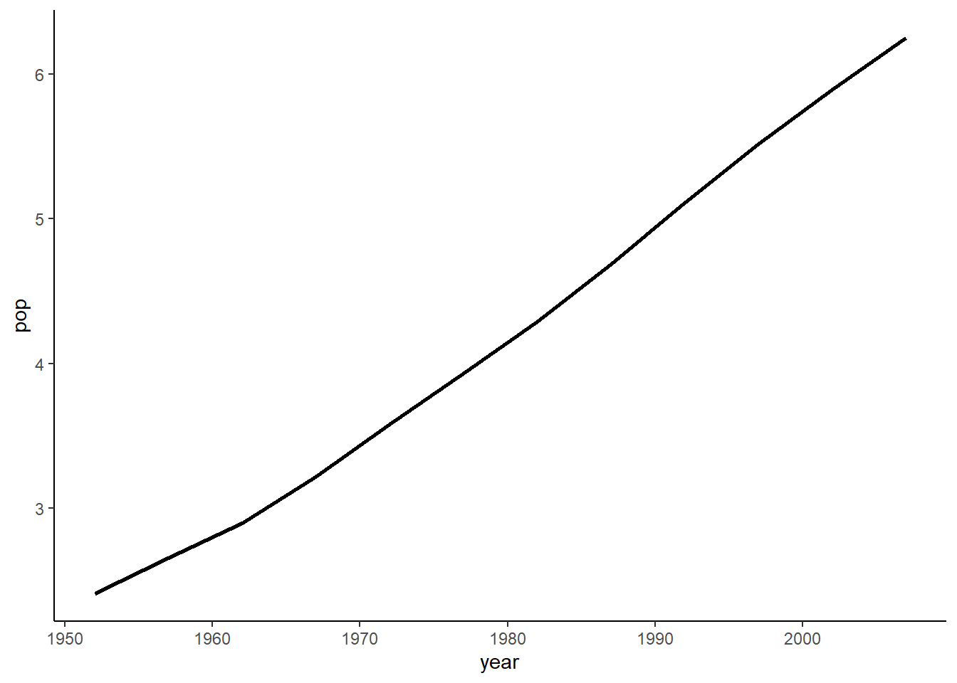
6.16.10.2 Line style
The argument linetype= controls line style. It accepts the same values as base graphics that is, integers ranging from 0 to 6 and
- ‘blank’ = 0,
- ‘solid’ = 1 (default)
- ‘dashed’ = 2
- ‘dotted’ = 3
- ‘dotdash’ = 4
- ‘longdash’ = 5
- ‘twodash’ = 6
ggplot(data = pop_growth, aes(y = pop, x = year)) +
  geom_line(size = 1, linetype = 2) +
  theme_classic()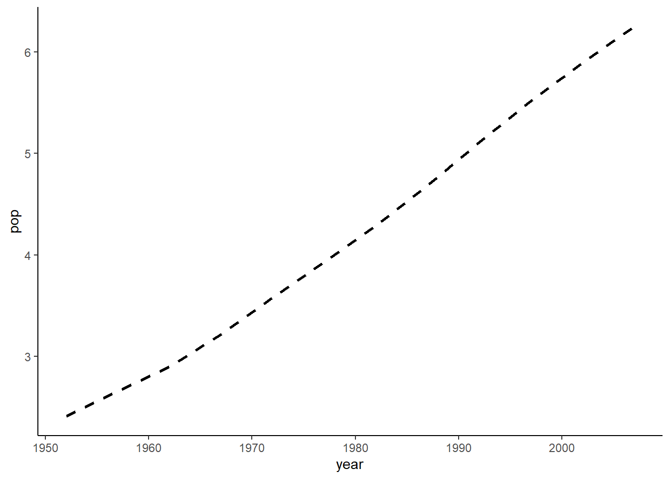
ggplot(data = pop_growth, aes(y = pop, x = year)) +
  geom_line(size = 1, linetype = 'twodash') +
  theme_classic()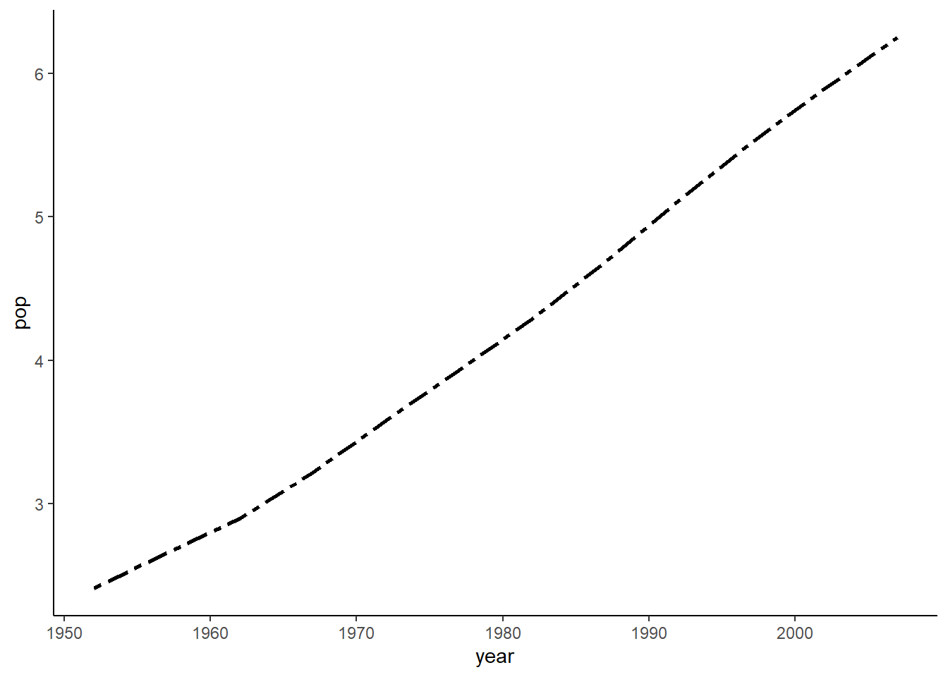
6.16.10.3 Multiple line plot
# preparing data
pop_growth_cont <- aggregate(pop ~ year + continent, gapminder, sum)
head(pop_growth_cont)
#>   year continent       pop
#> 1 1952    Africa 237640501
#> 2 1957    Africa 264837738
#> 3 1962    Africa 296516865
#> 4 1967    Africa 335289489
#> 5 1972    Africa 379879541
#> 6 1977    Africa 433061021

ggplot(data = pop_growth_cont,
       aes(y = pop/1e6, x = year, colour = continent, fill = continent)) +
  geom_line() +
  geom_point()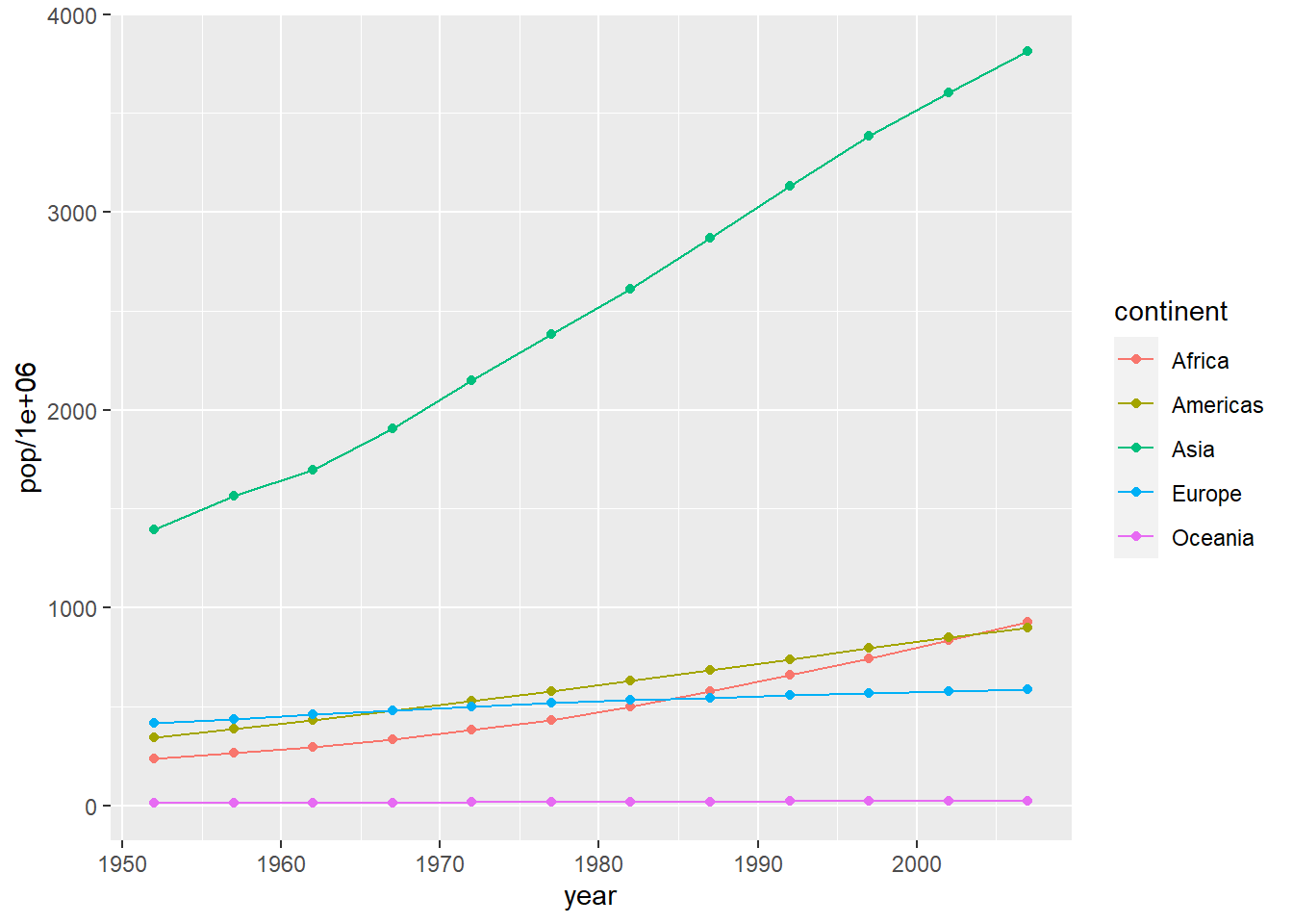
ggplot(data = pop_growth_cont, aes(y = pop, x = year, colour = continent, fill = continent)) +
  geom_area() +
  scale_colour_brewer(palette = "Dark2") +
  theme_classic()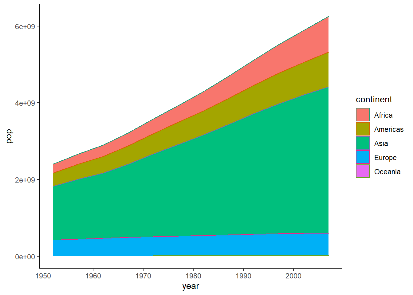
6.16.11 Lollipop plot
By combining the functions geom_segment() and geom_point(), we can produce a lollipop plot.
ggplot(data = pop_growth, aes(y = pop, x = year)) +
  geom_segment(aes(yend = 0, xend = year)) +
  geom_point(aes(y = pop, x = year), size = 3) +
  theme_classic()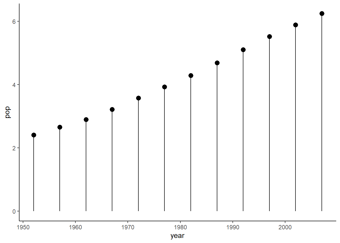
6.16.12 Area plot
The function geom_area() is used to create an area plot.
ggplot(data = pop_growth, aes(y = pop, x = year)) +
  geom_area() +
  theme_classic()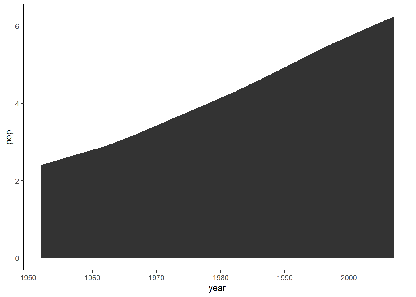
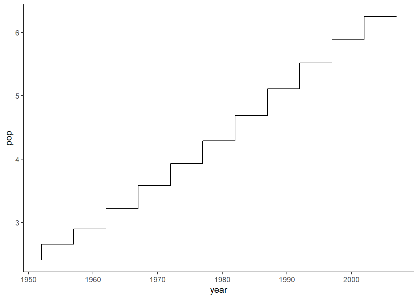
6.16.13 Step plot
The function geom_step() is used to create a step plot with the argument direction indicating the direction of the plot.
ggplot(data = pop_growth, aes(y = pop, x = year)) +
  geom_step(aes(y = pop, x = year)) +
  theme_classic()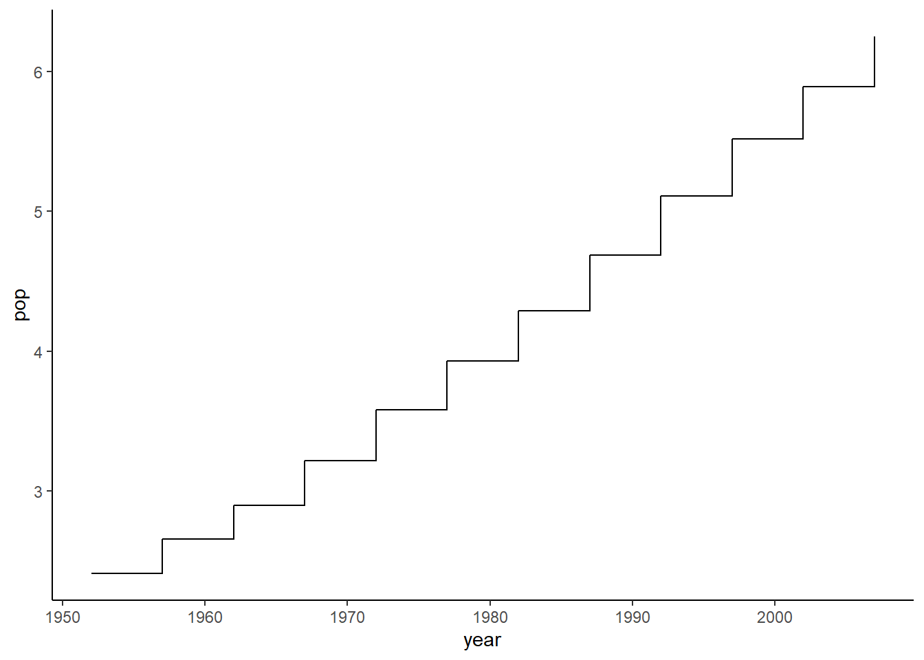
# vh (vertical then horizontal)
ggplot(data = pop_growth, aes(y = pop, x = year)) +
  geom_step(aes(y = pop, x = year), direction = 'vh') +
  theme_classic()